

The Riskiest SFR Markets - Q1 2026
Increased Inventory, Price Cuts, Price Declines, and More
We modeled every metro on a 0–100 scale based on seven indicators of home-value decline risk (inventory growth, price direction, peak decline, months of supply, market heat, price cuts, and two-year inventory trends) to identify which markets are most at risk of near-term price corrections.
Higher scores mean higher risk of price declines over the next 6–12 months.
Executive Summary:
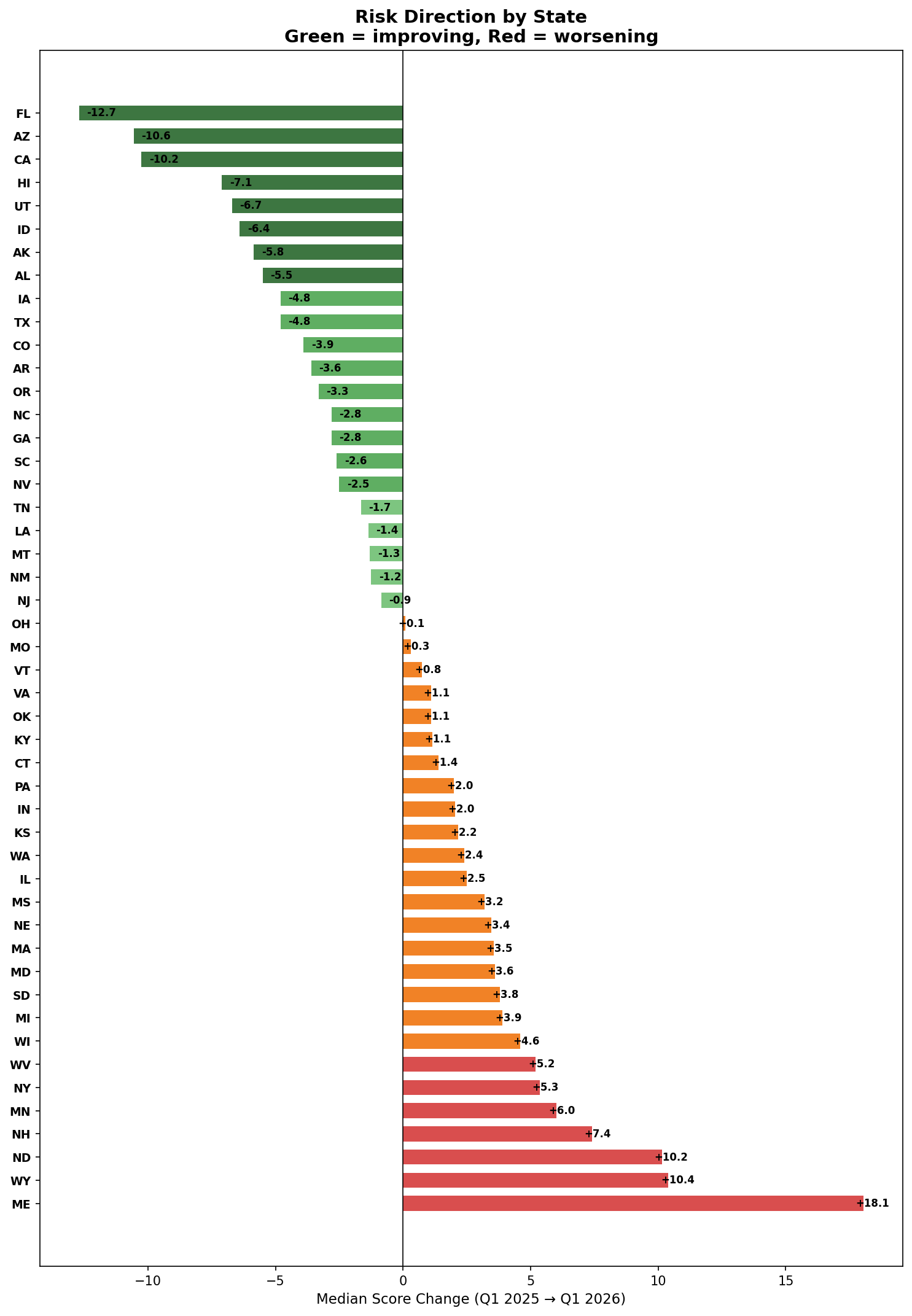
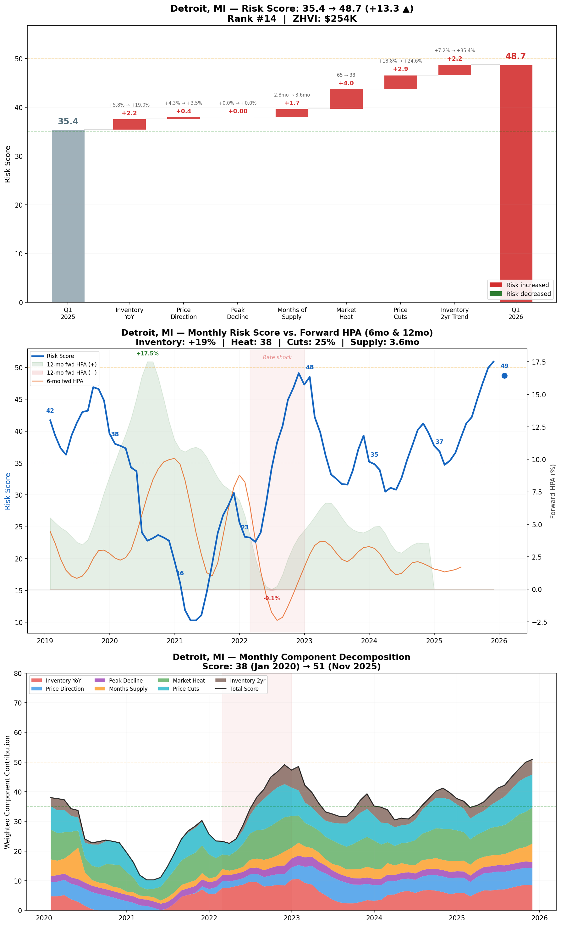
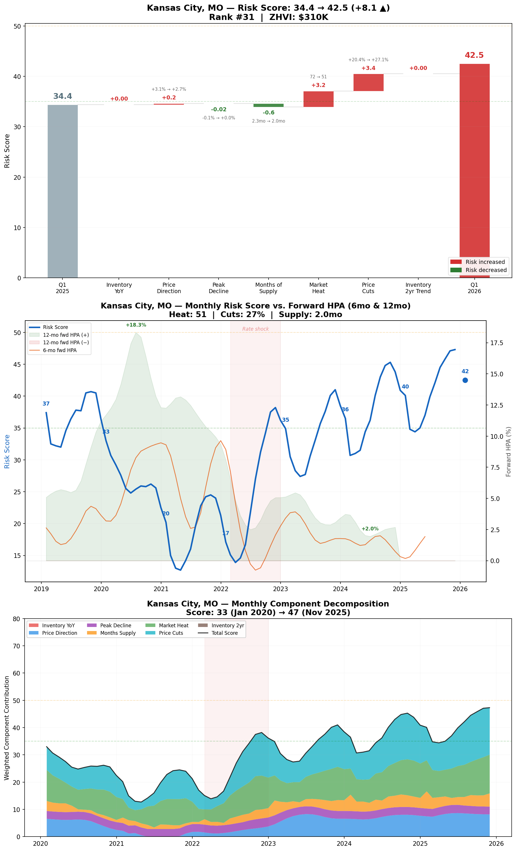
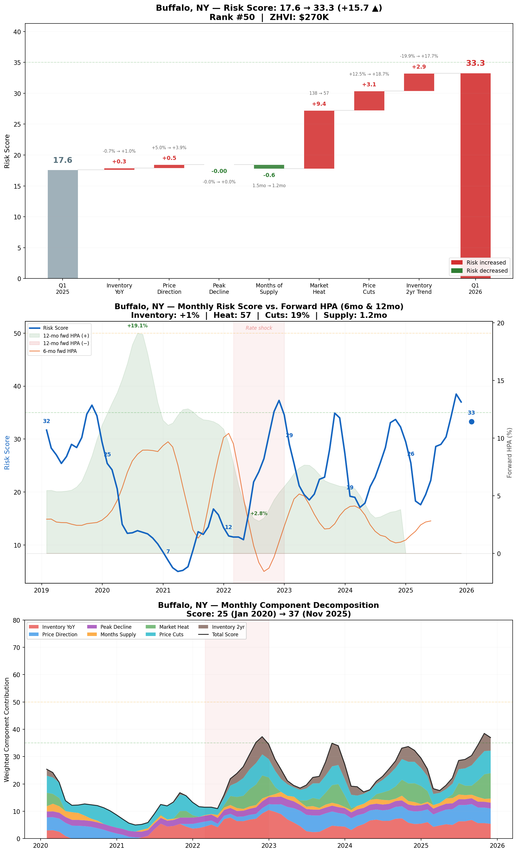
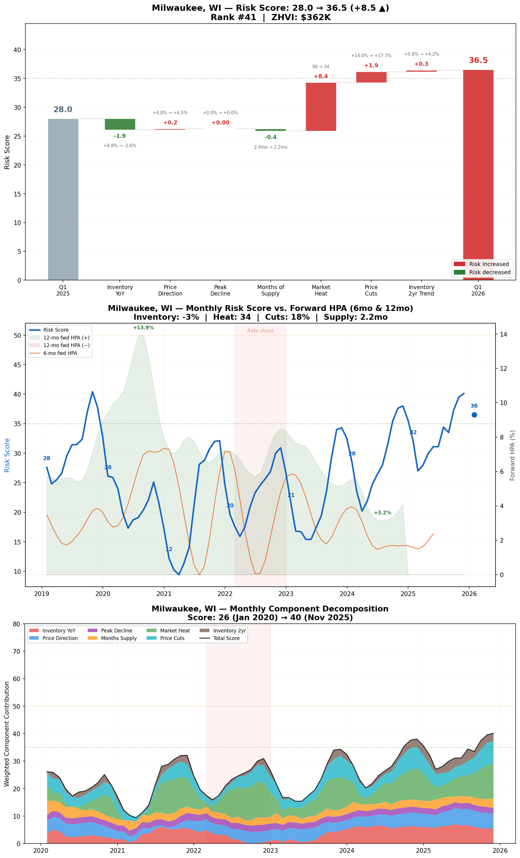
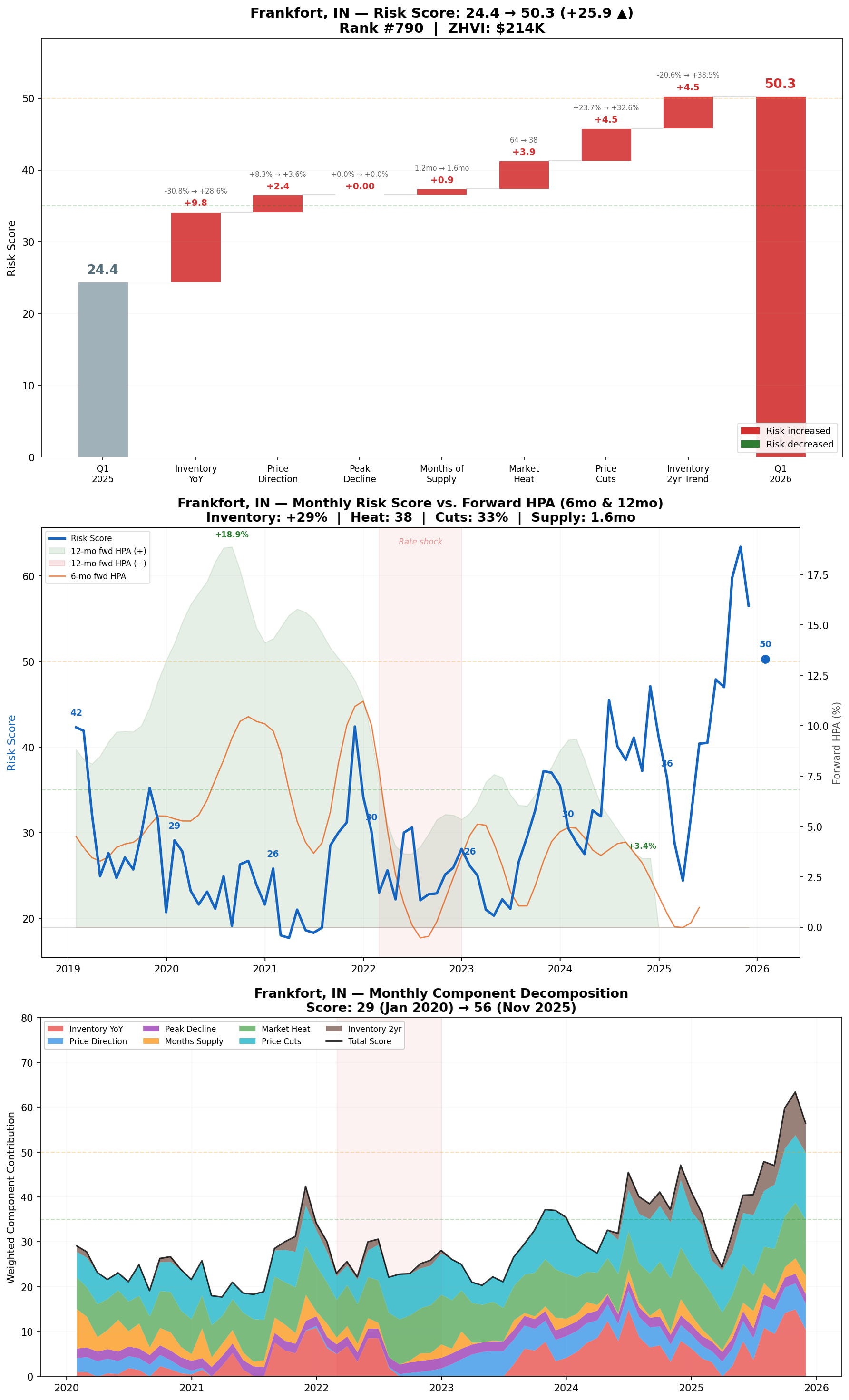
Risk increases are migrating from the Sun Belt to the Midwest. Detroit (+13.3), Buffalo (+15.7), and Milwaukee (+8.5) are the fastest-rising risk markets, though all still remain at relatively low absolute risk levels.
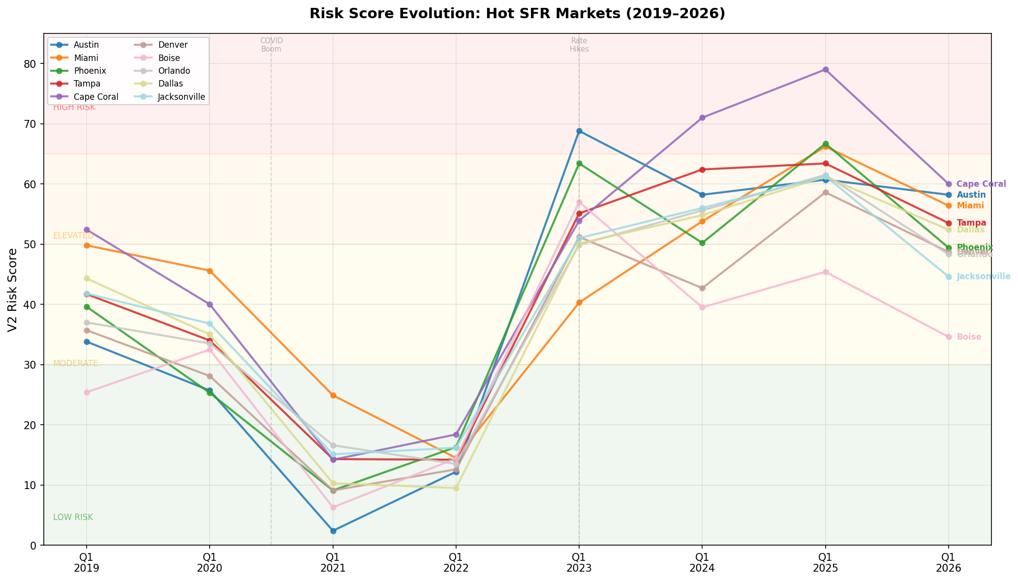
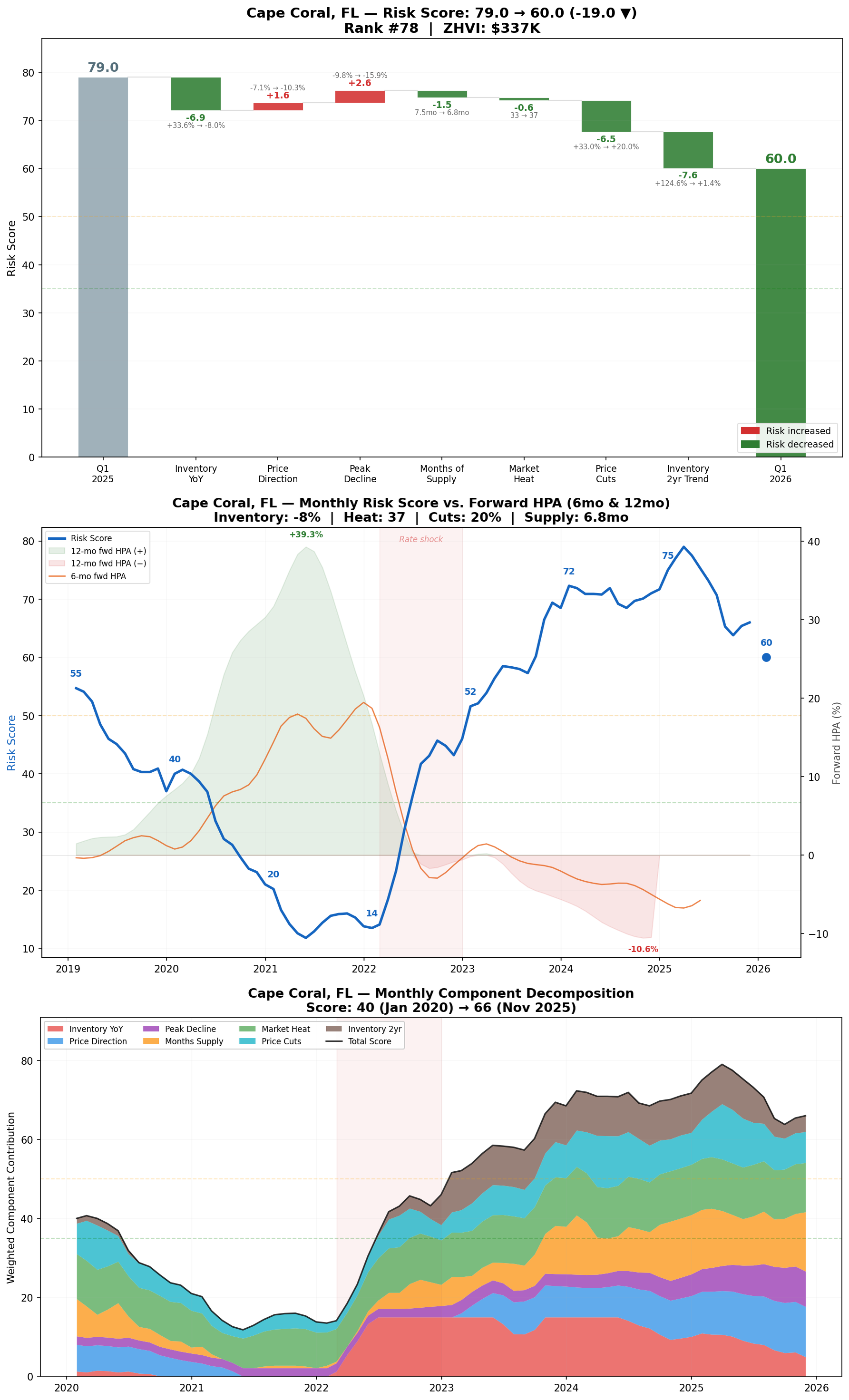
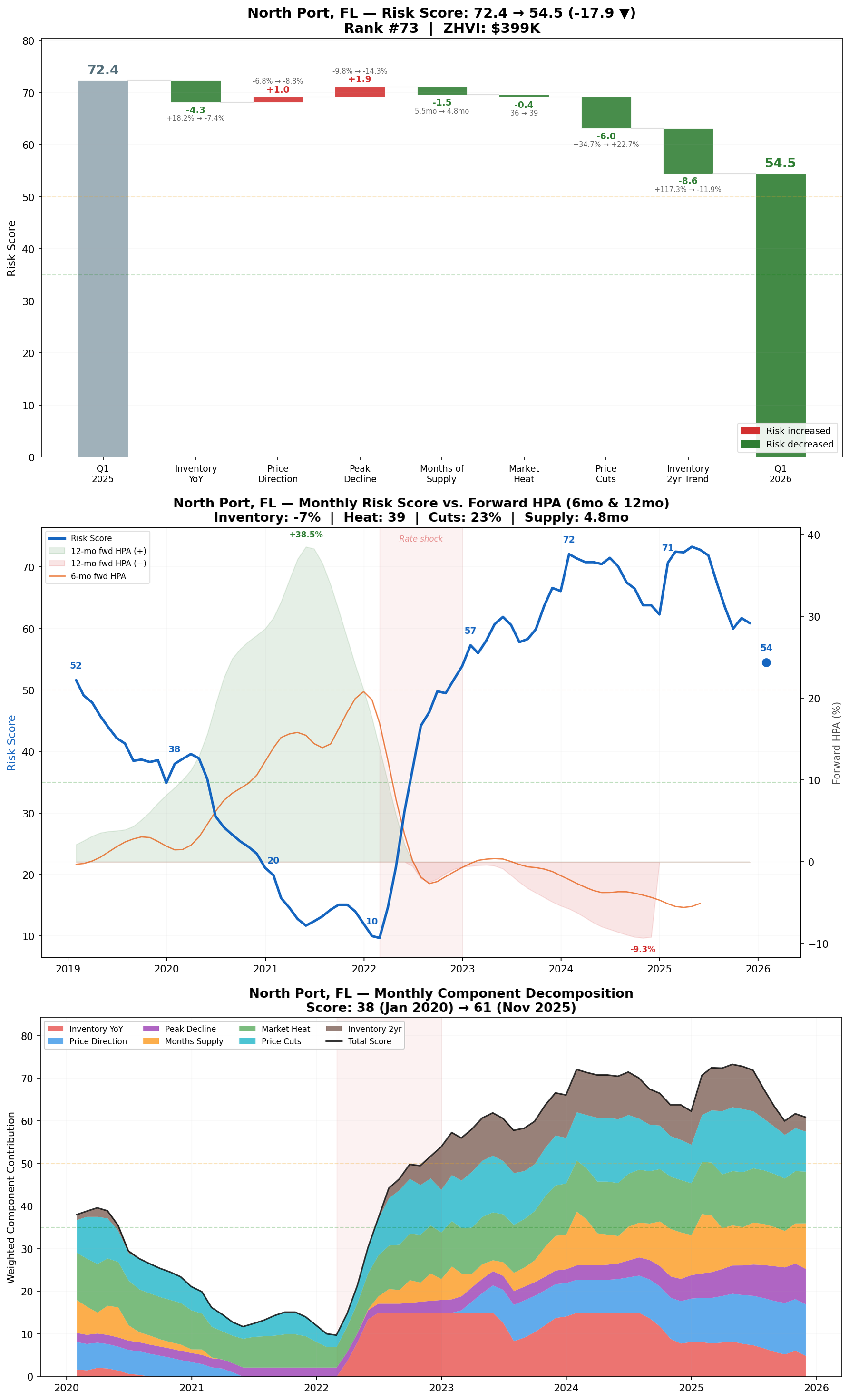
Austin and Cape Coral remain the highest-risk major markets, but both are improving.
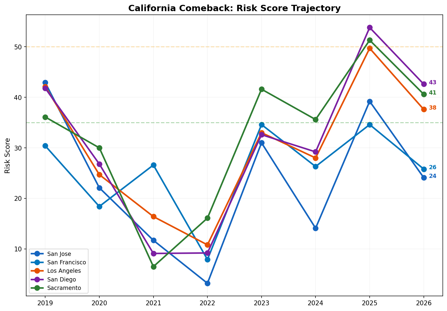
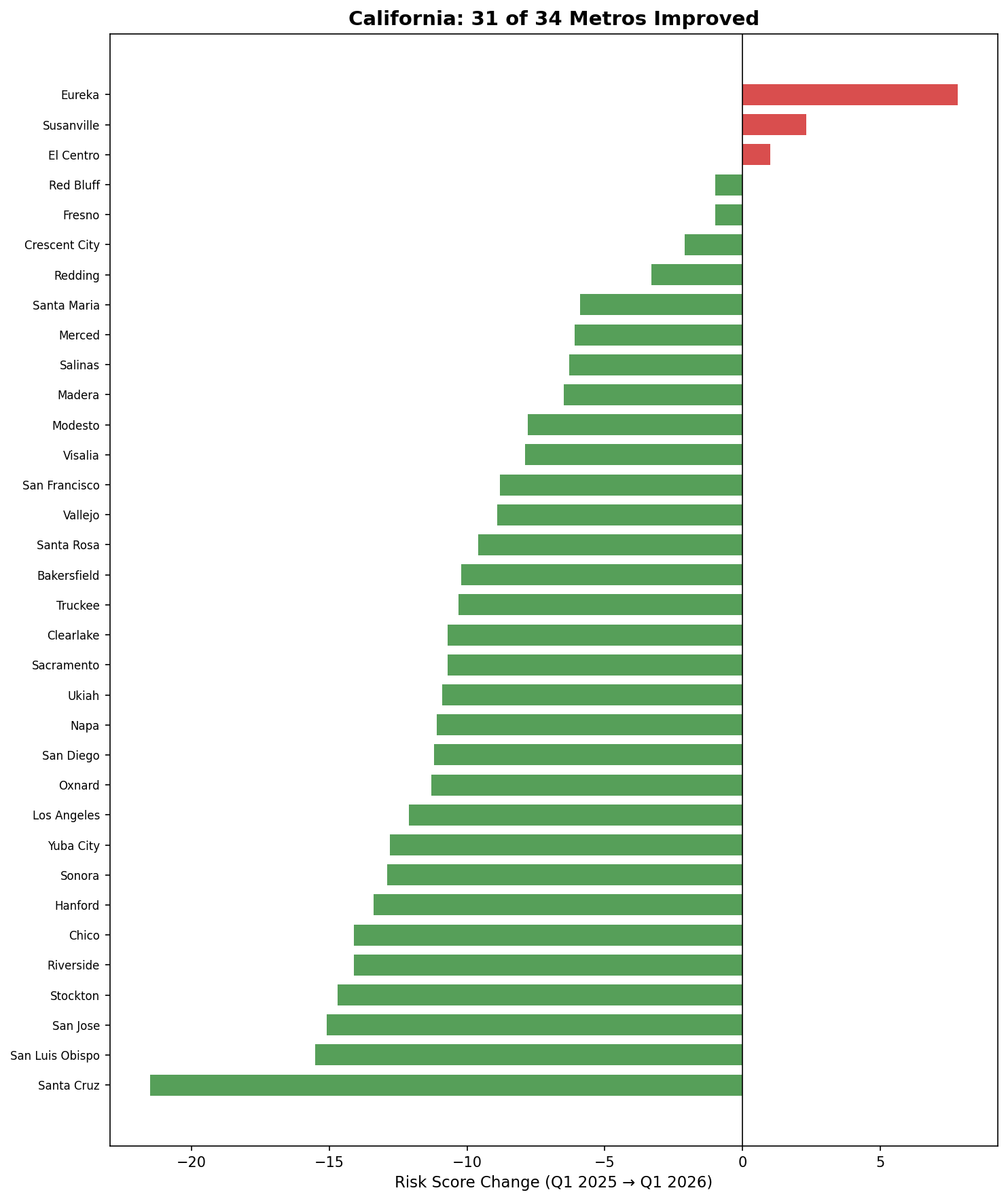
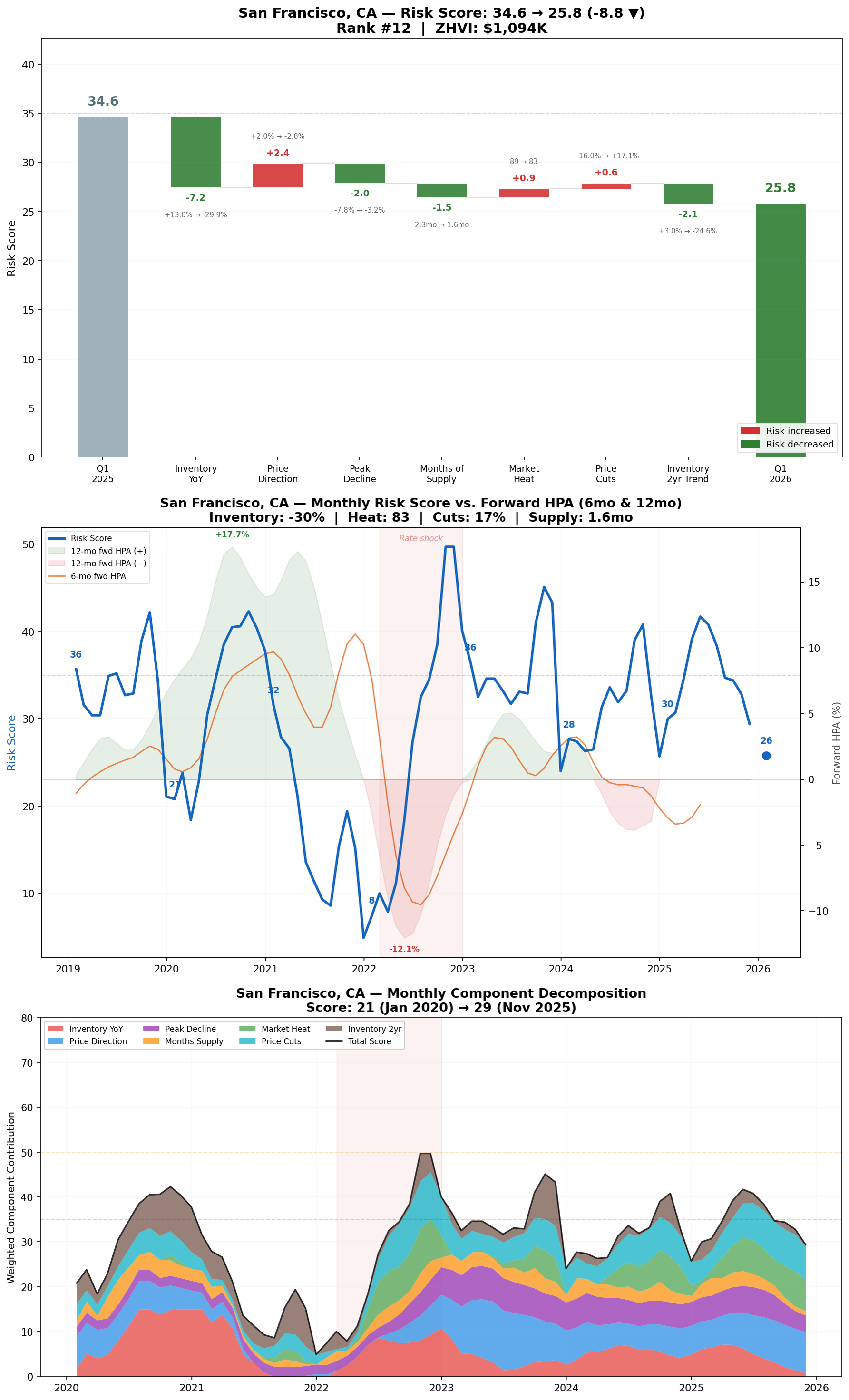
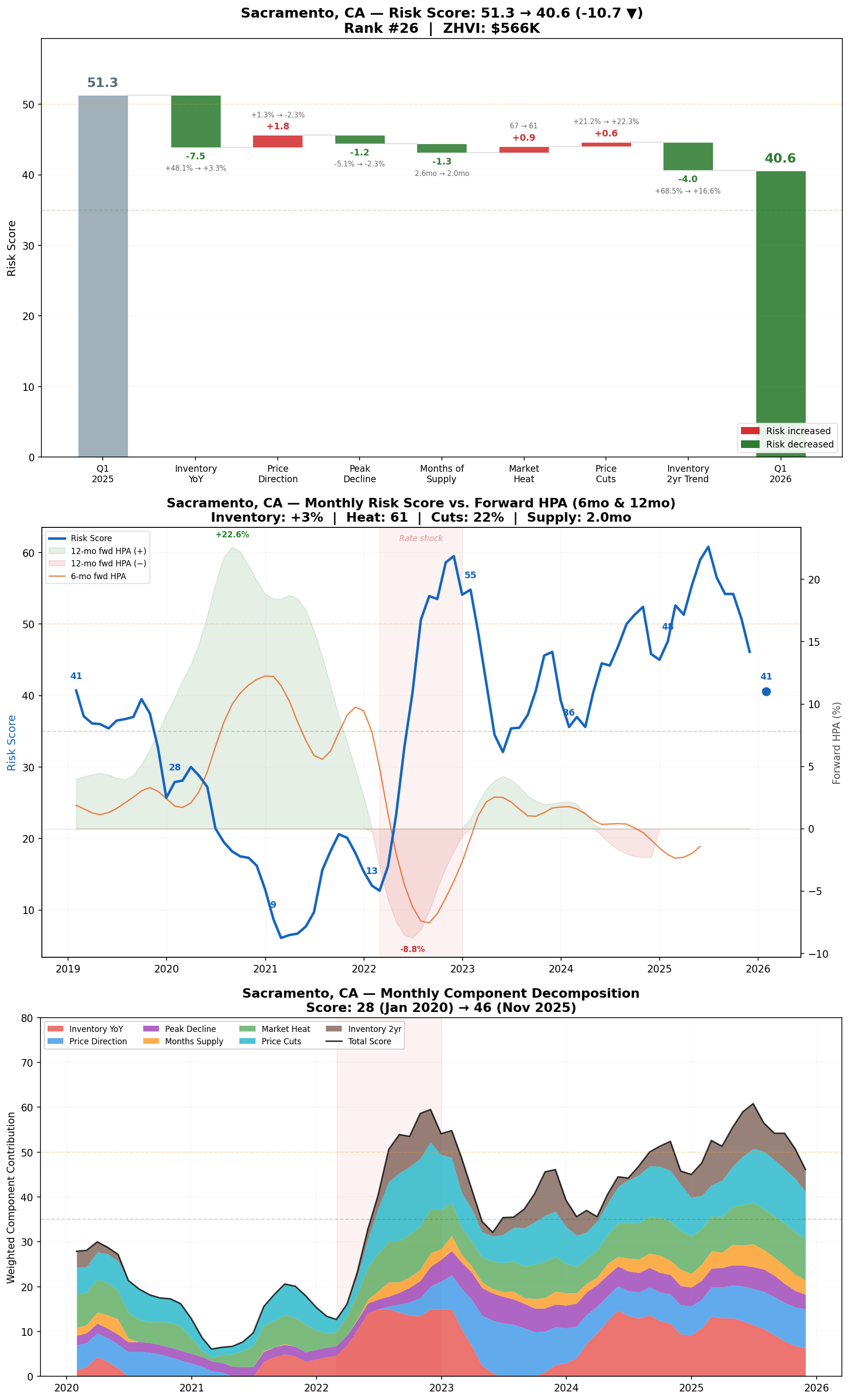
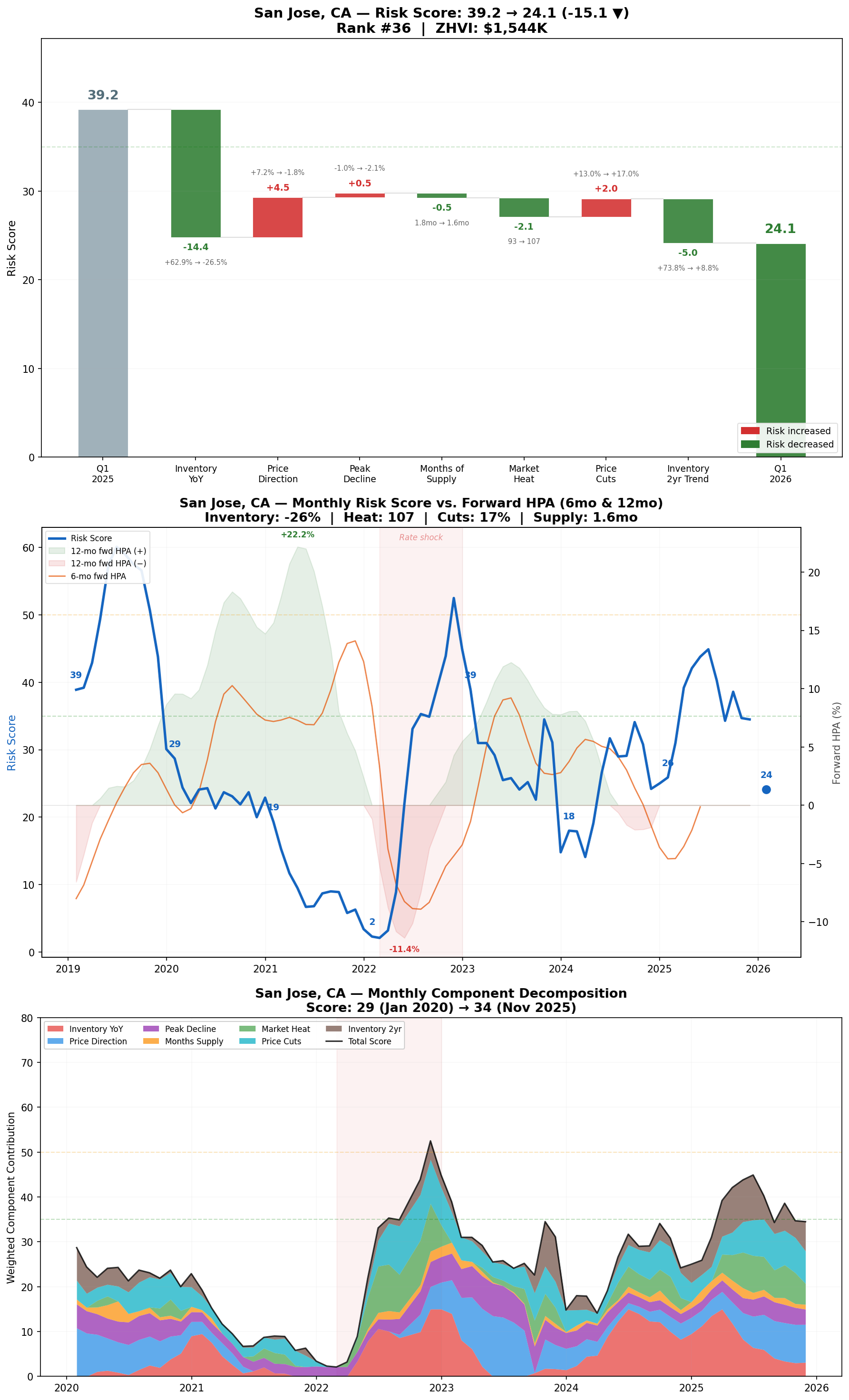
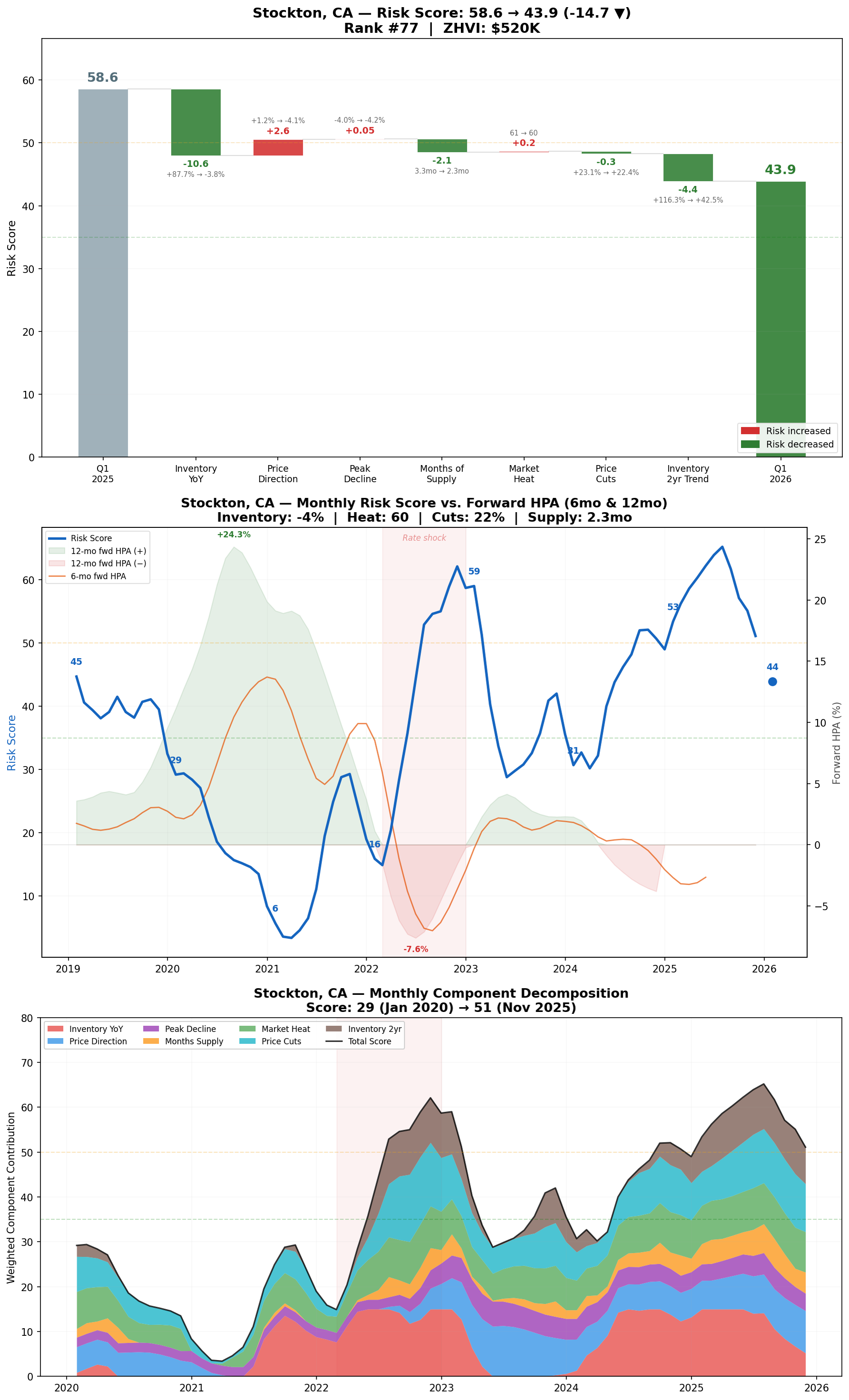
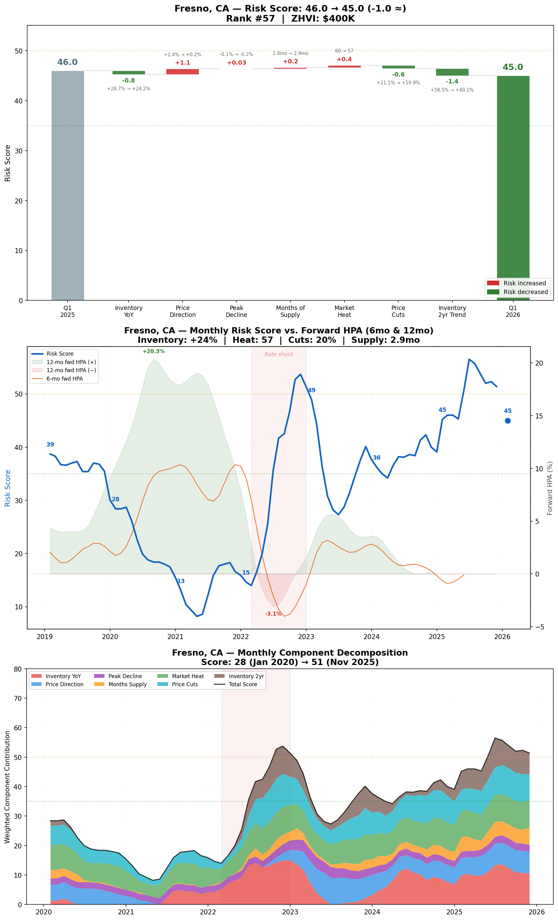
California markets saw the biggest declines in risk scores YoY.
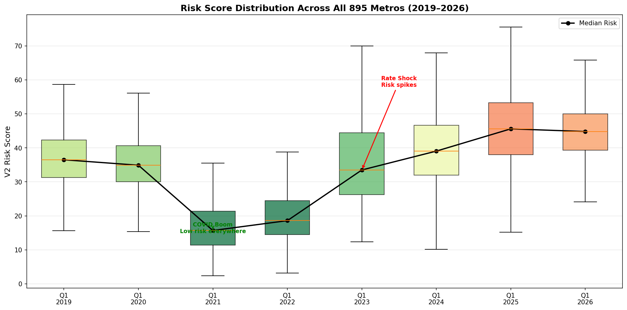
Overall, risk scores are rising nationwide, but far fewer metros have very high risk scores compared to the last few years.
Major Metro Risk Score Snapshot:
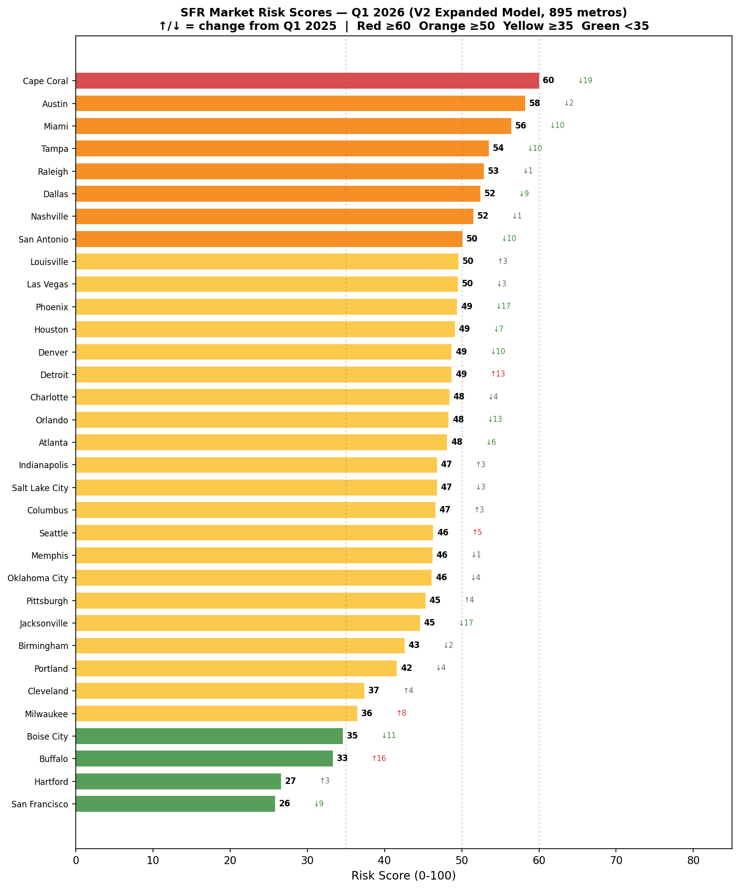
While major markets that became overheated during 2021–2022 remain at the top of the charts, their risk scores have mostly decreased YoY. Meanwhile, some Midwest markets are rising significantly but still sit at relatively low levels.
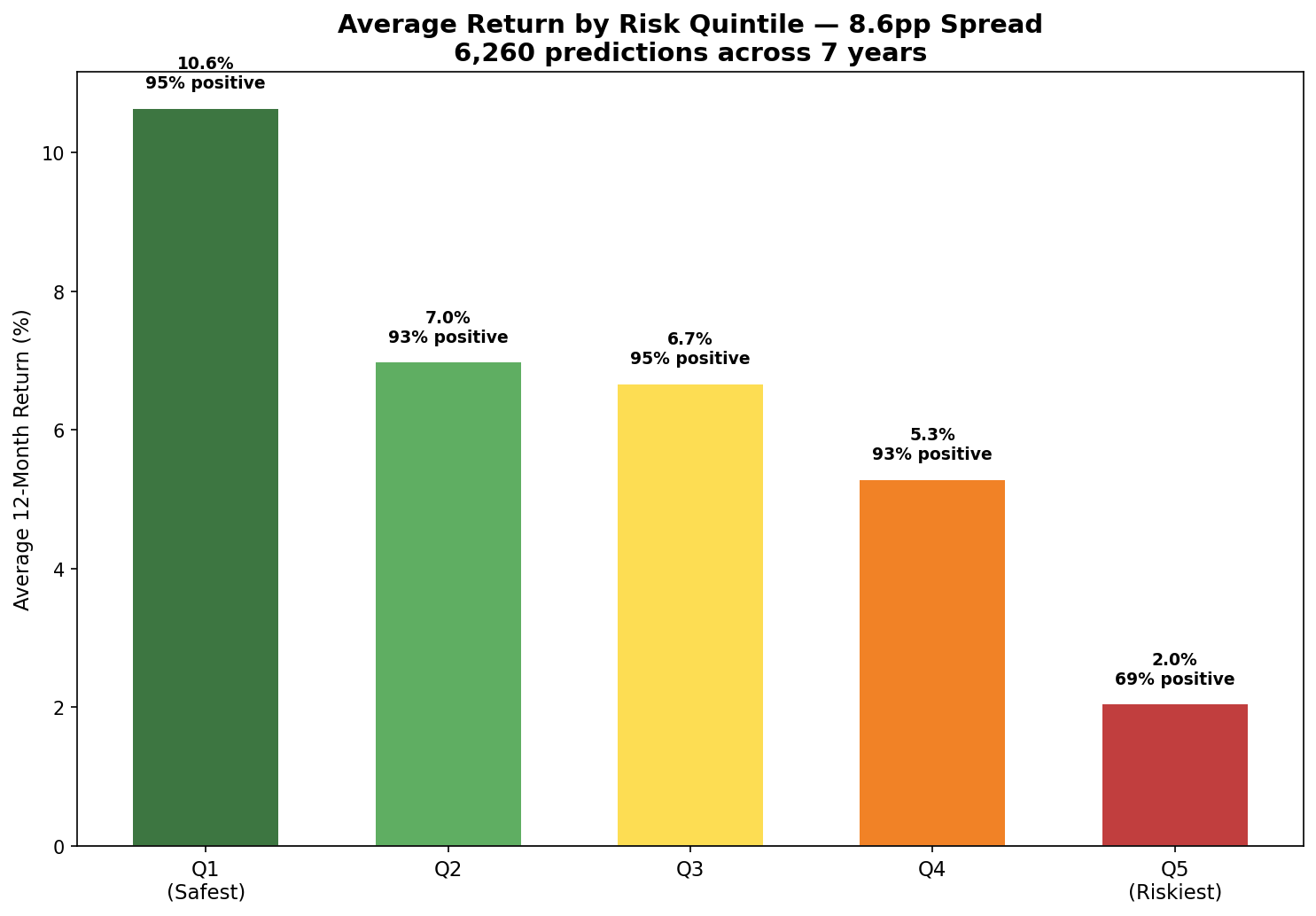
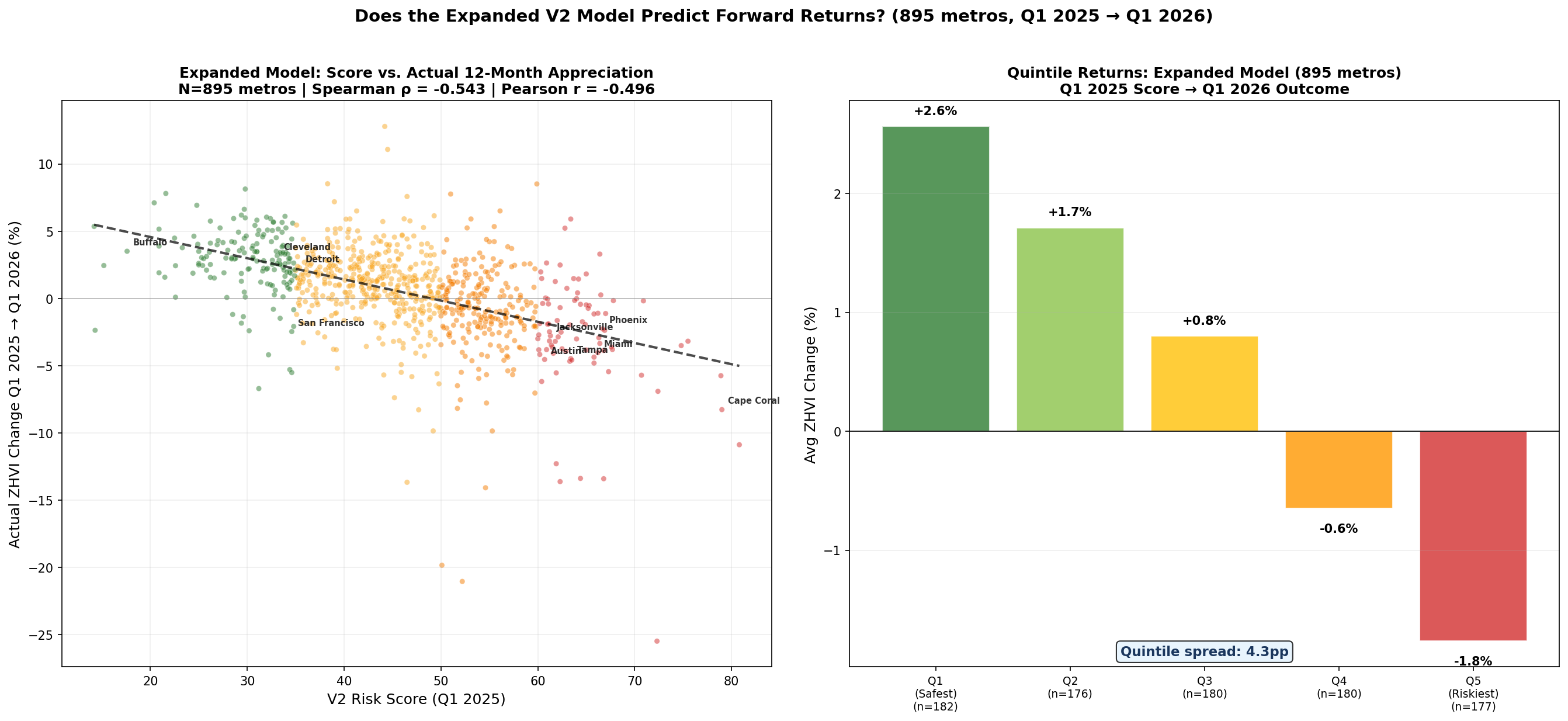
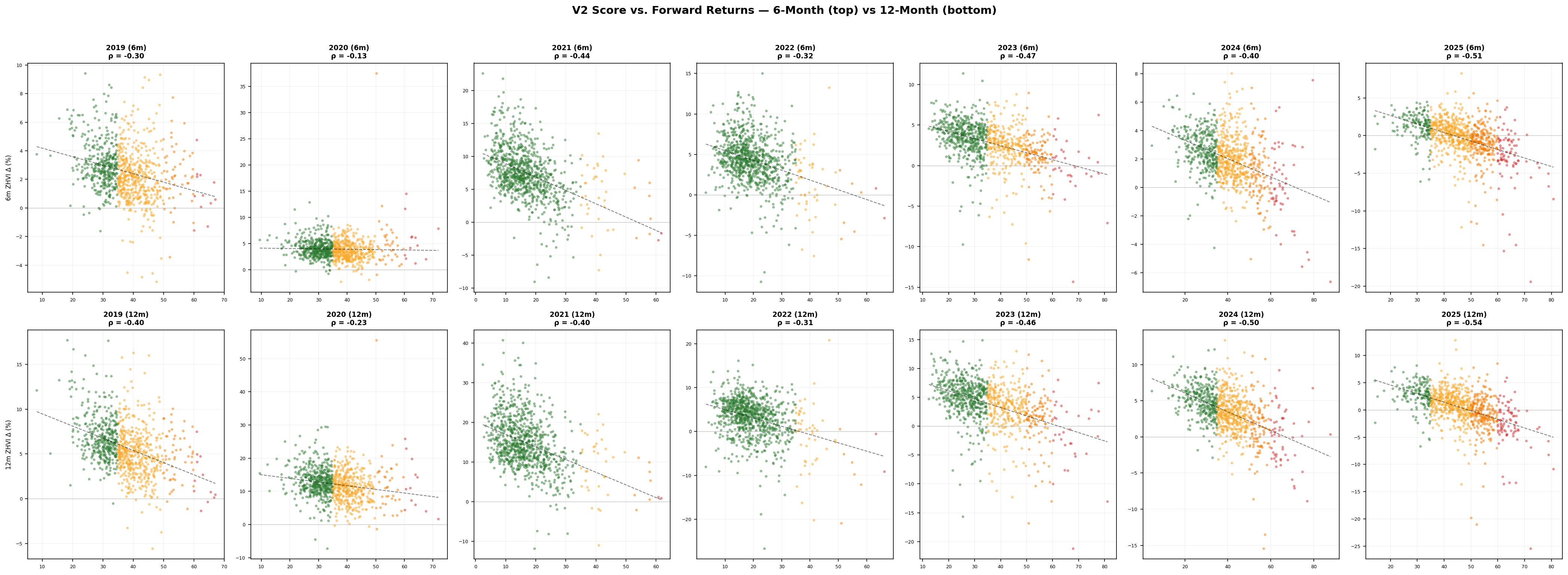
The key takeaway: extreme scores are predictive of 6-month and 12-month home price depreciation. Below we show rank-ordered home price appreciation by risk score, illustrating this trend.
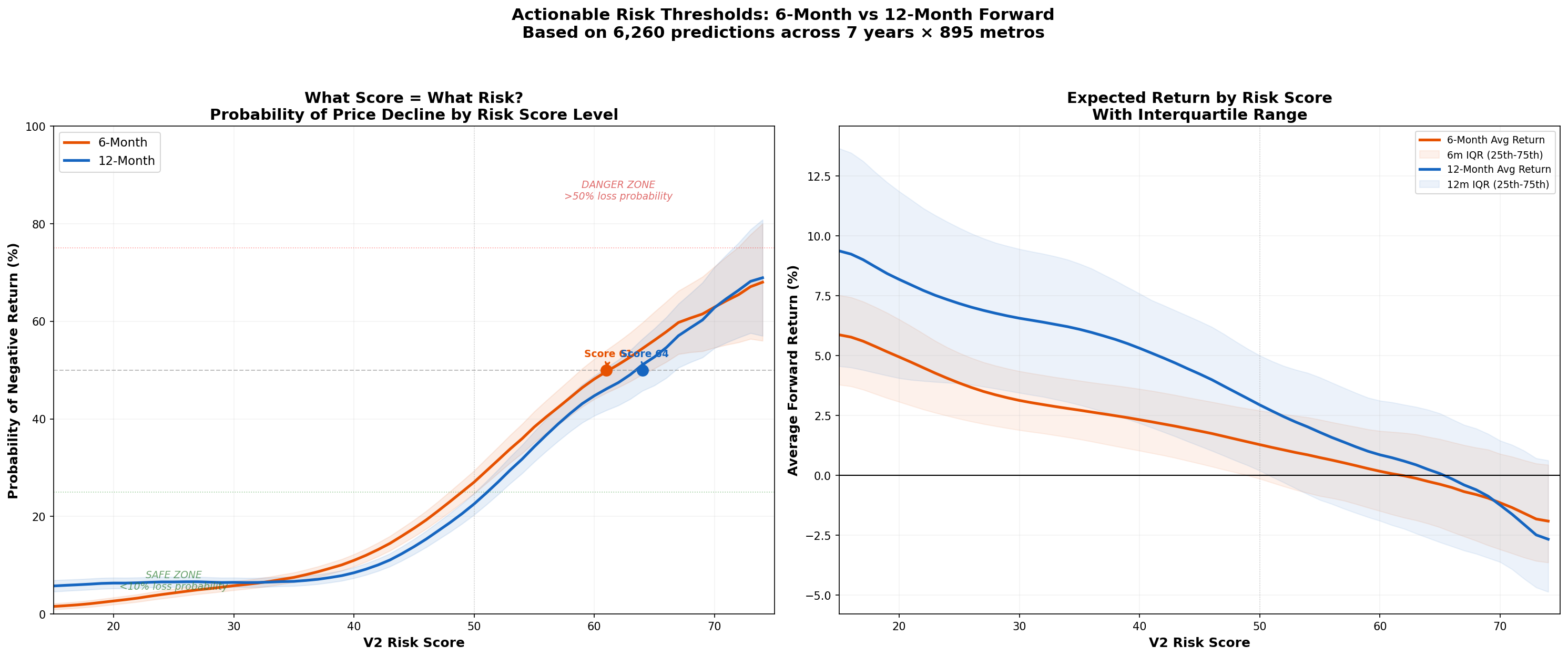
The chart below shows the probability of price decline by risk score, revealing a similar pattern.
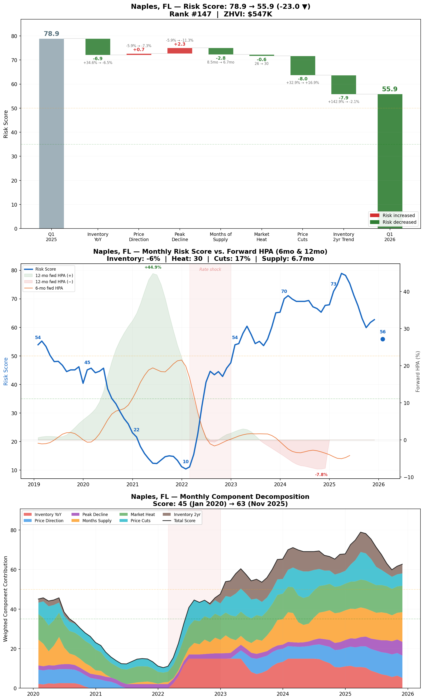
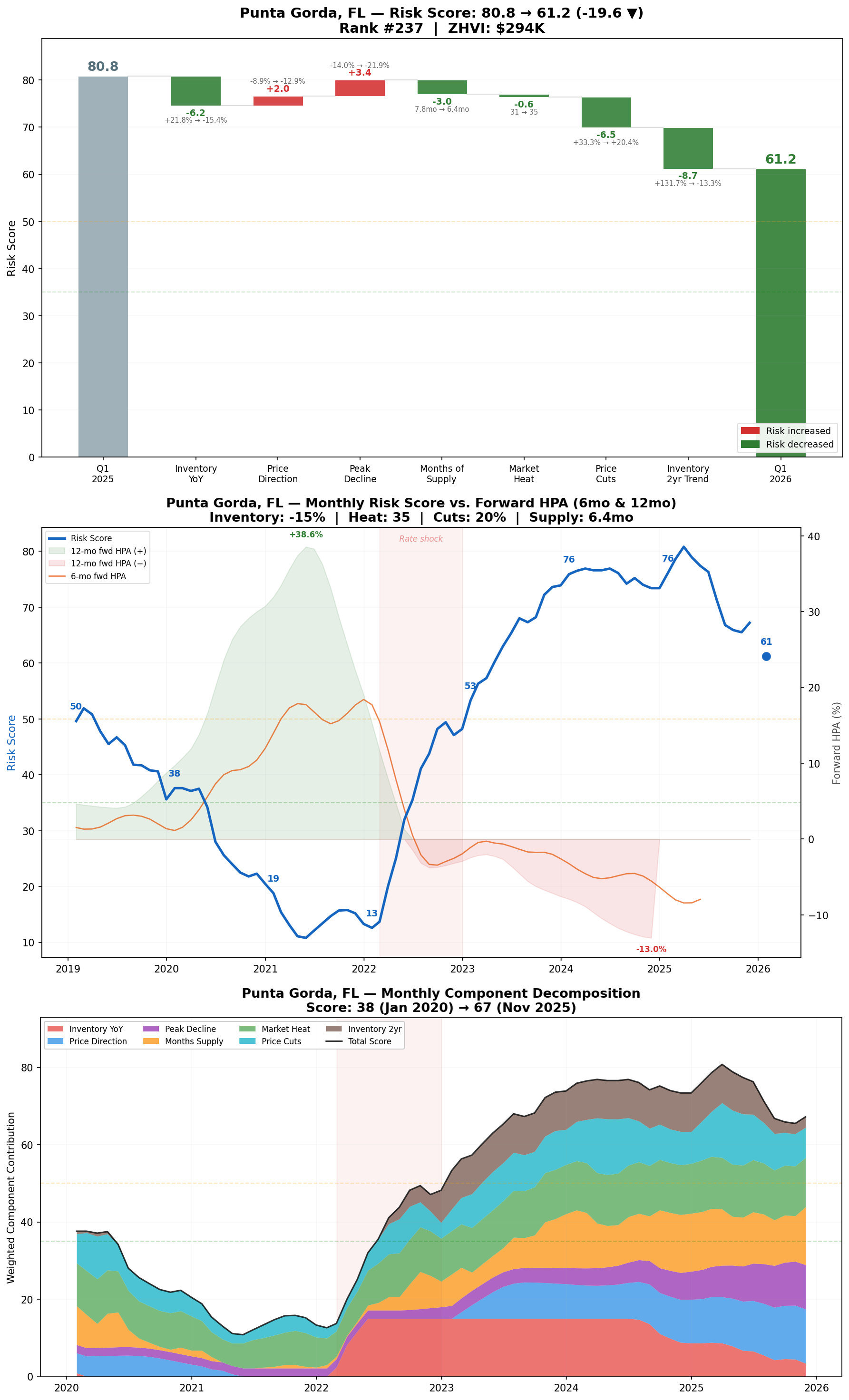
Where Risk Has Shifted
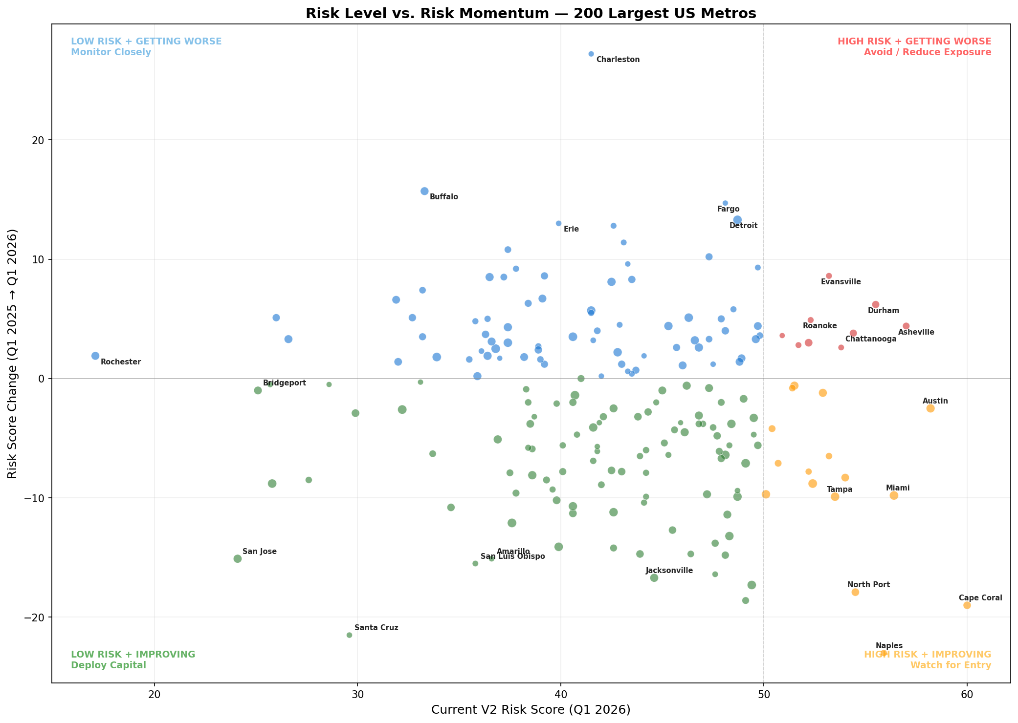
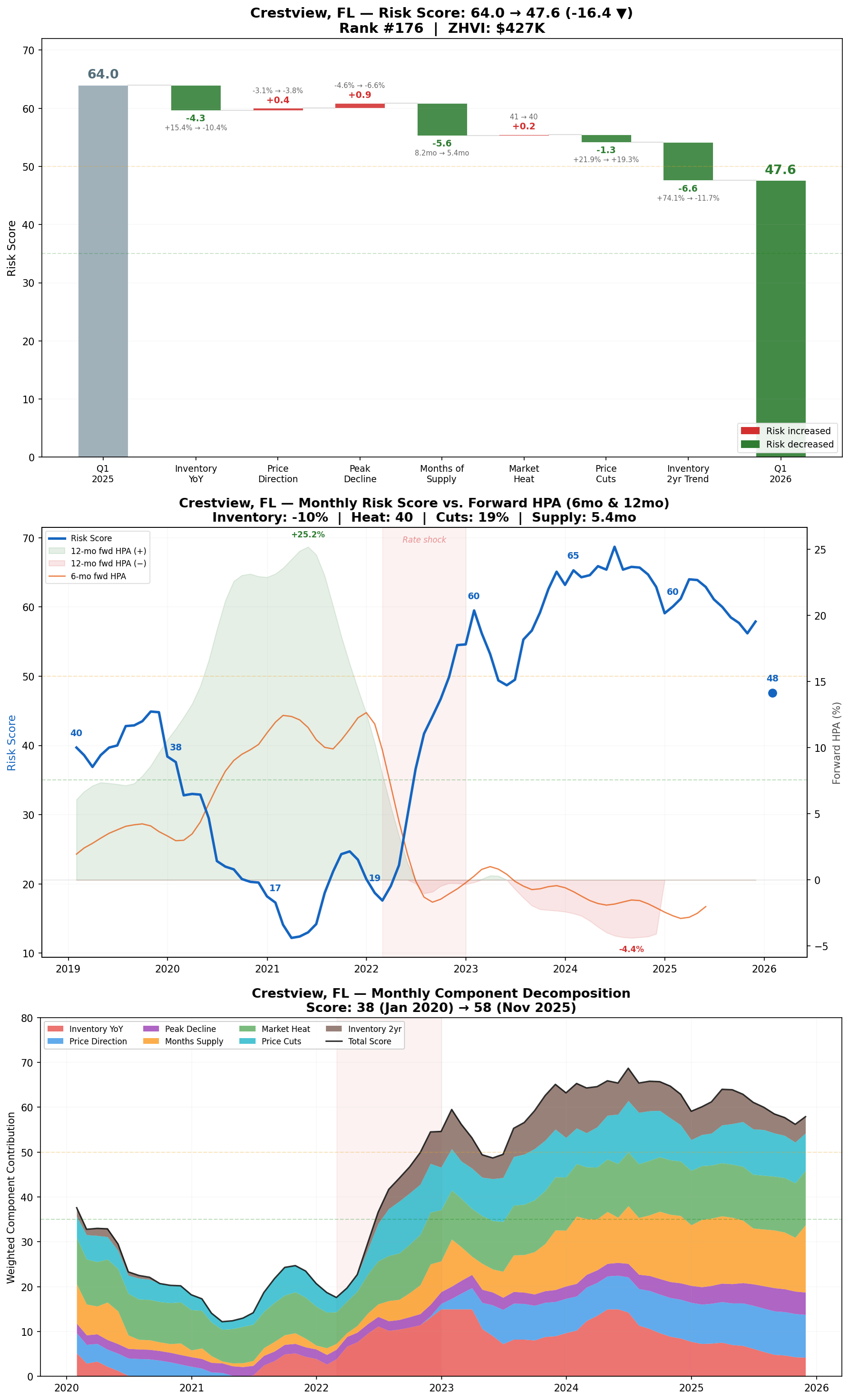
The chart below plots each metro’s risk score against its YoY change to show where risk is shifting. Florida metros are seeing sharp declines in risk scores, though they remain among the riskiest markets.
Major Northern California markets like San Jose and San Francisco saw the largest drops in risk scores while already having among the lowest scores of any major metro.
Regional Differences
Over the last year, risk scores saw several notable regional shifts. On the West Coast, California has performed particularly well, with major metros posting very low risk scores and 31 of 34 metros seeing YoY improvement.
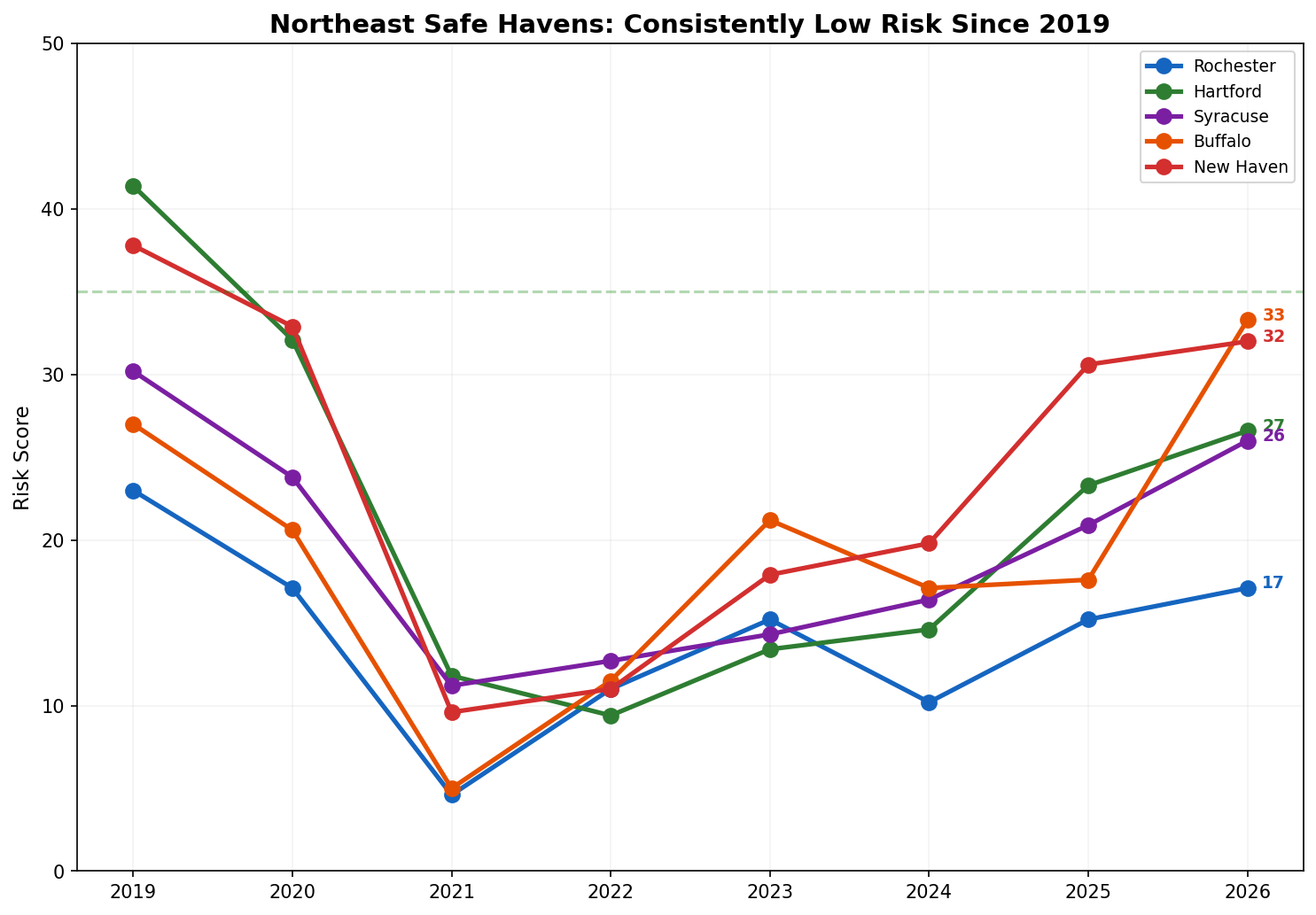
Many Northeast hubs remain consistently low-risk.
For core single-family rental (SFR) markets, most saw rapid spikes in 2022 and have since leveled off or slightly declined.
Overall
Nationwide, risk scores have compressed—more metros are clustering in the middle, with fewer extreme outliers at either end. This likely means we won’t see major home price appreciation (HPA) decreases, but rather widespread stagnation.
A look back at Q1 2025 performance: every metro with a risk score in the high 60s or above experienced negative home price appreciation.
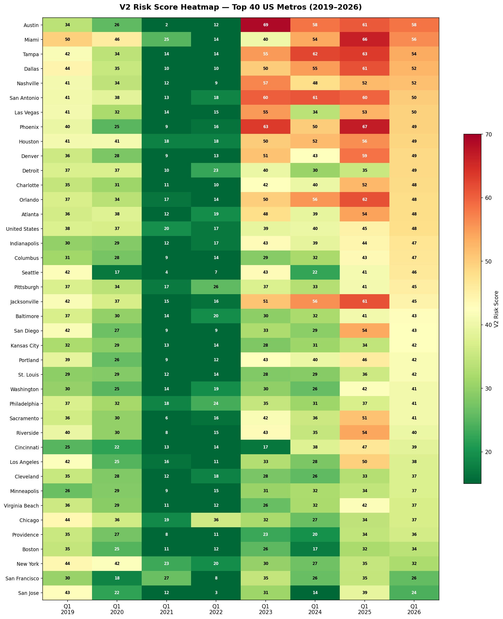
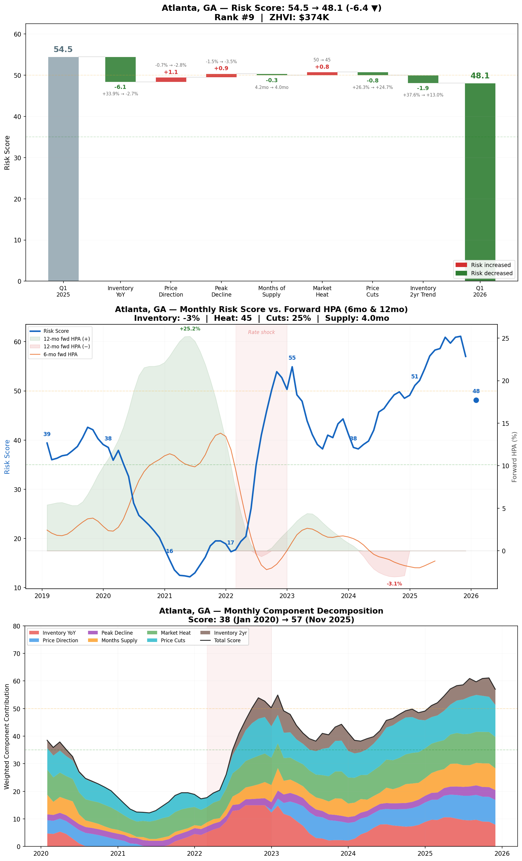
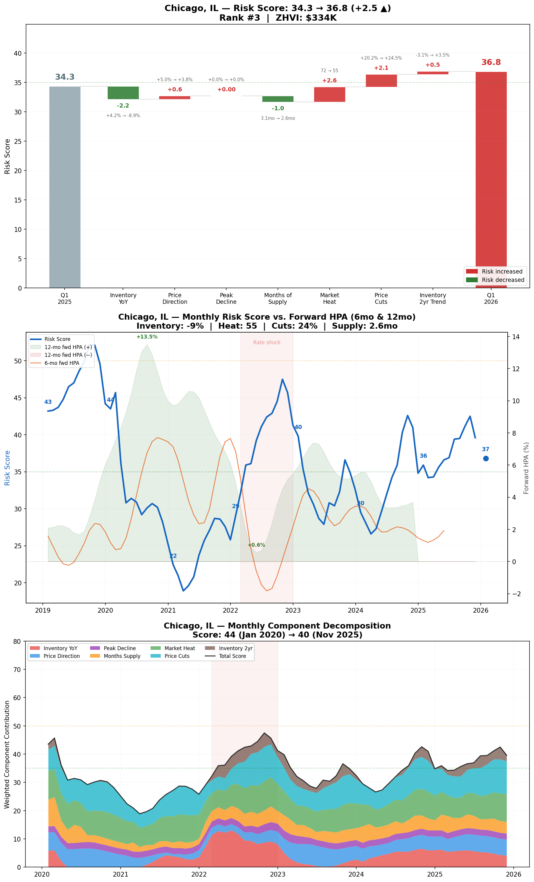
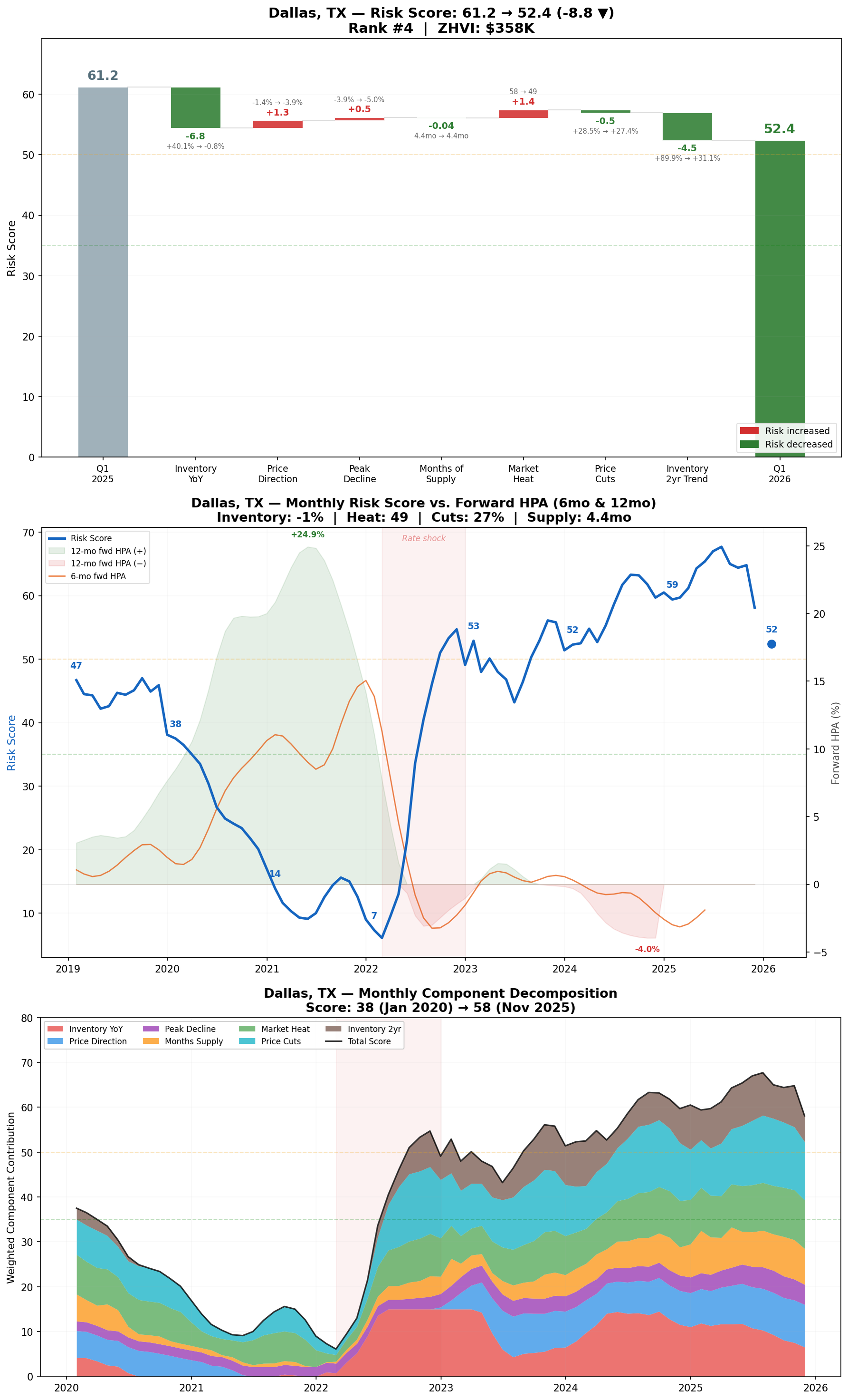
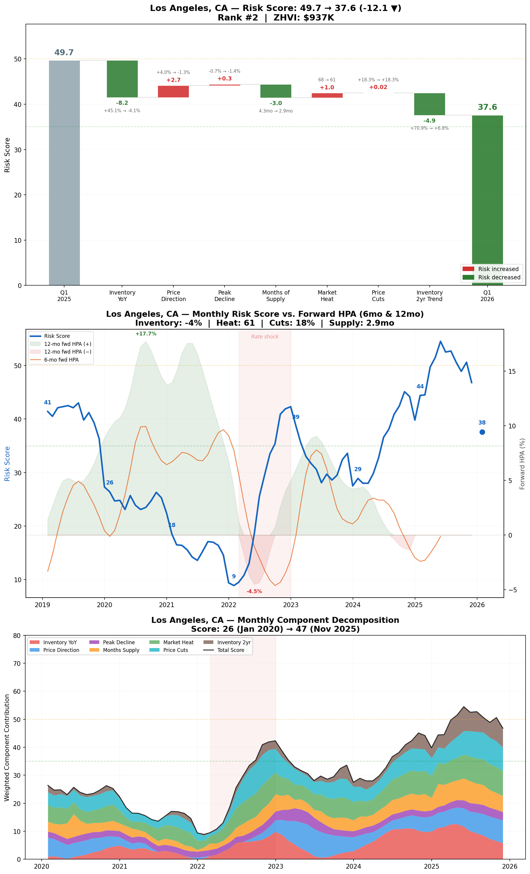
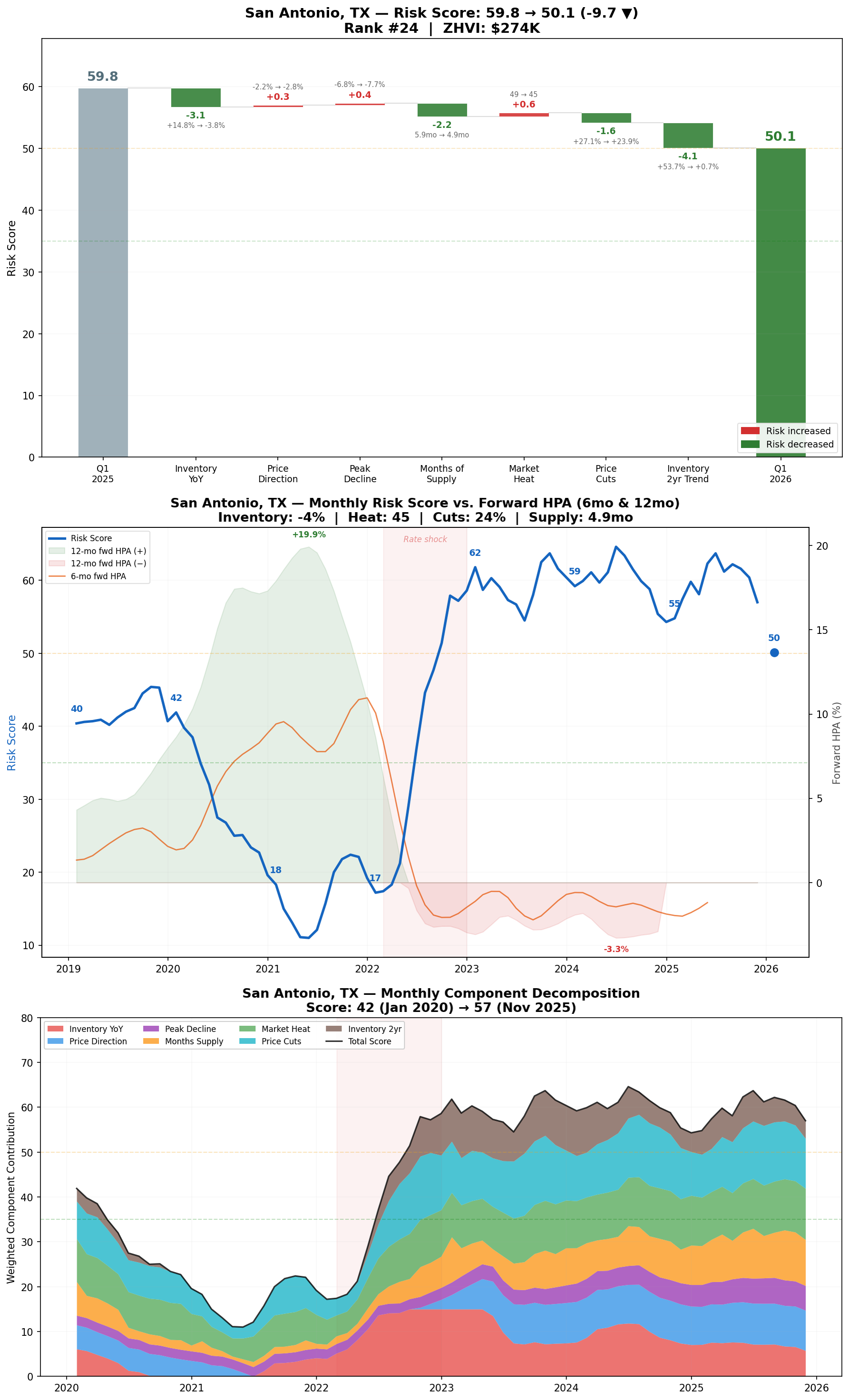
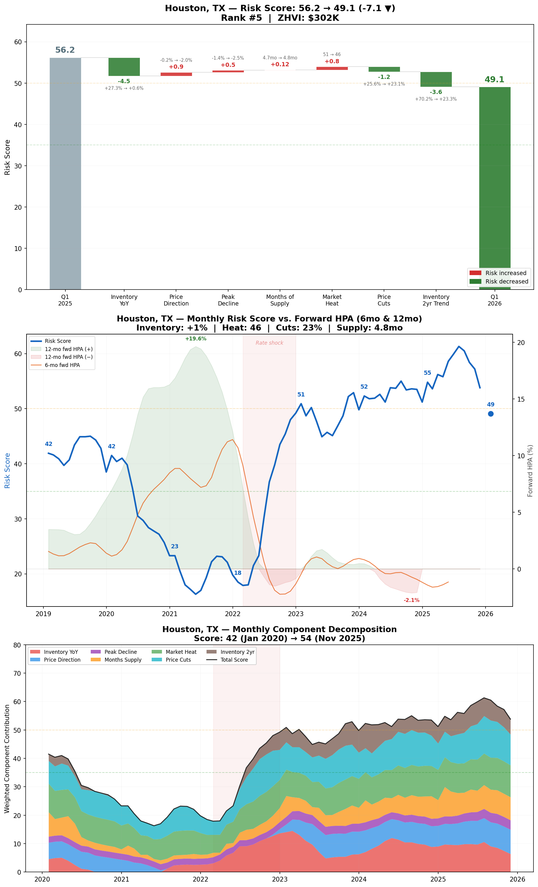
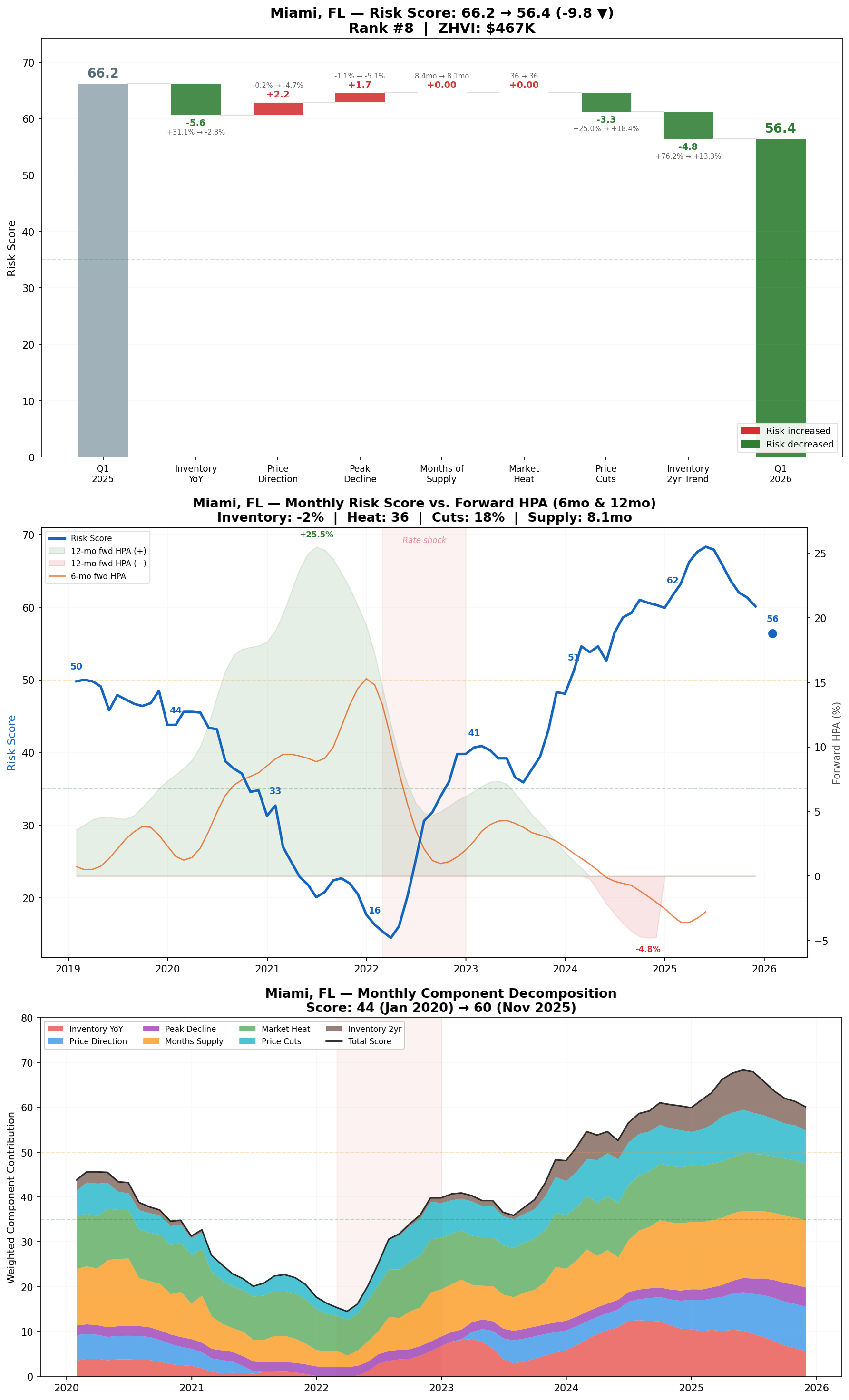
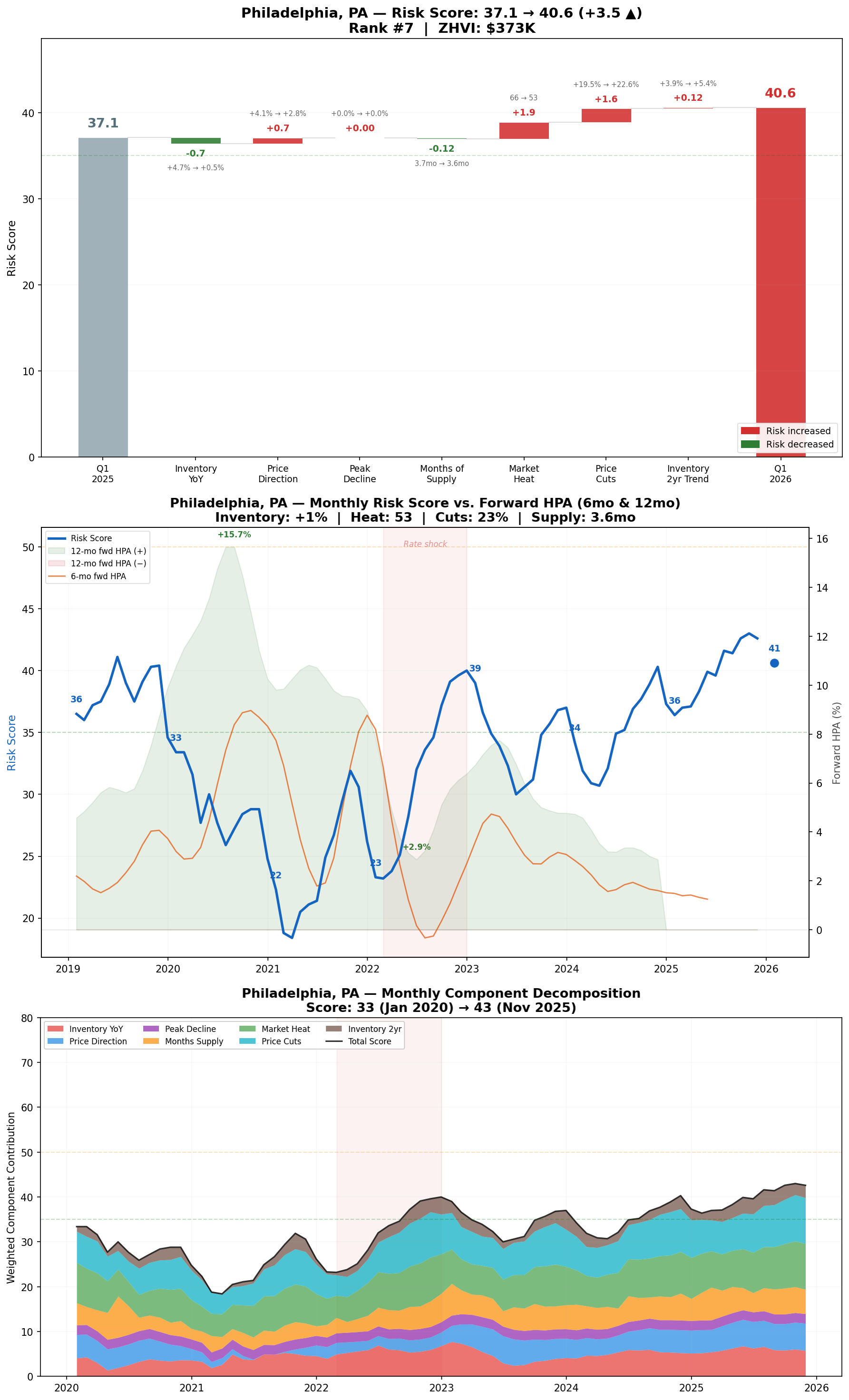
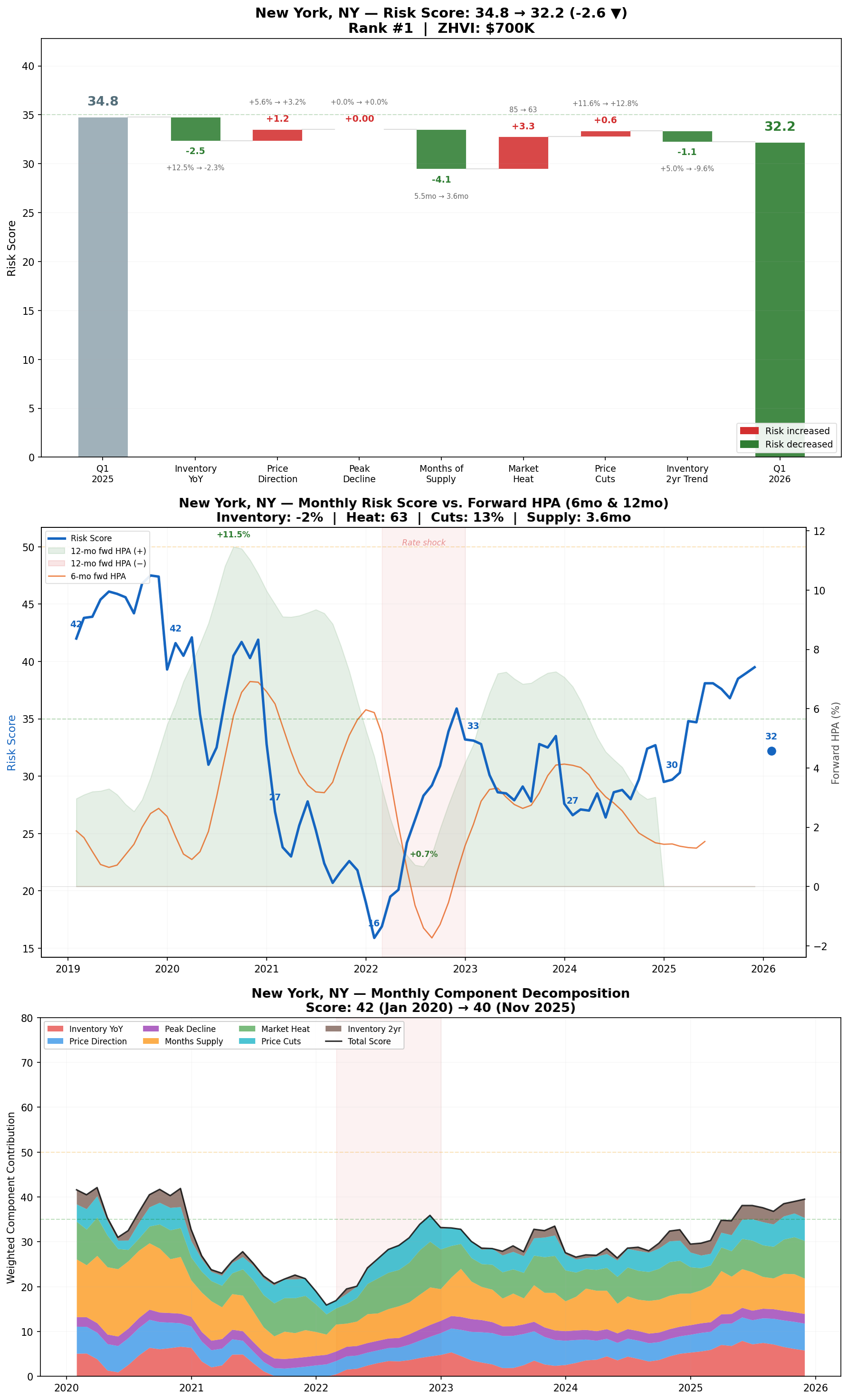
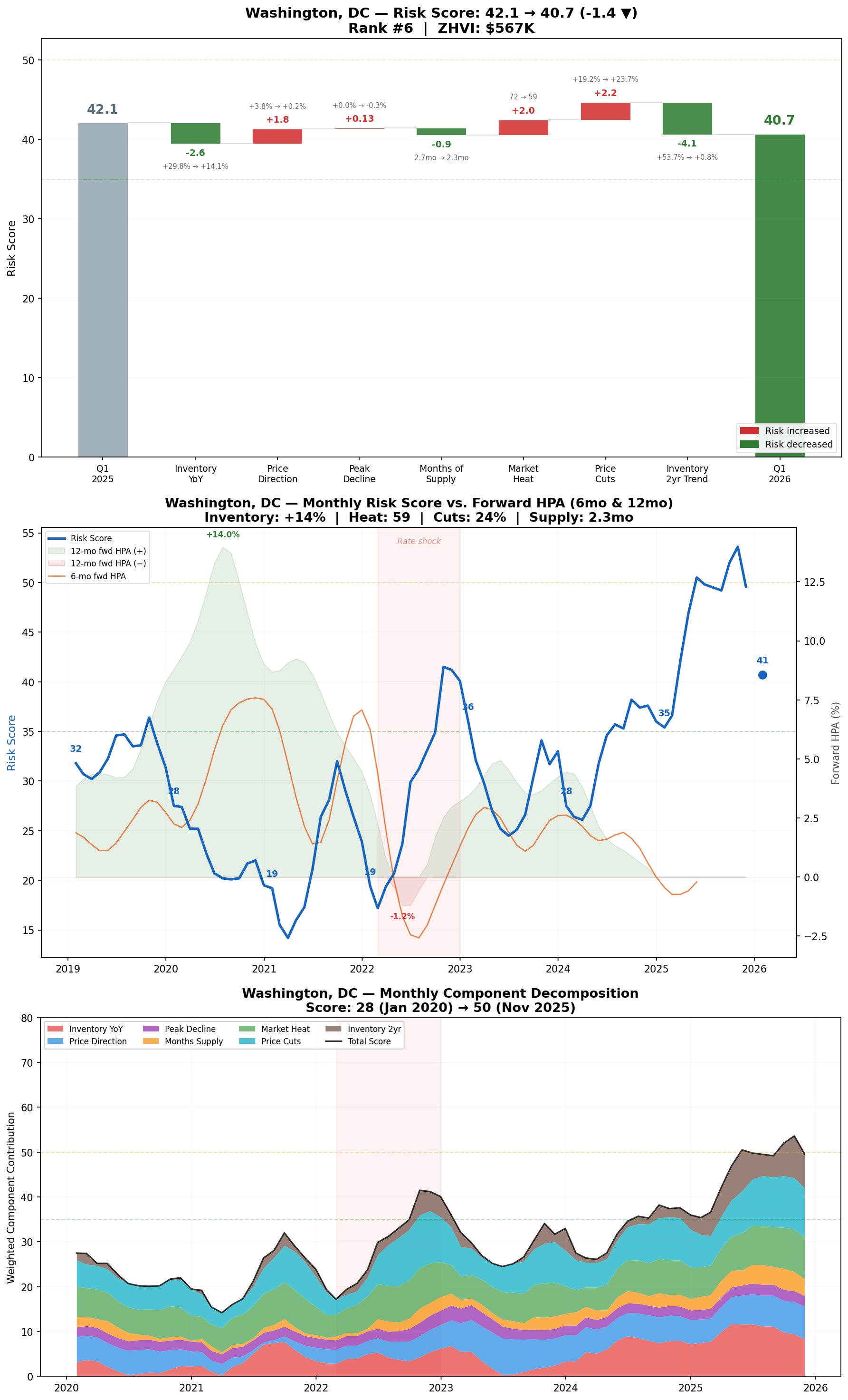
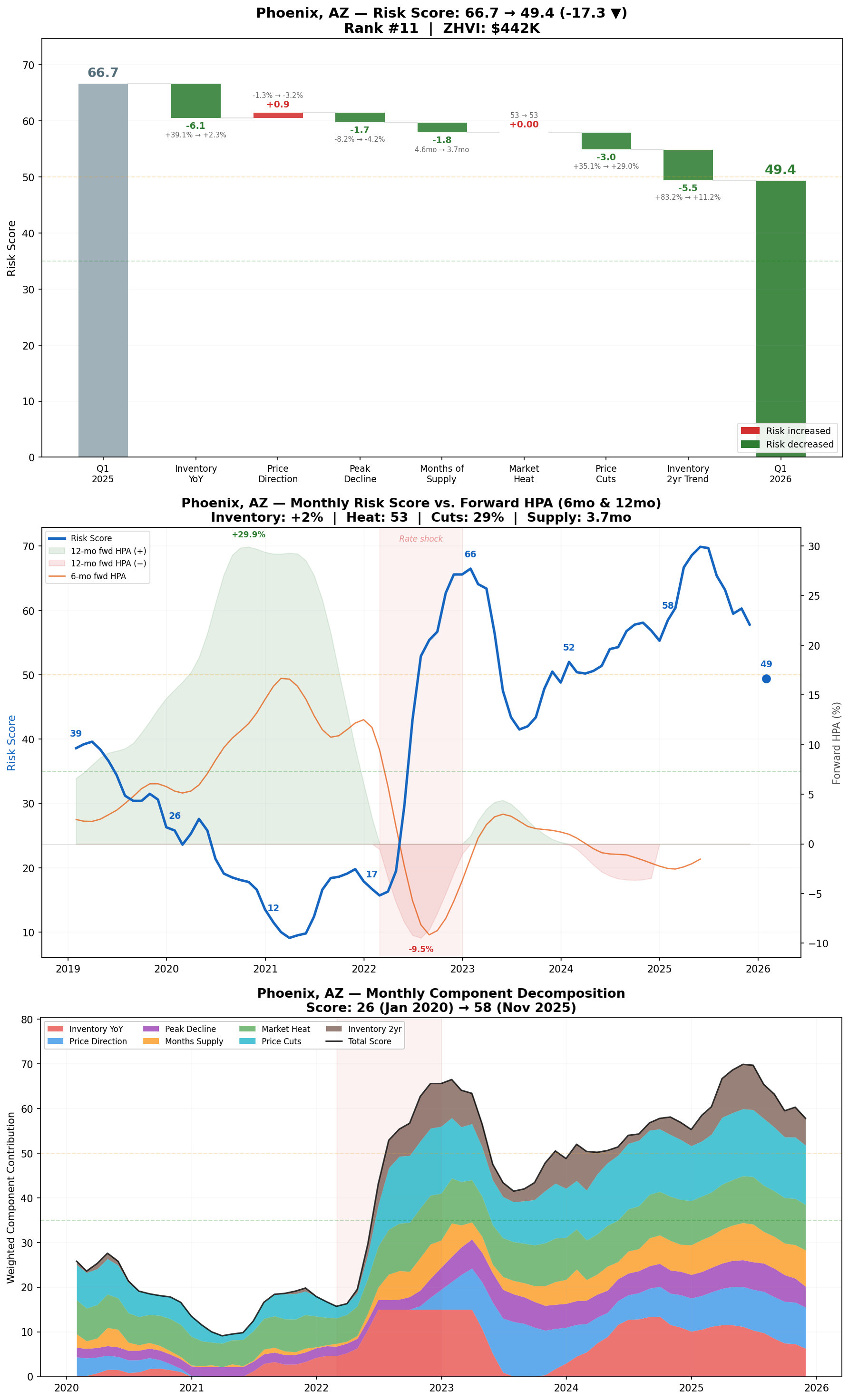
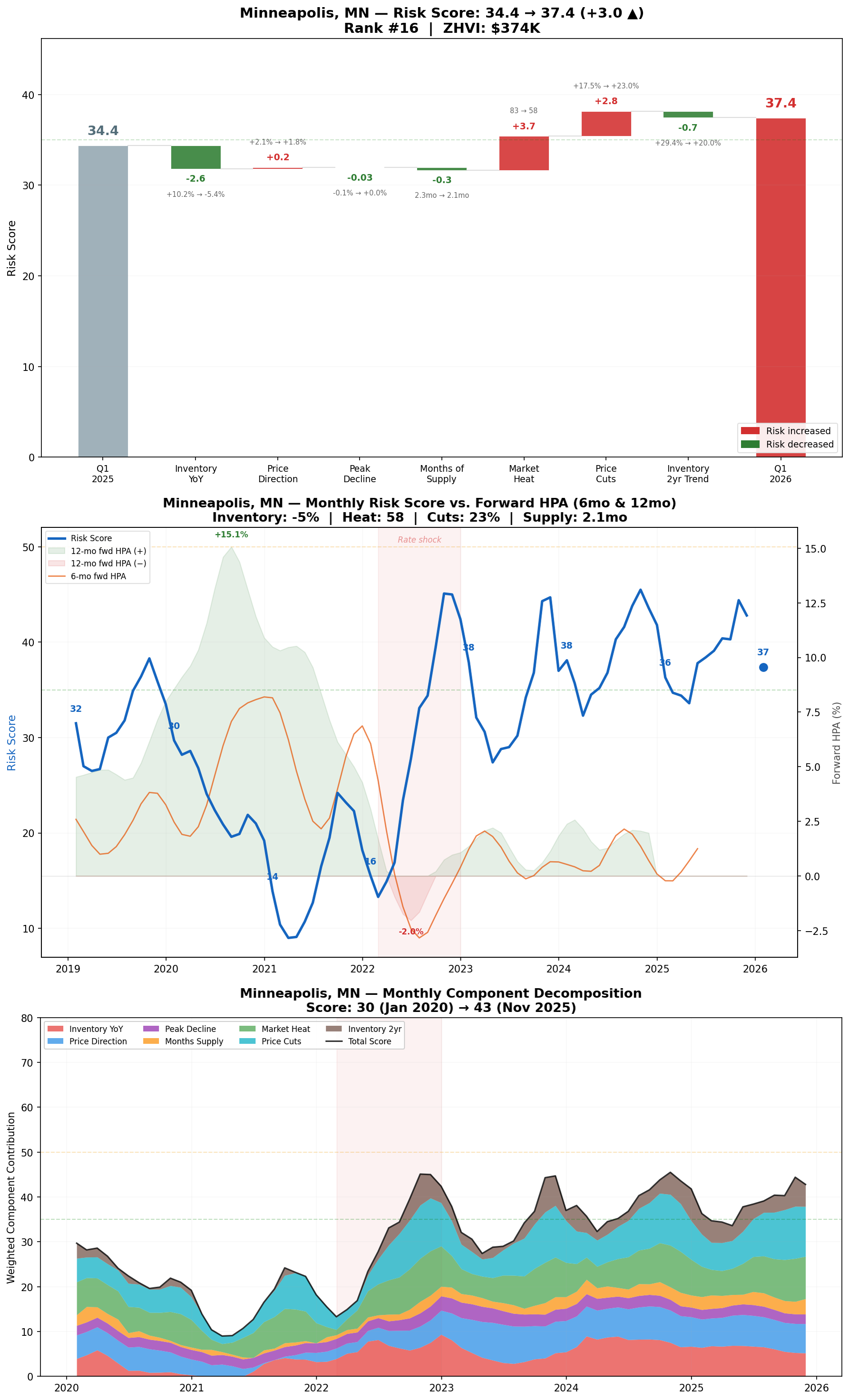
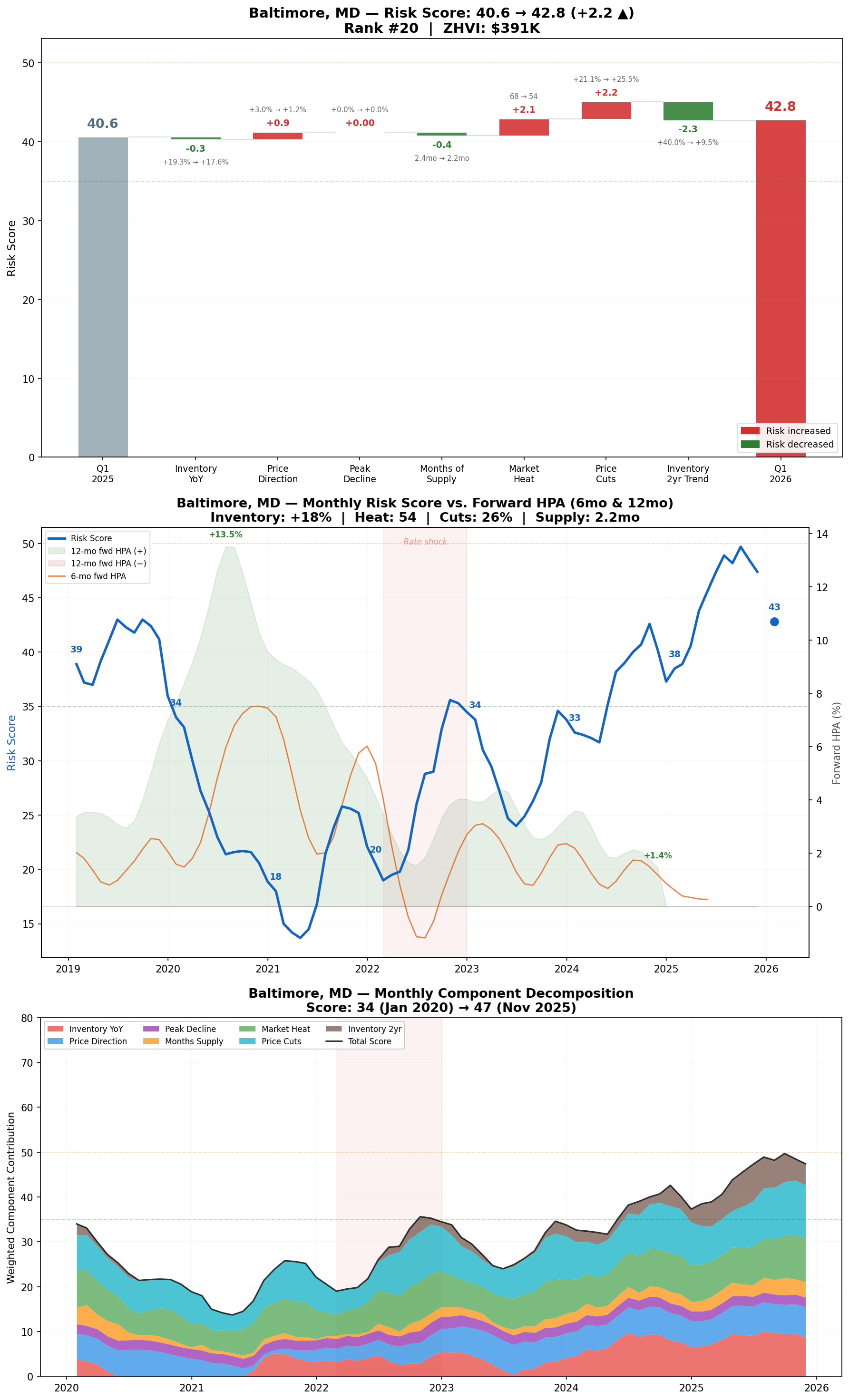
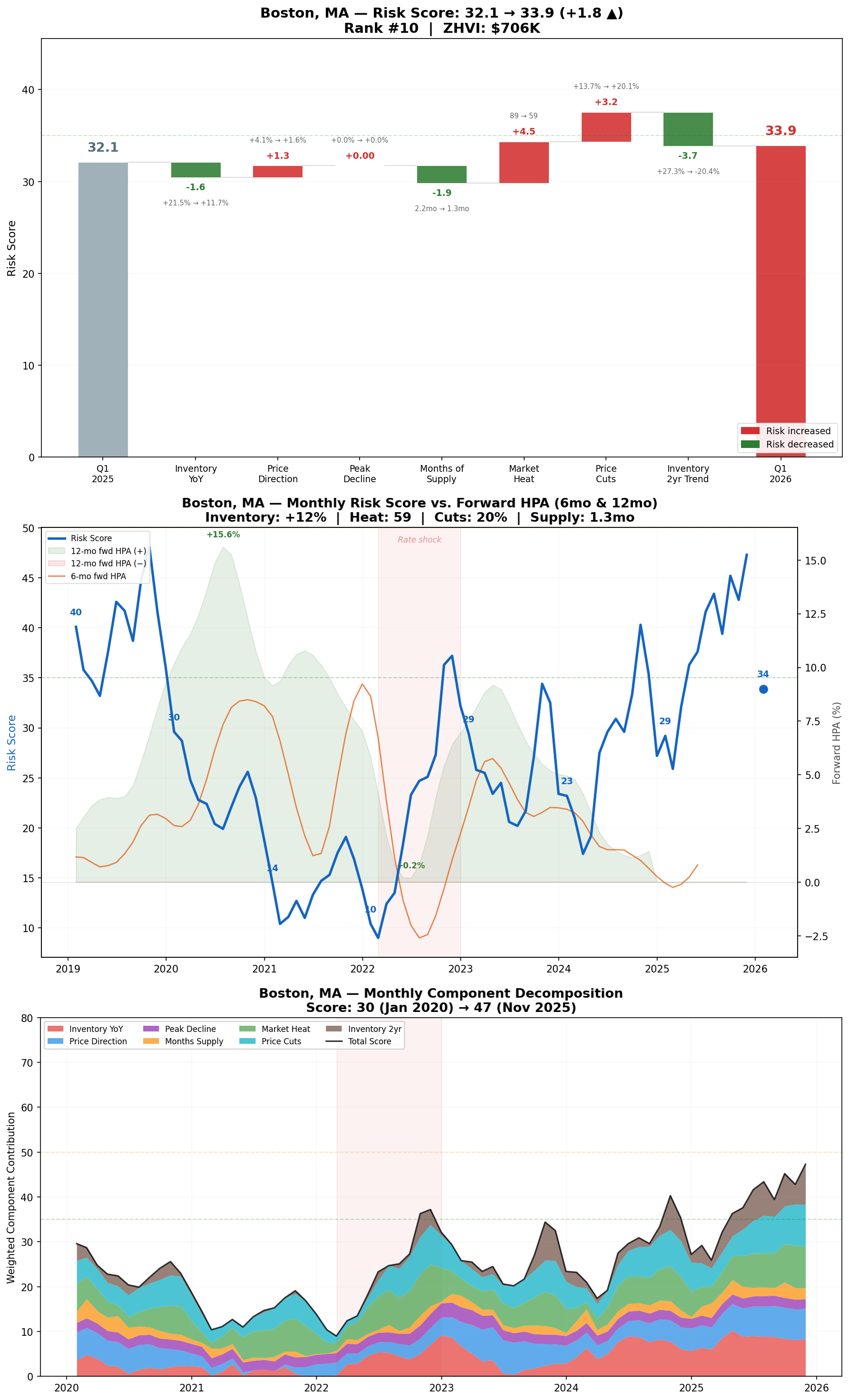
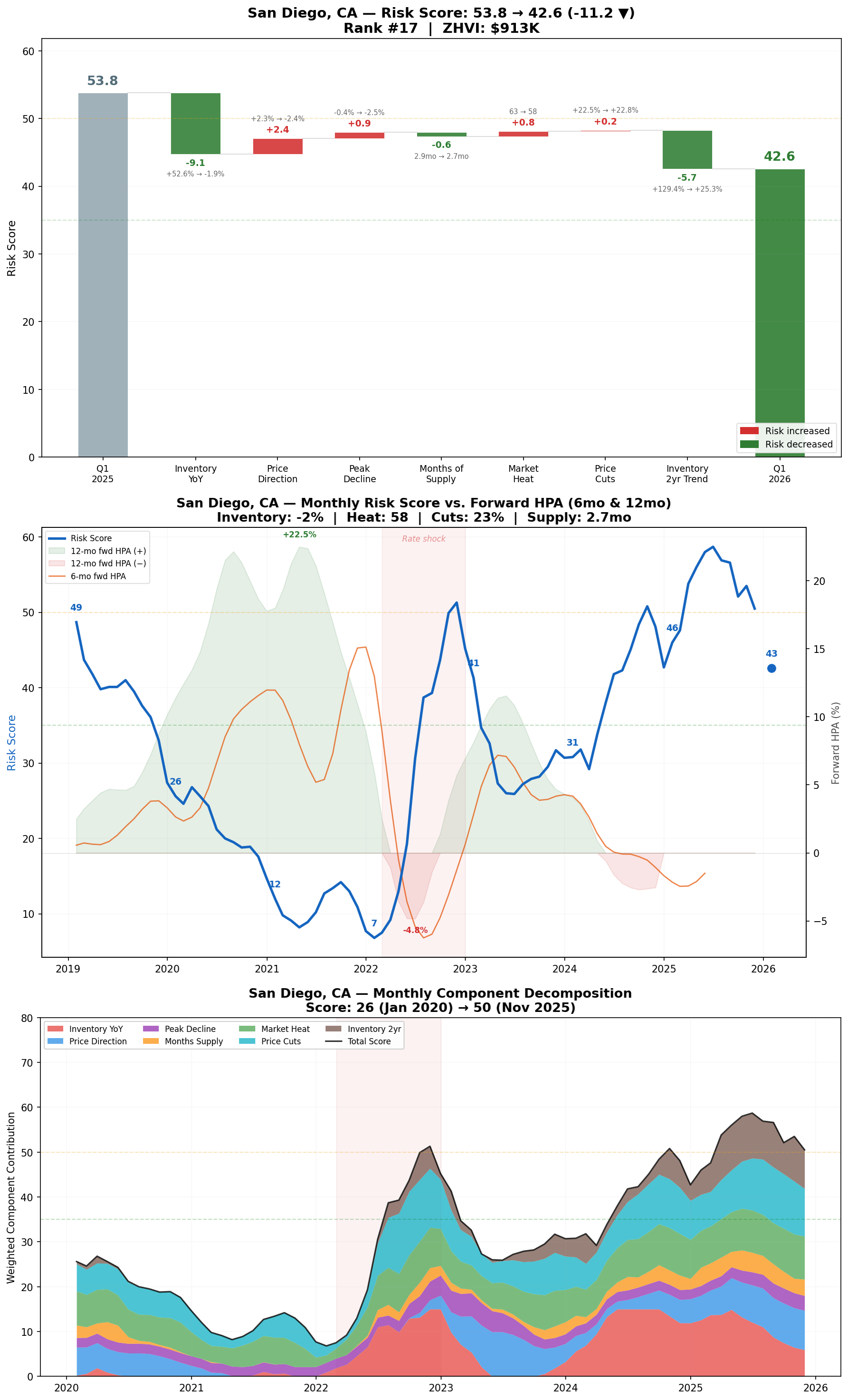
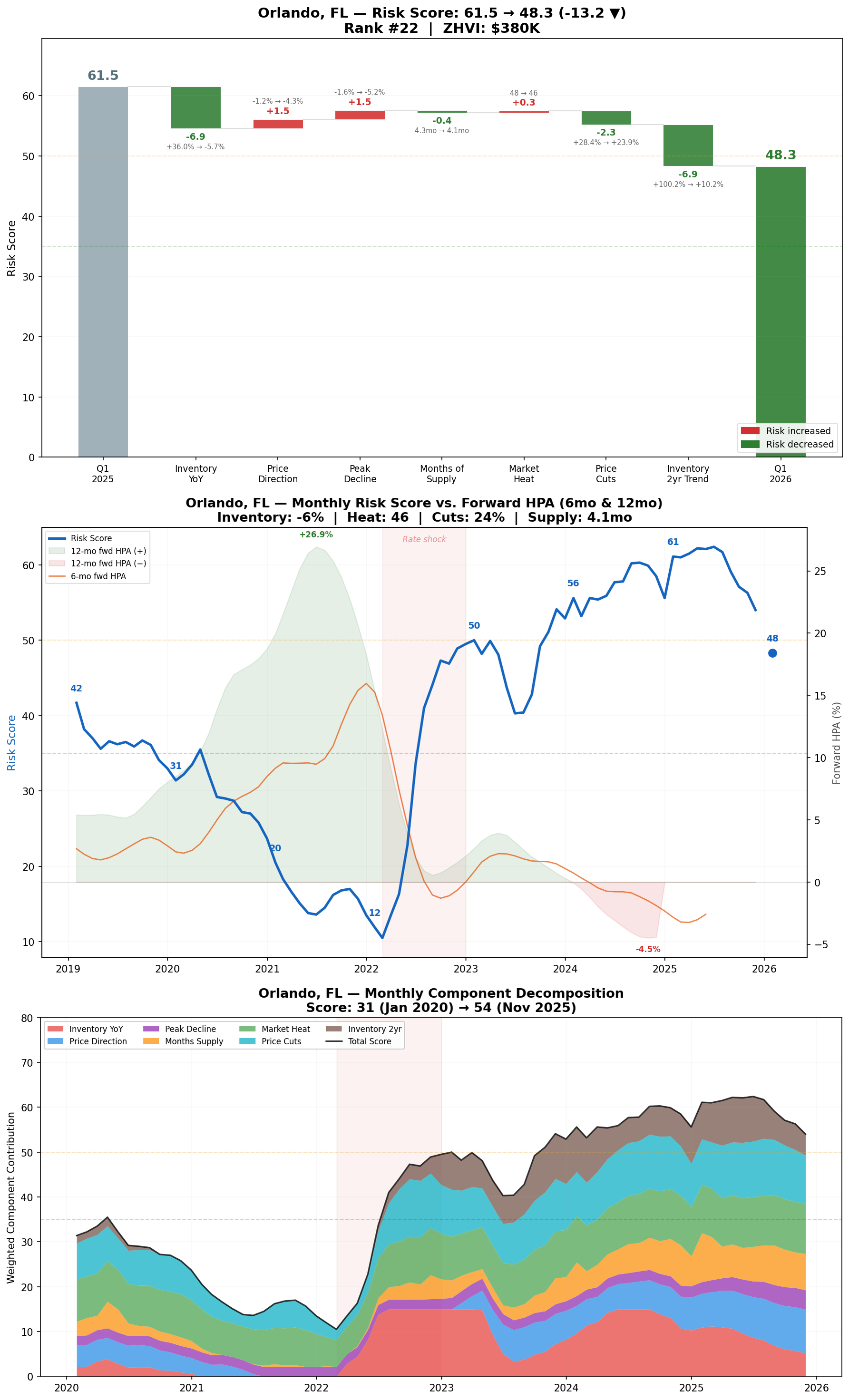
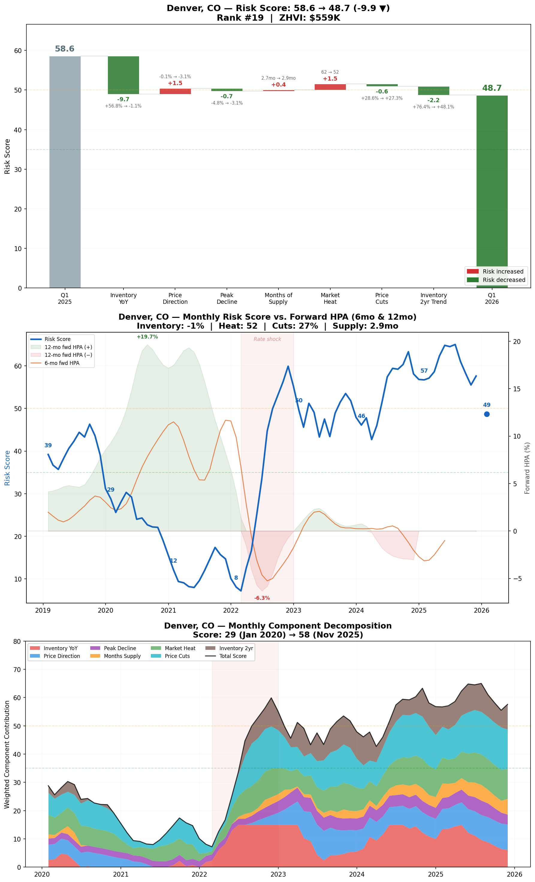
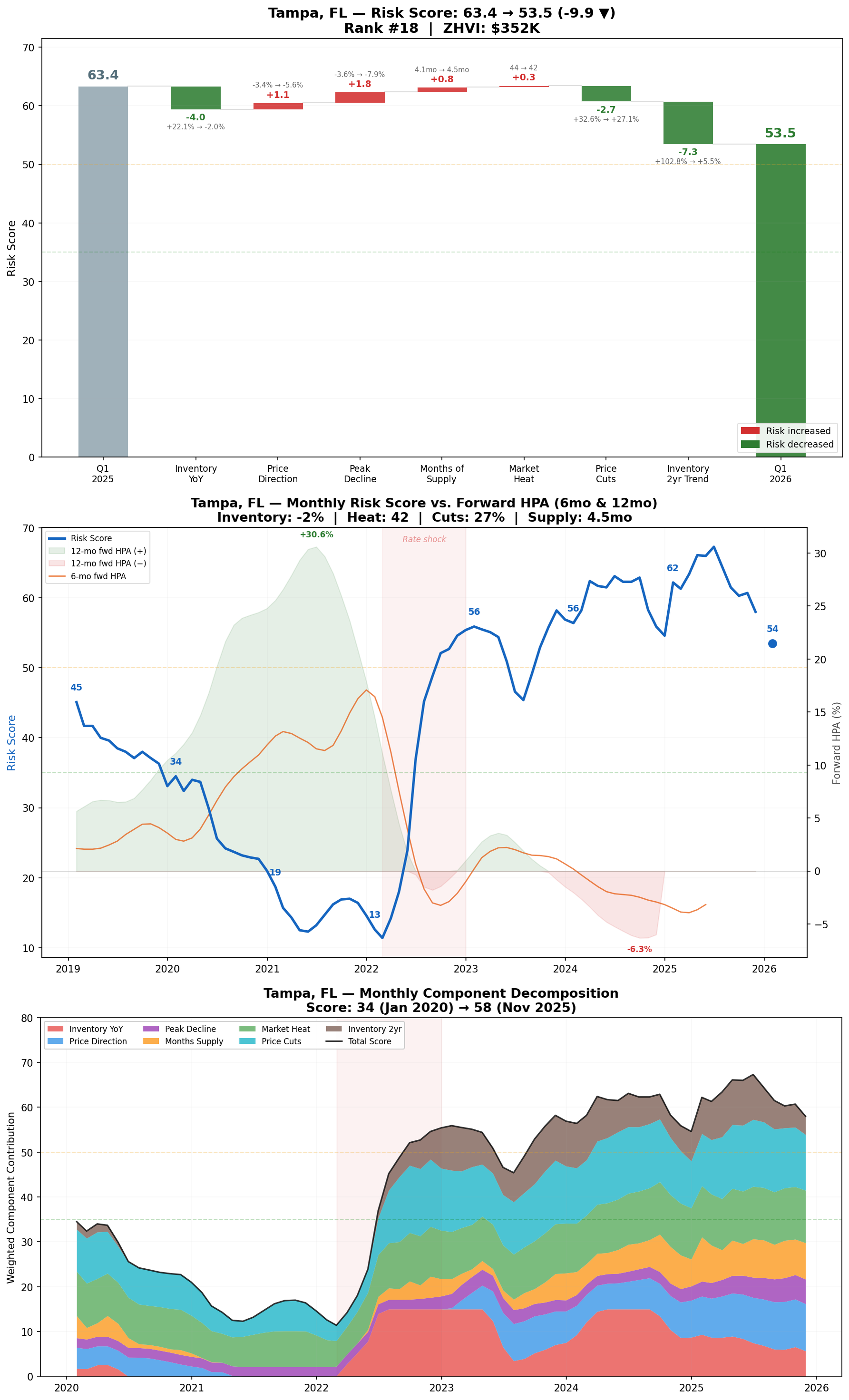
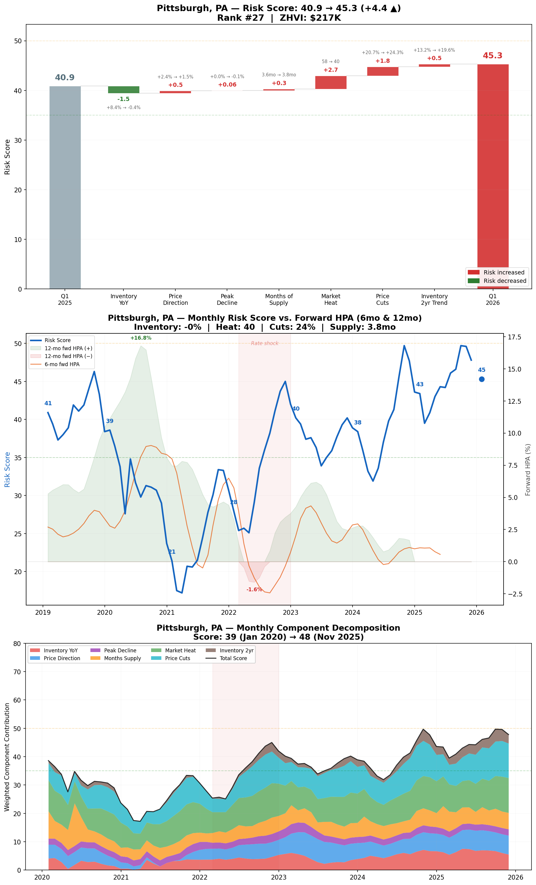
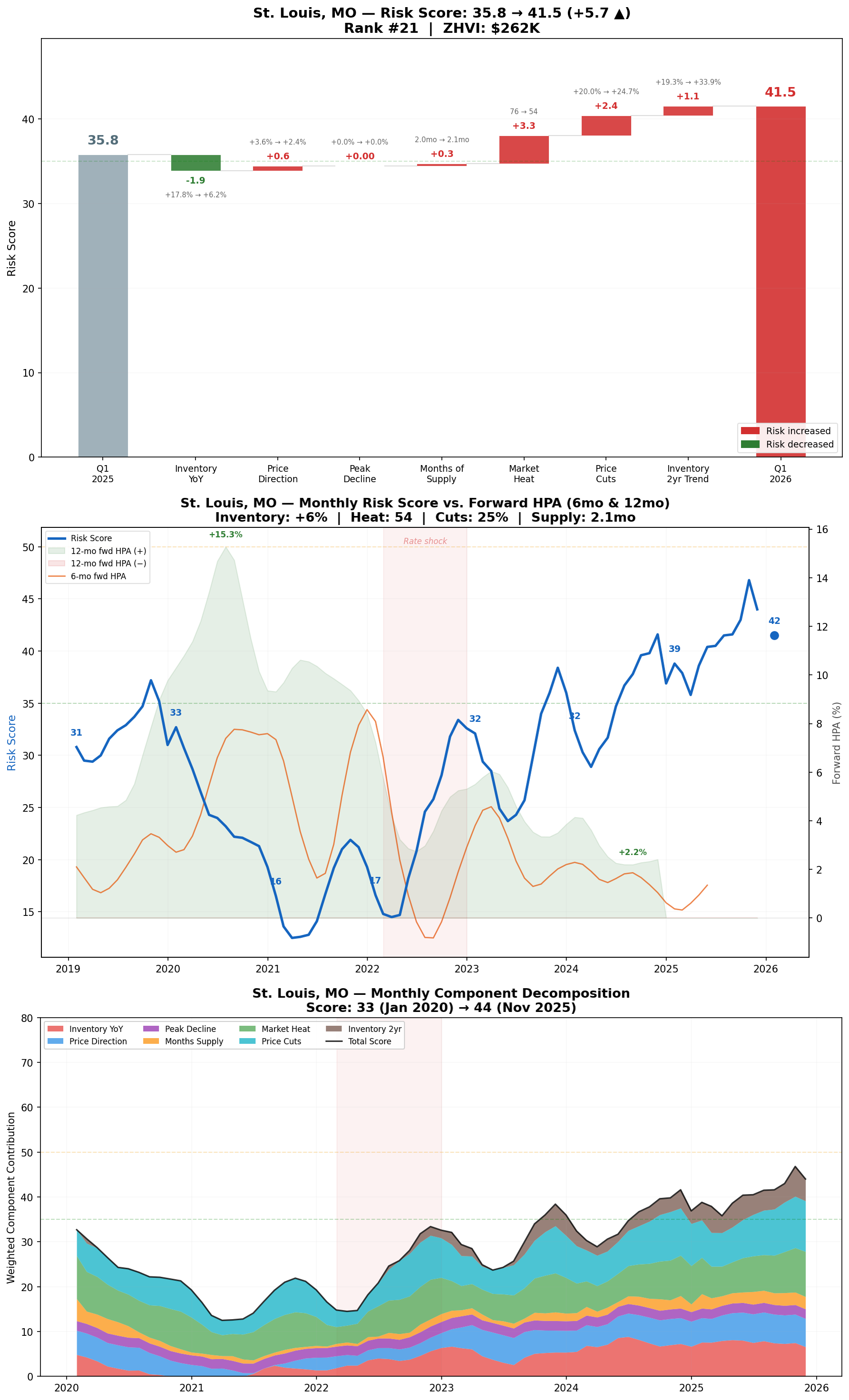
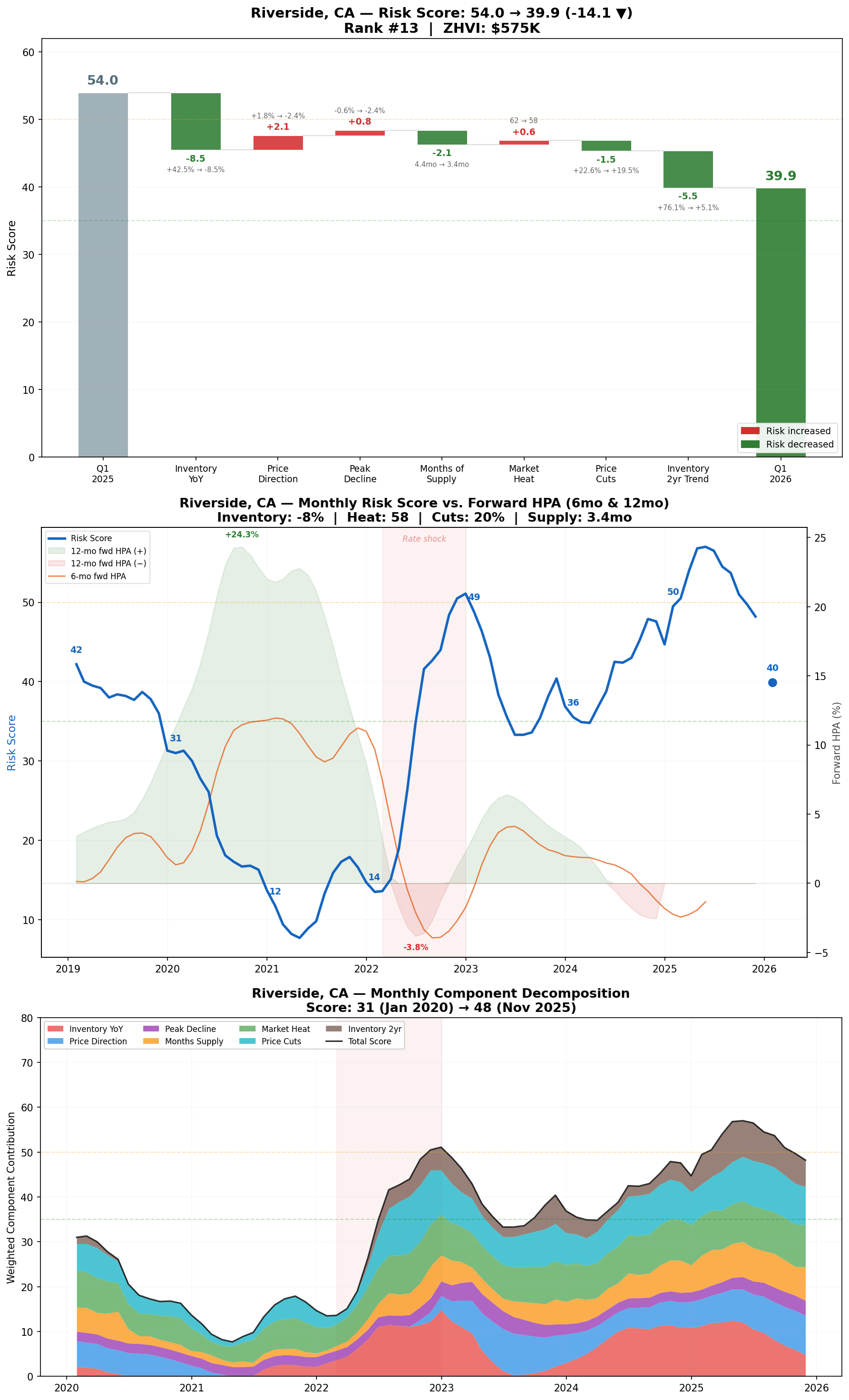
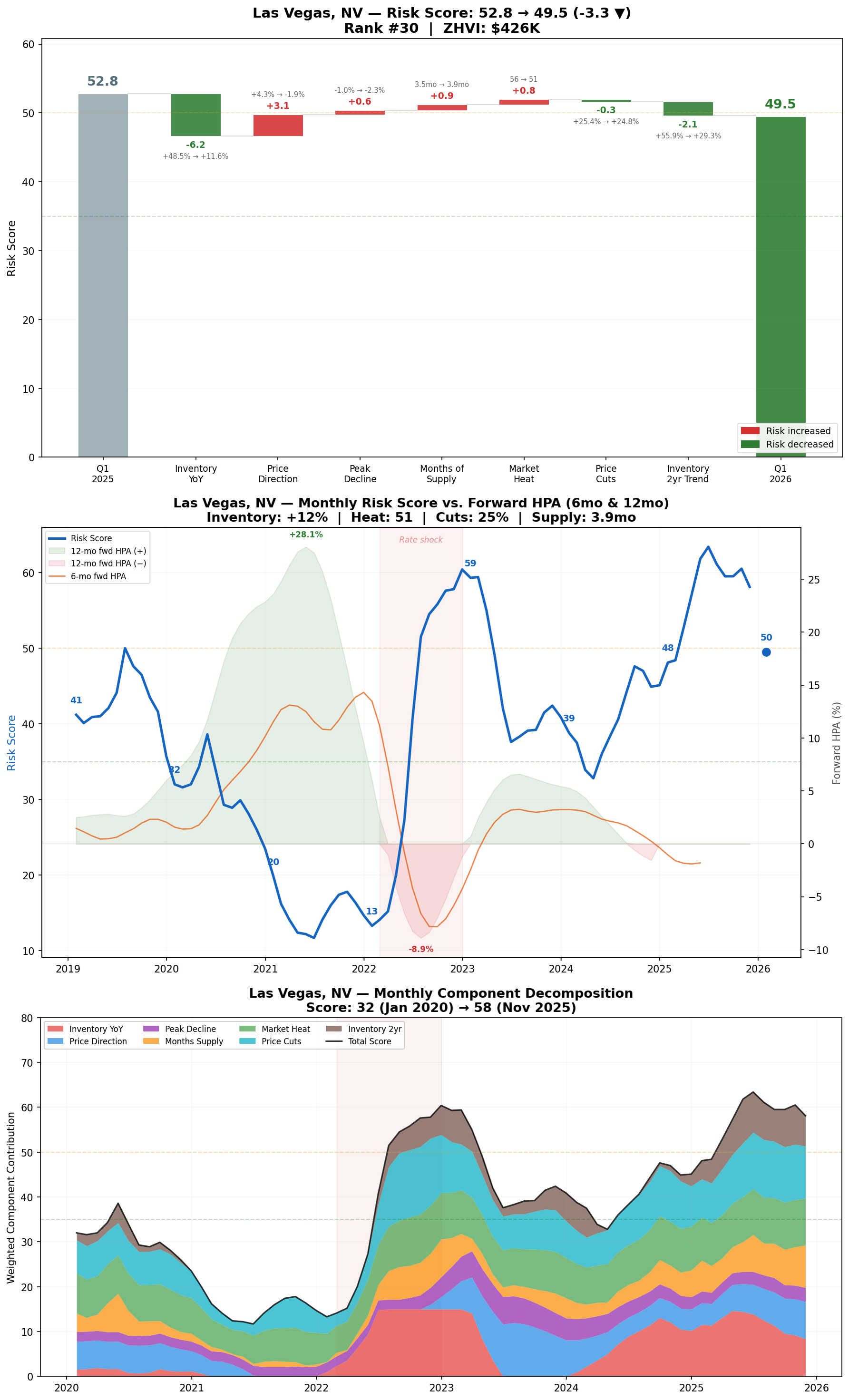
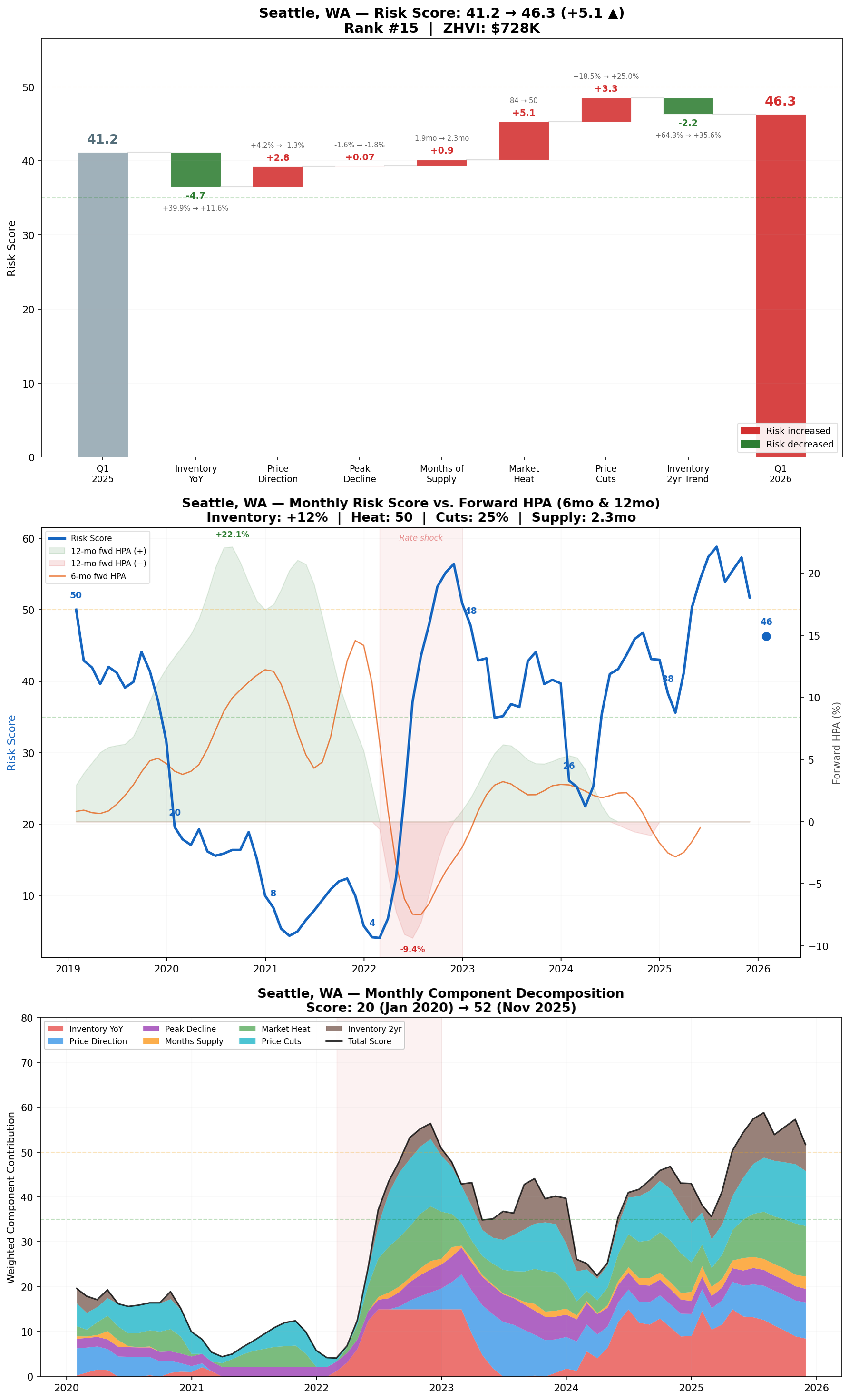
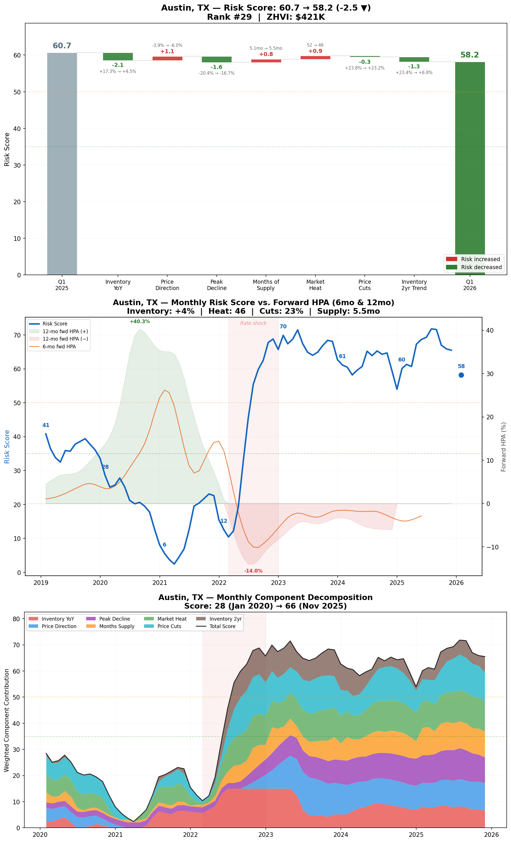
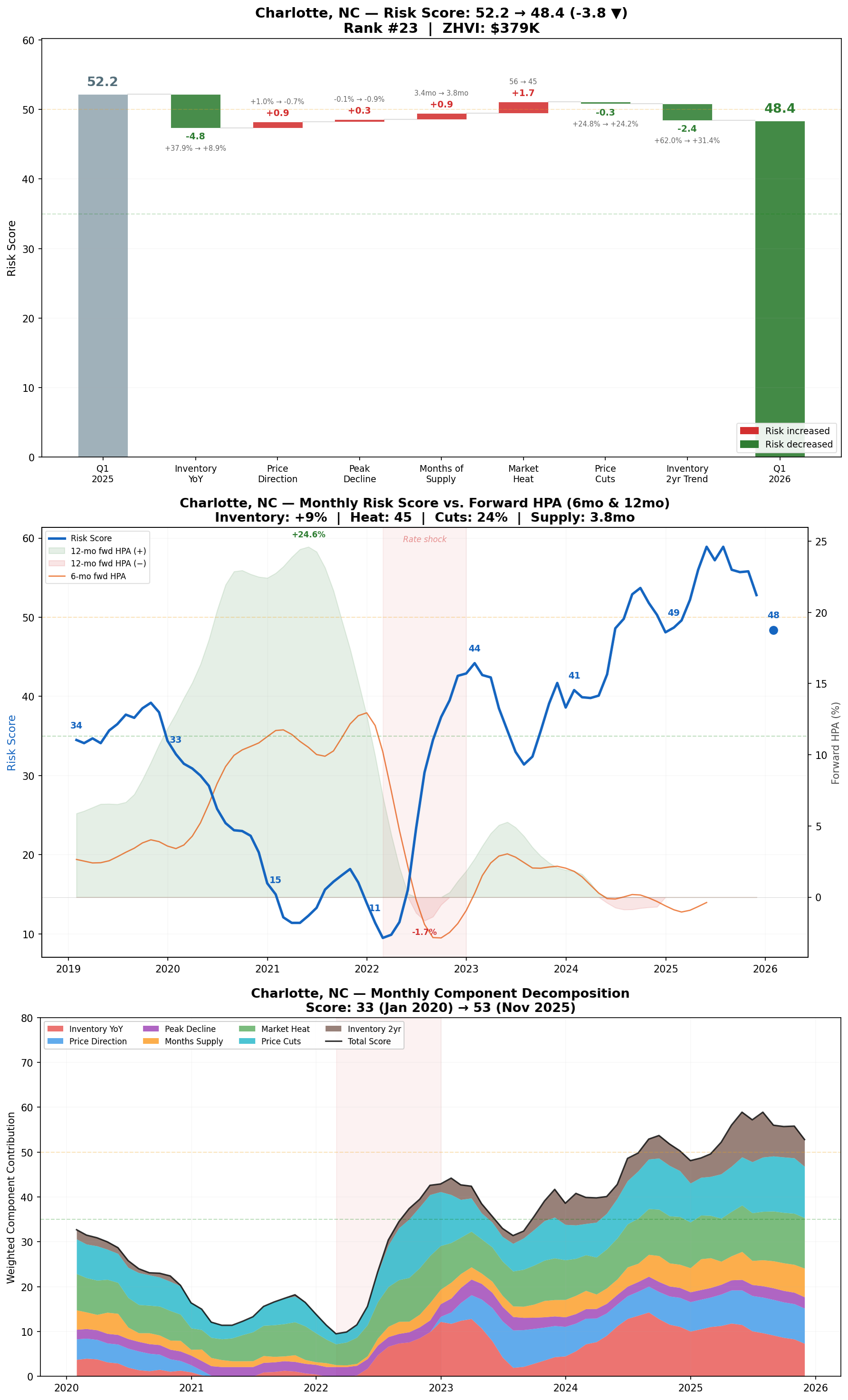
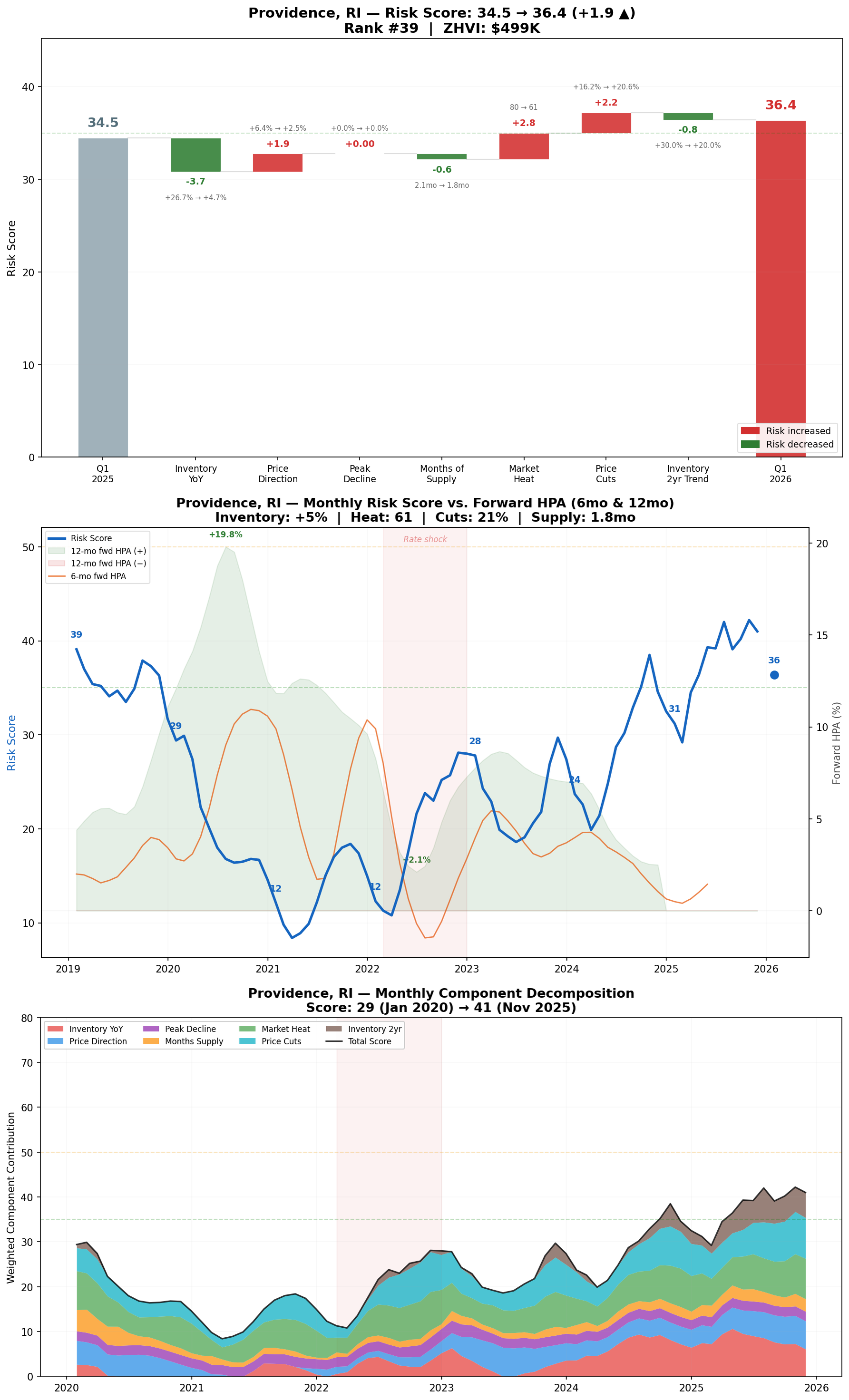
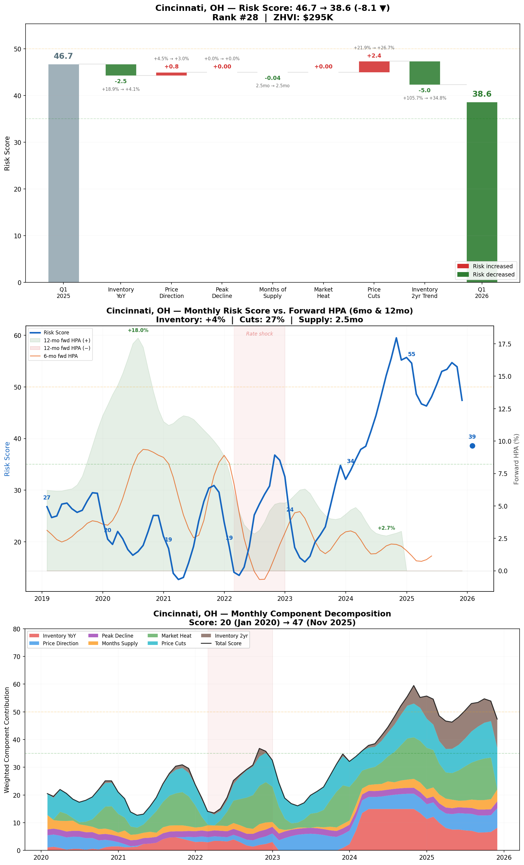
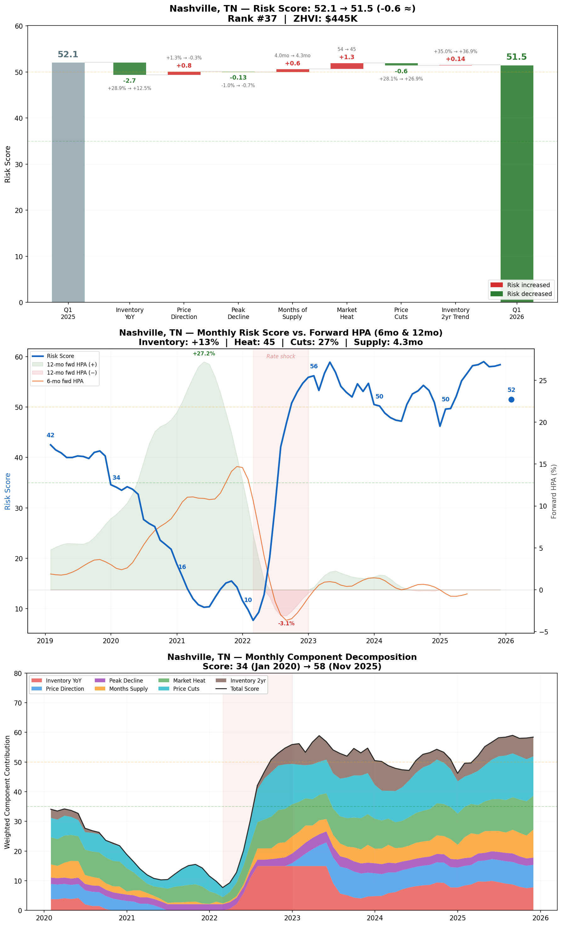
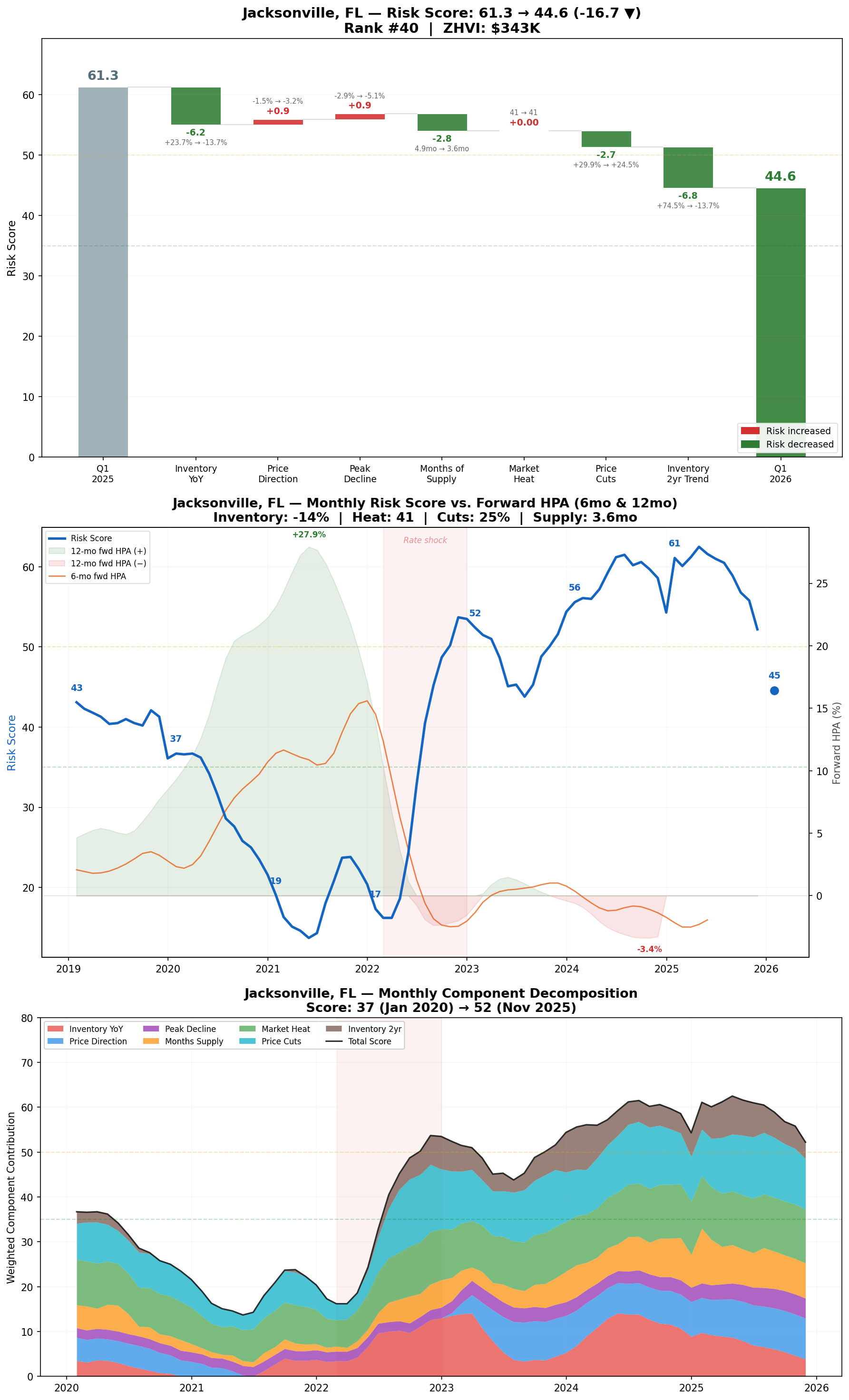
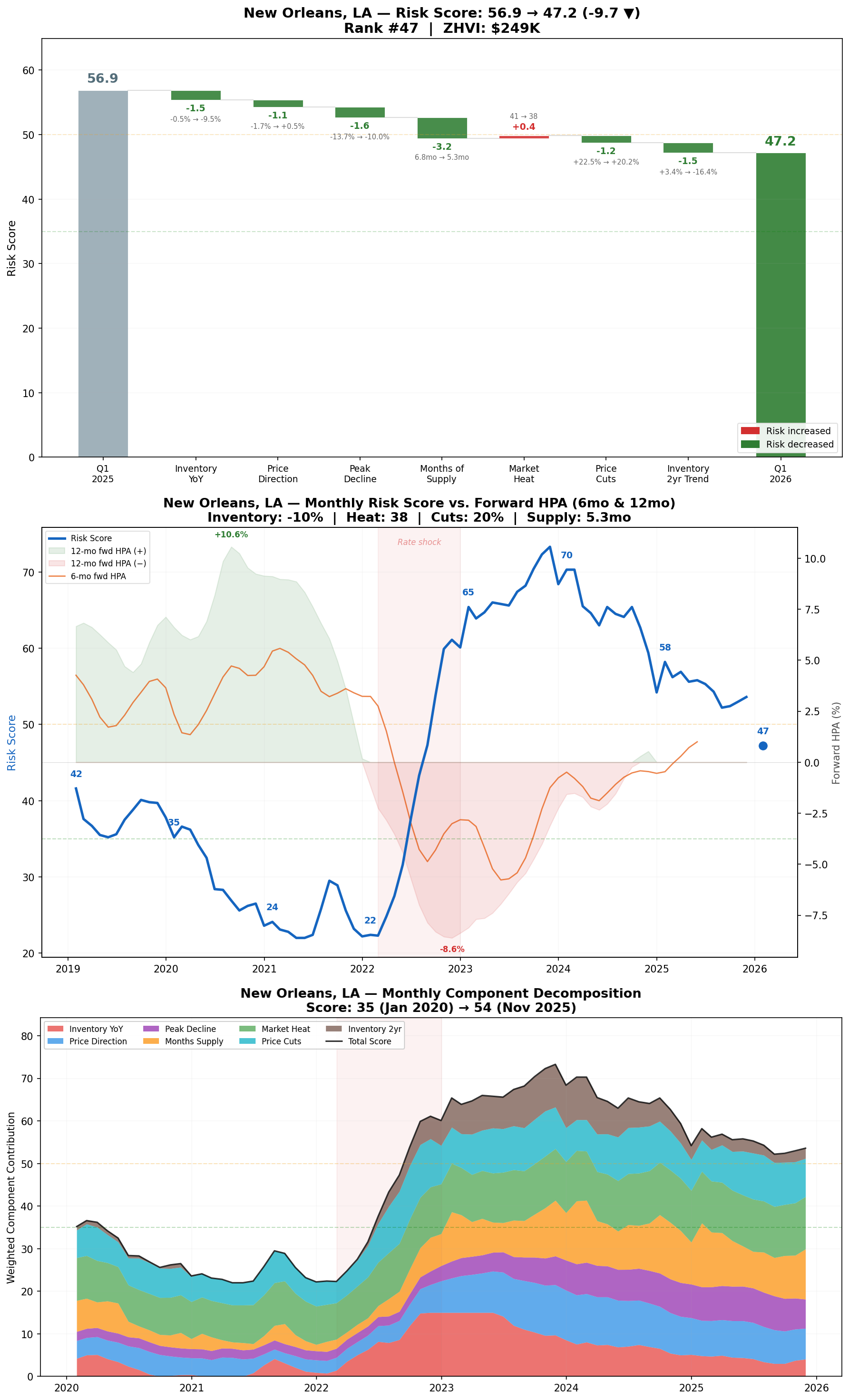
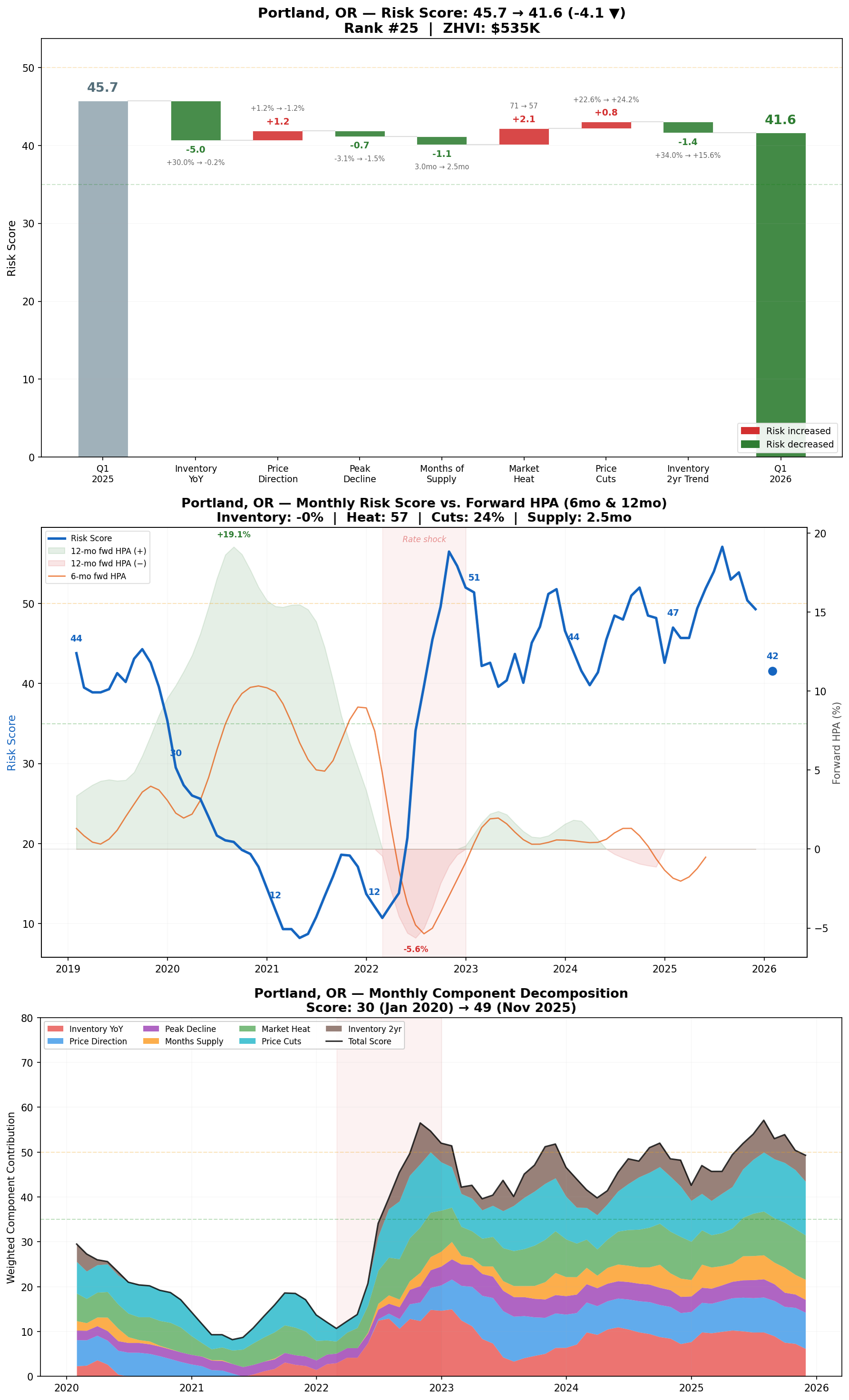
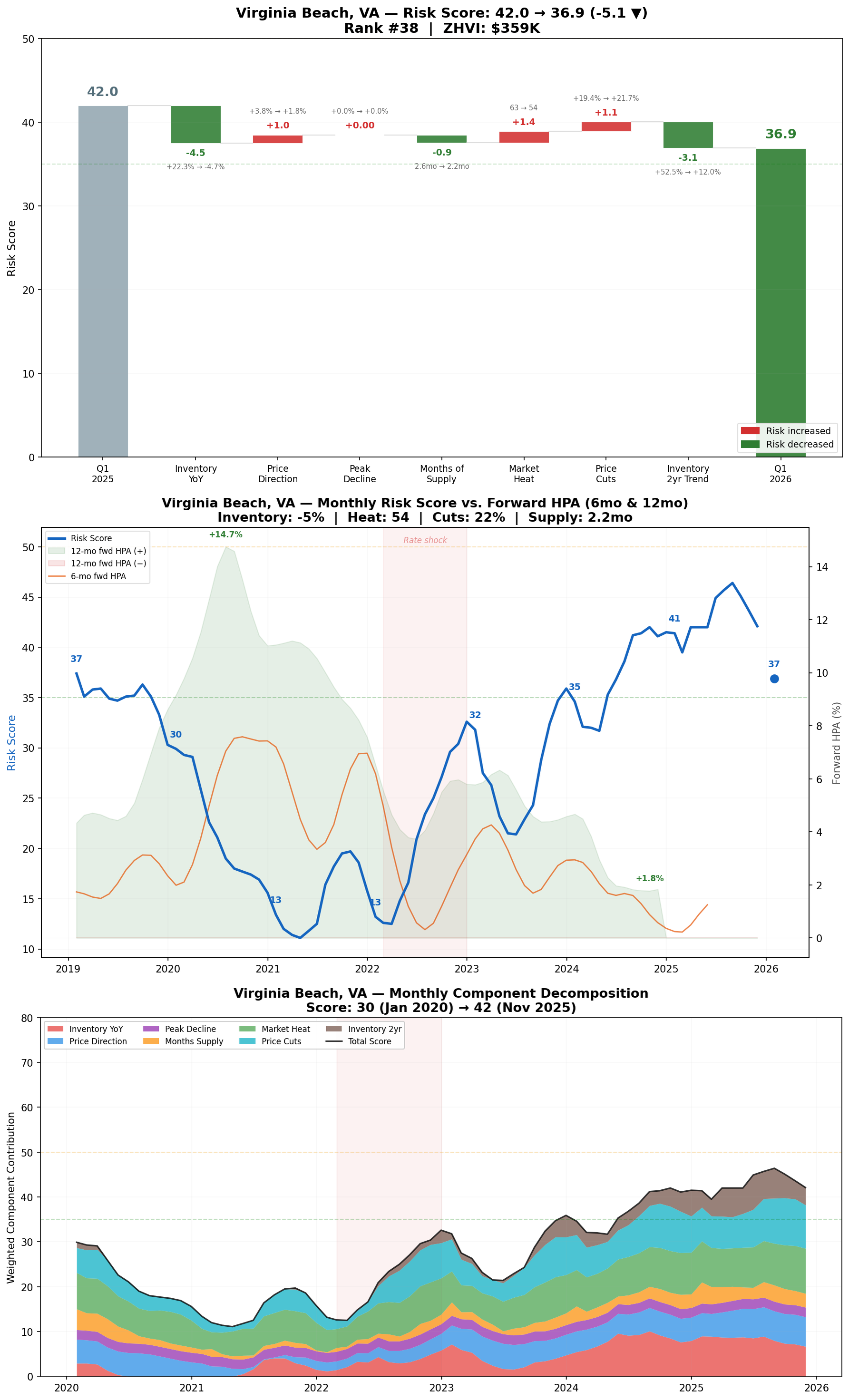
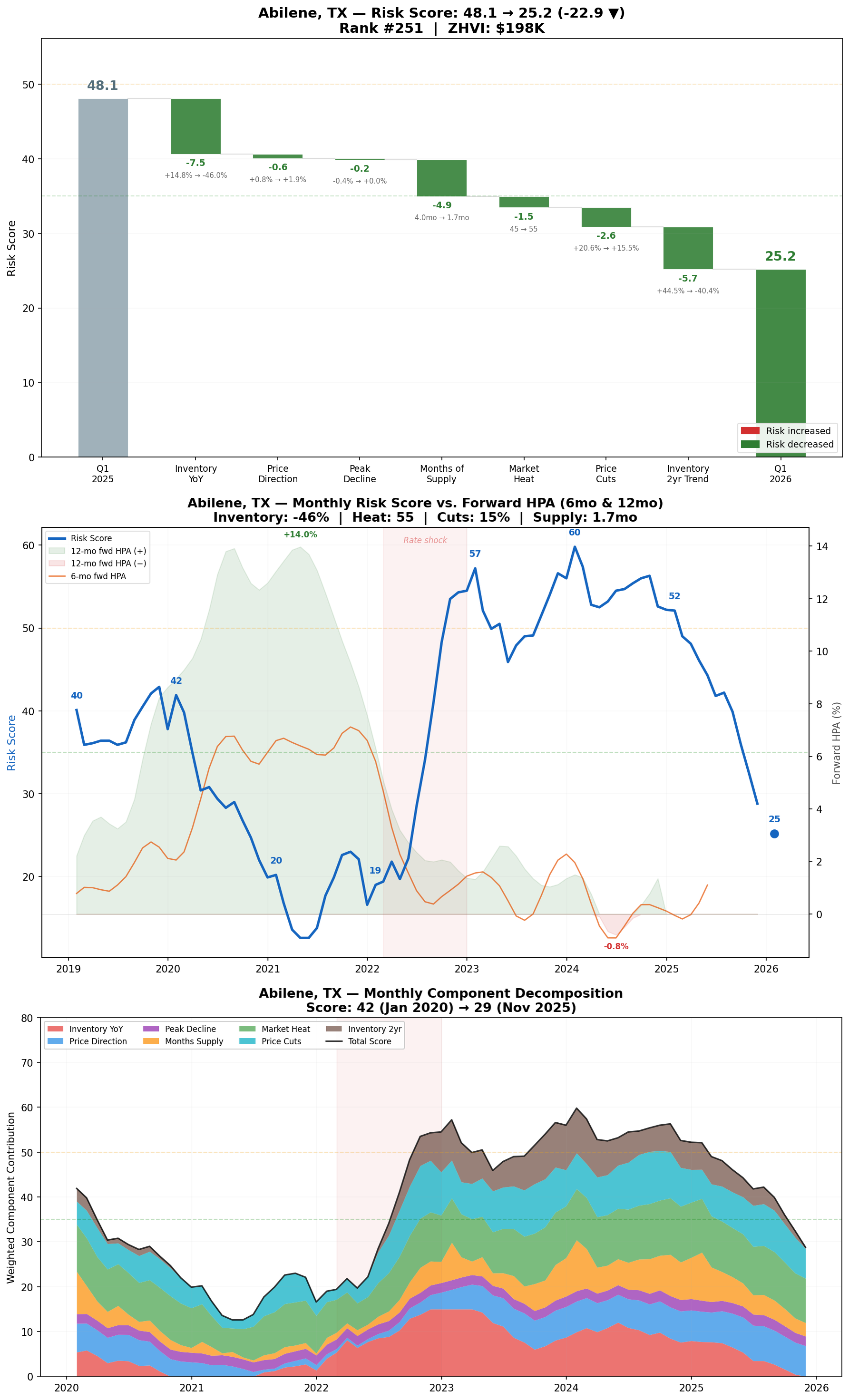
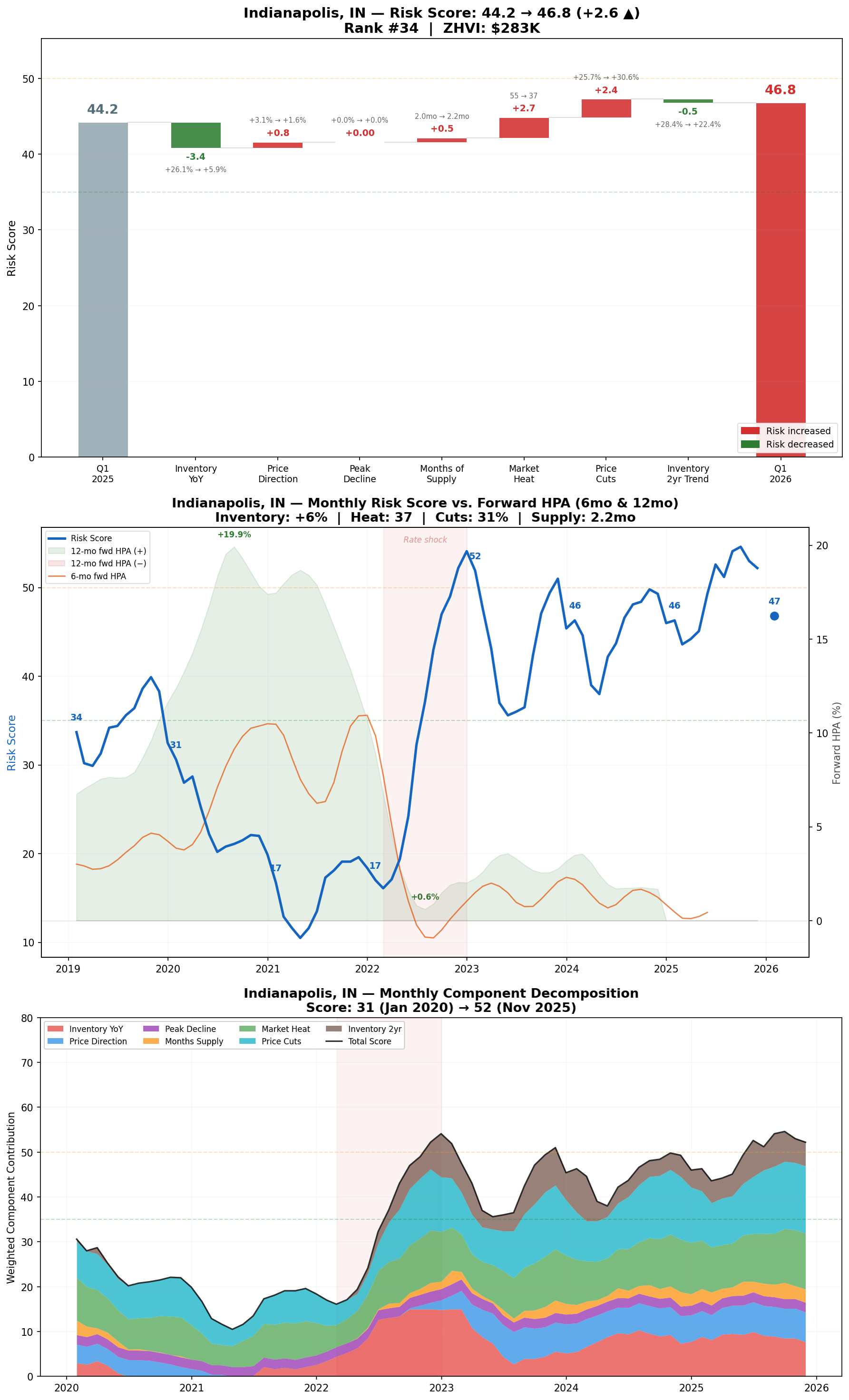
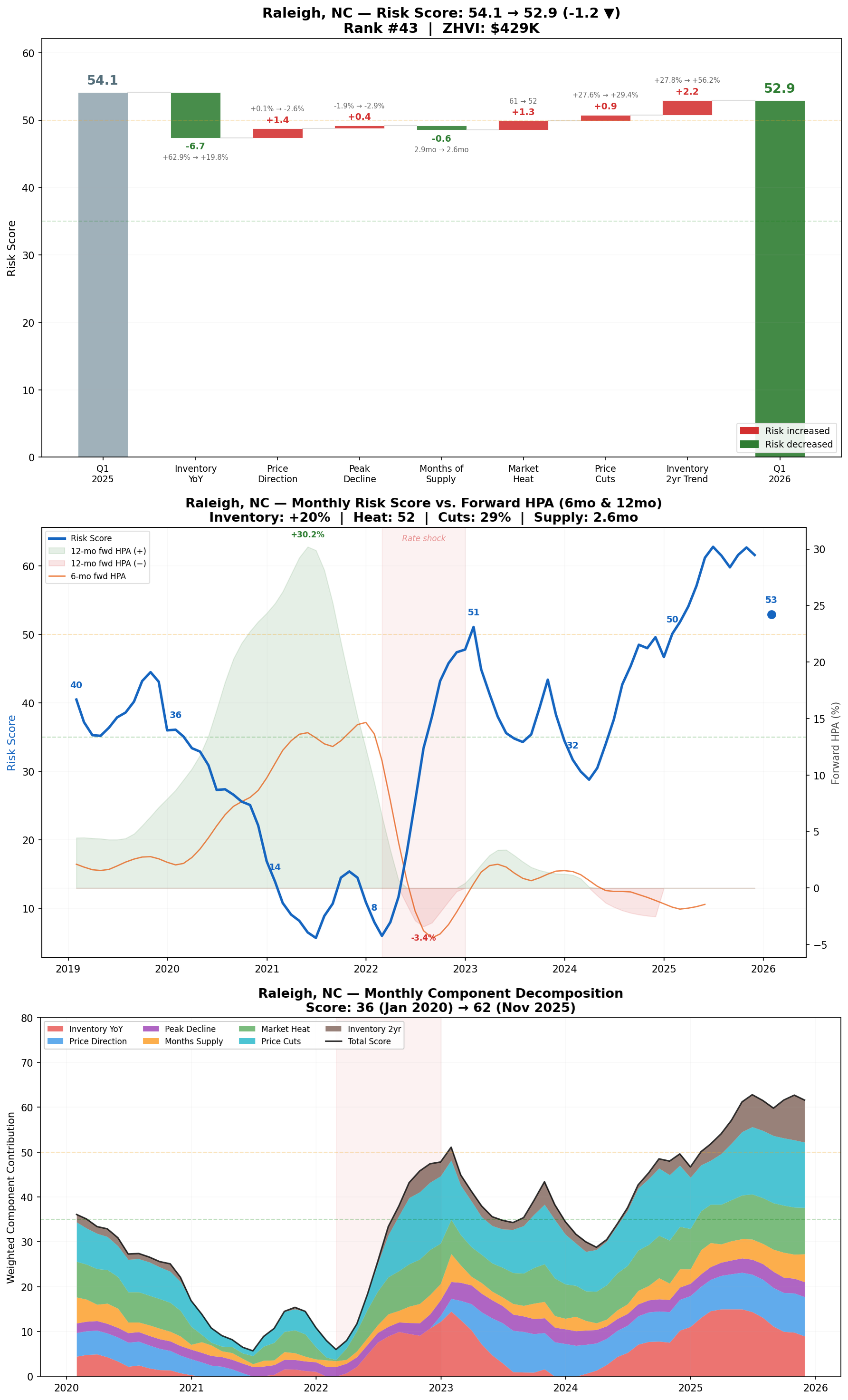
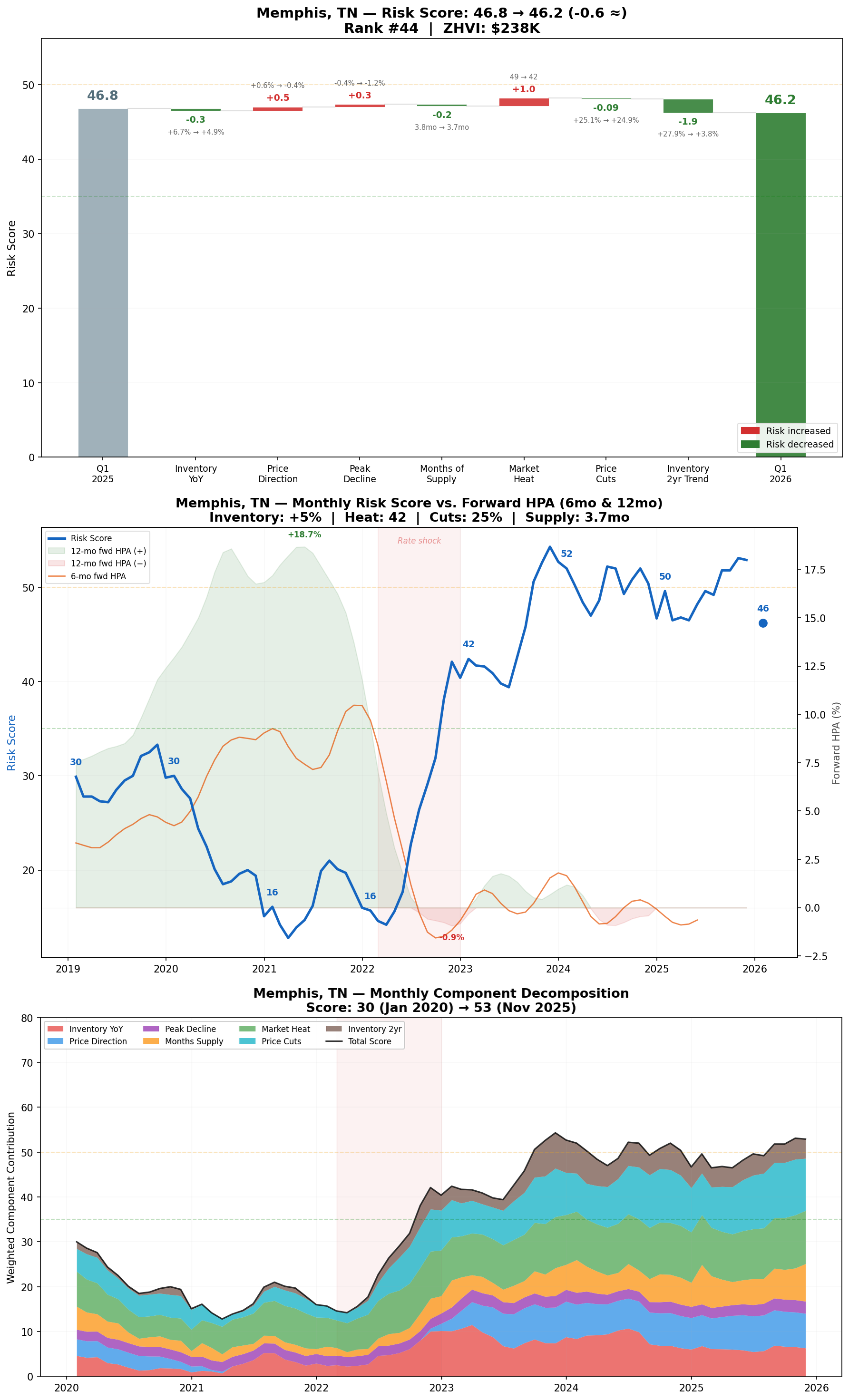
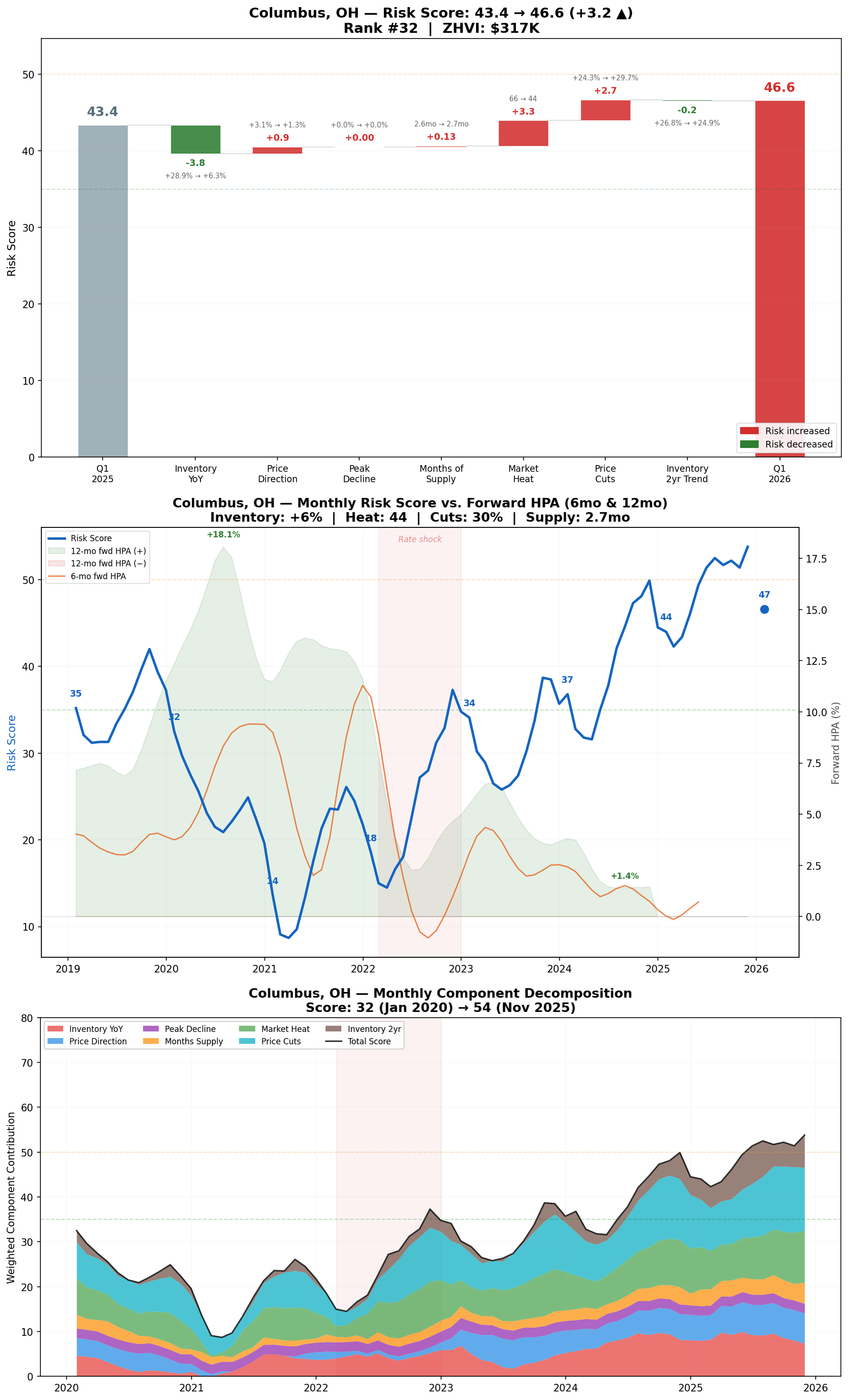
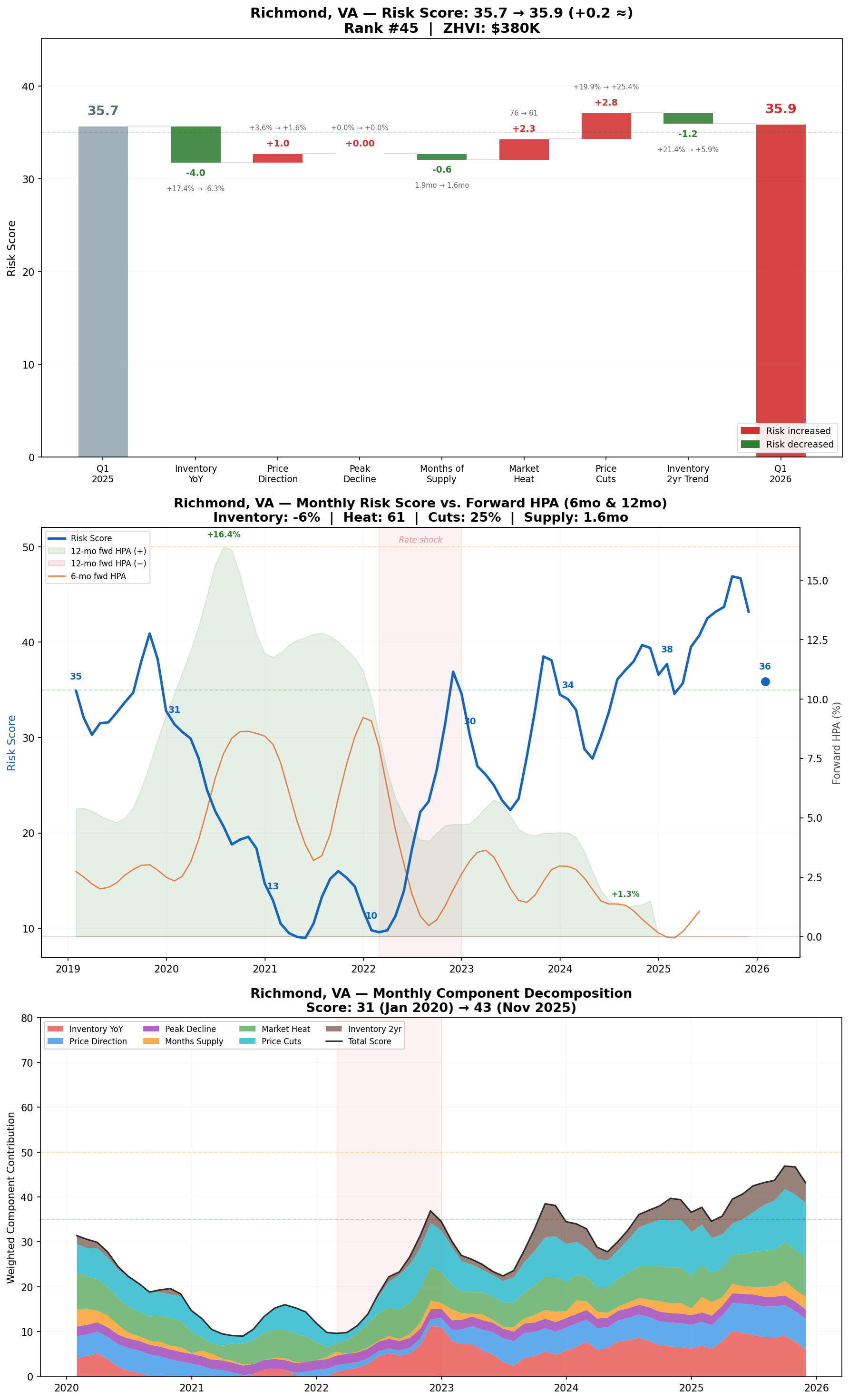
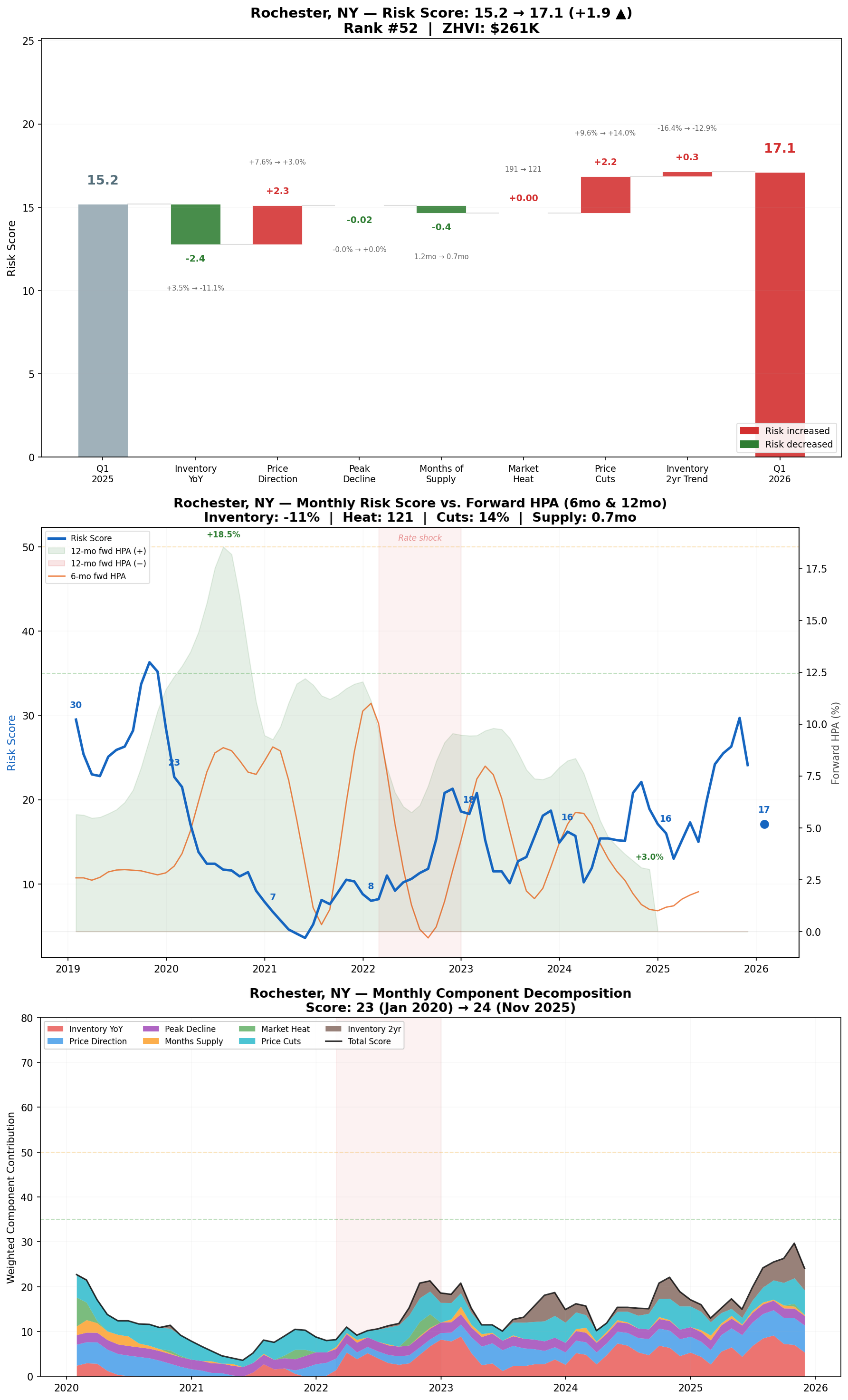
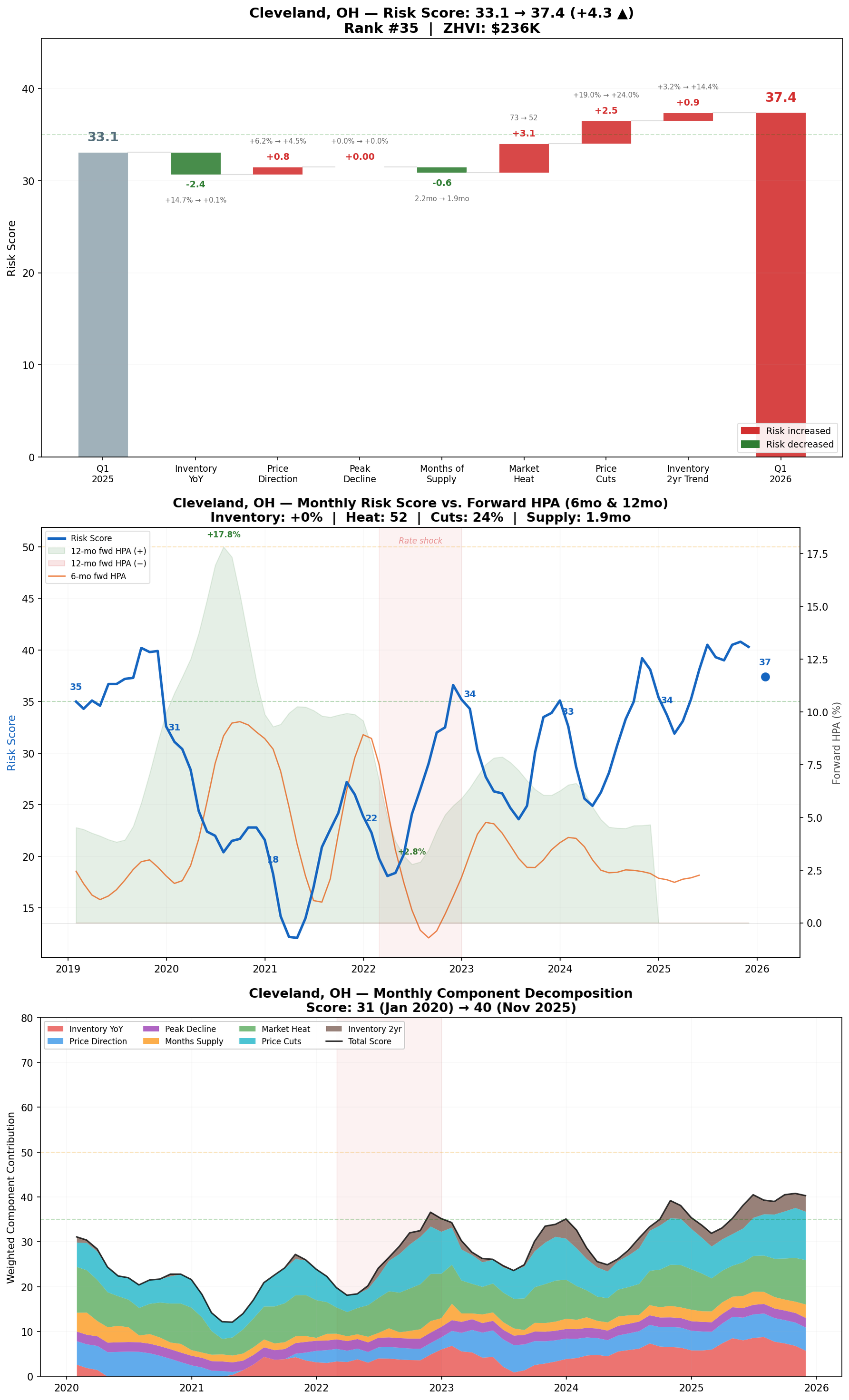
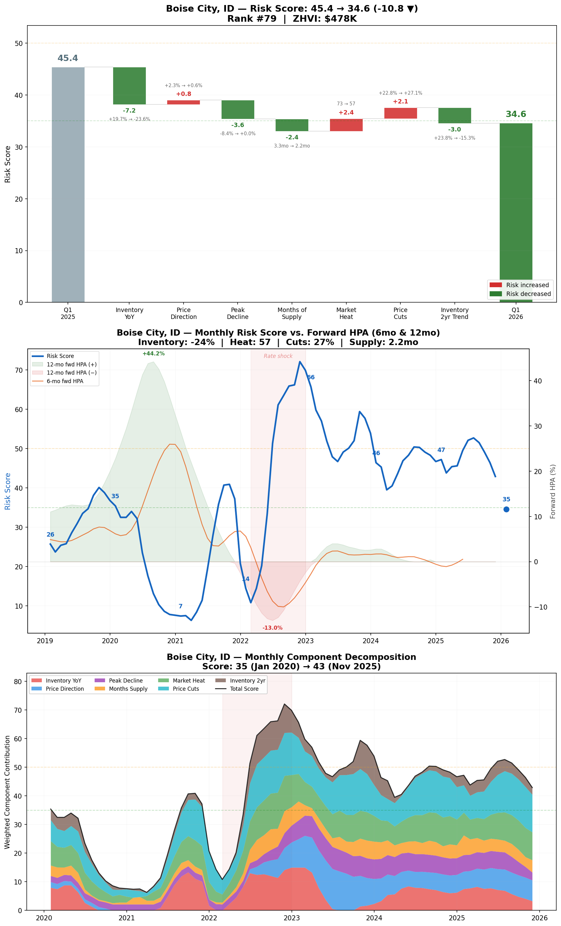
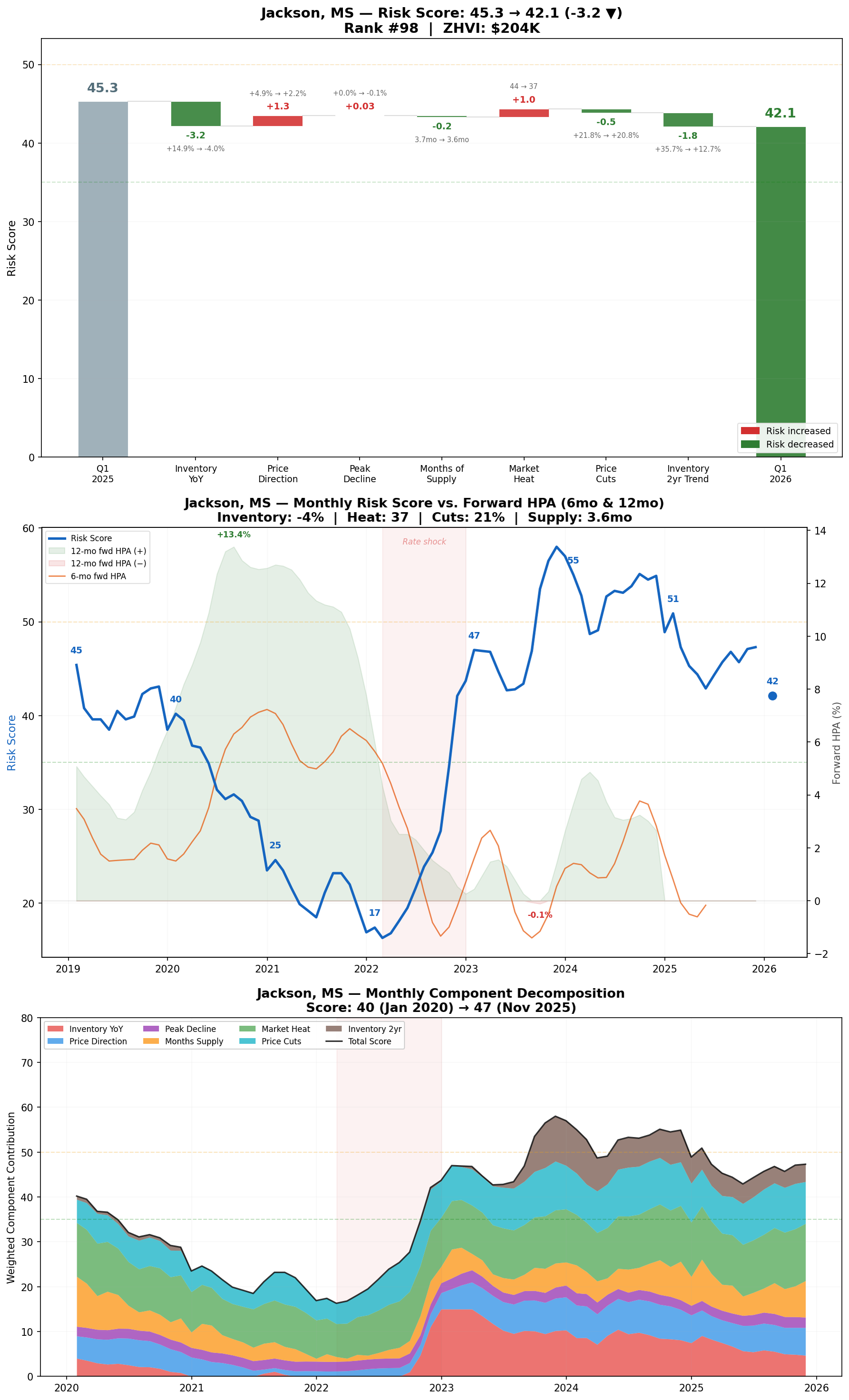
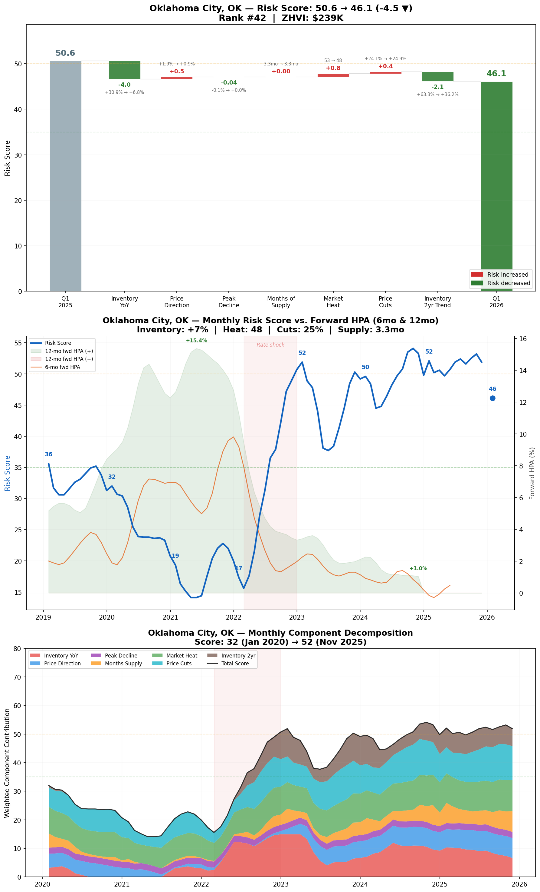
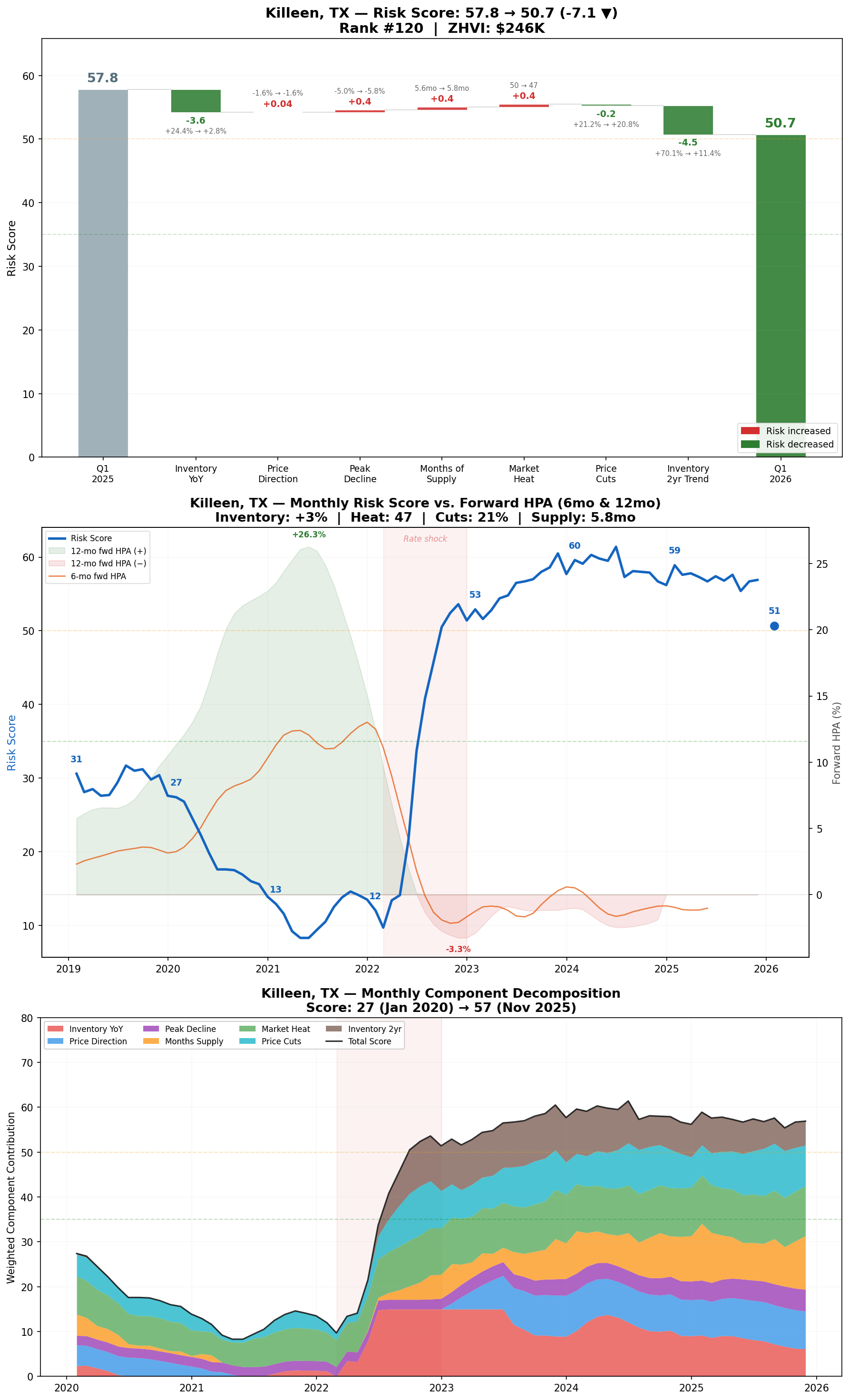
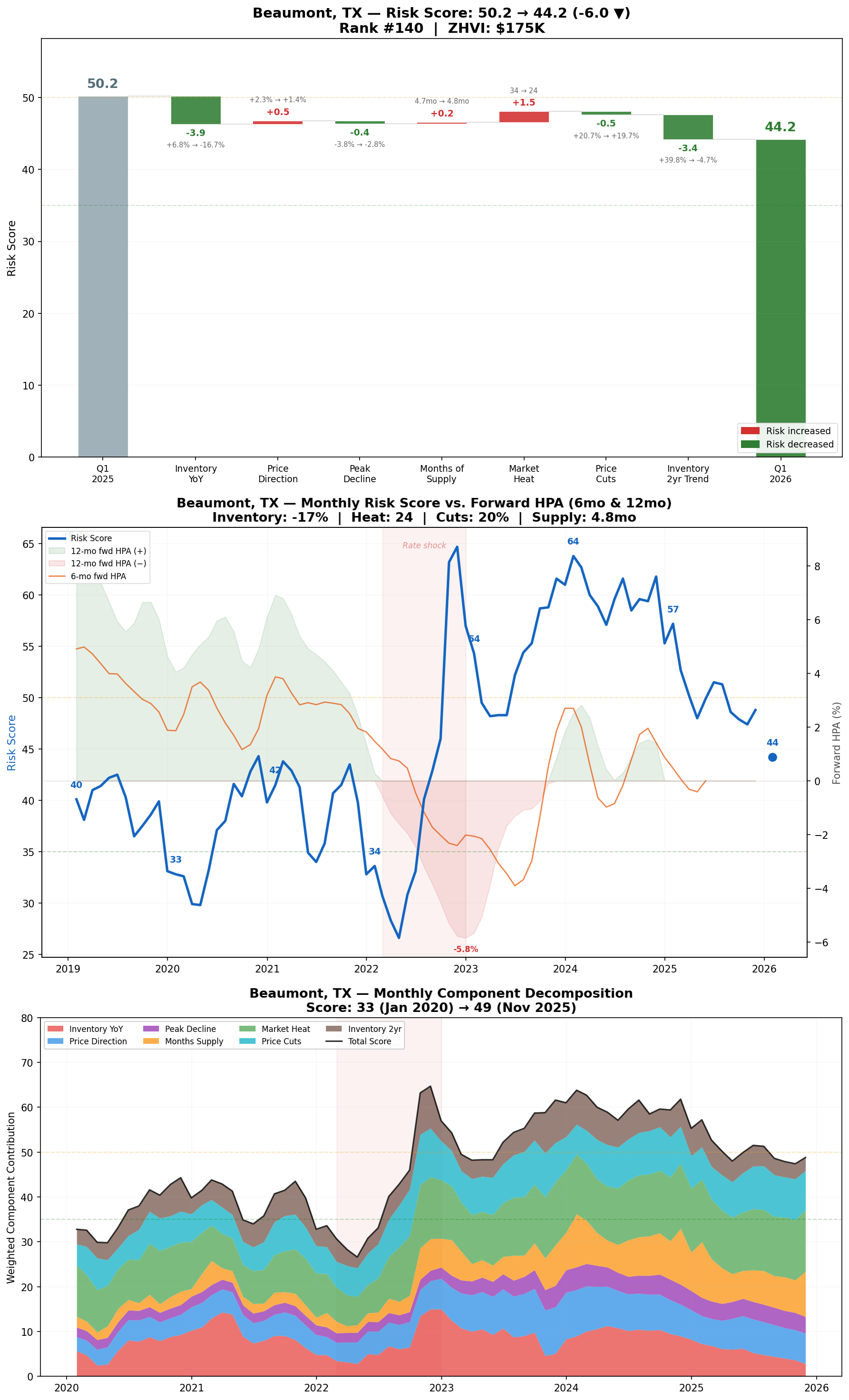
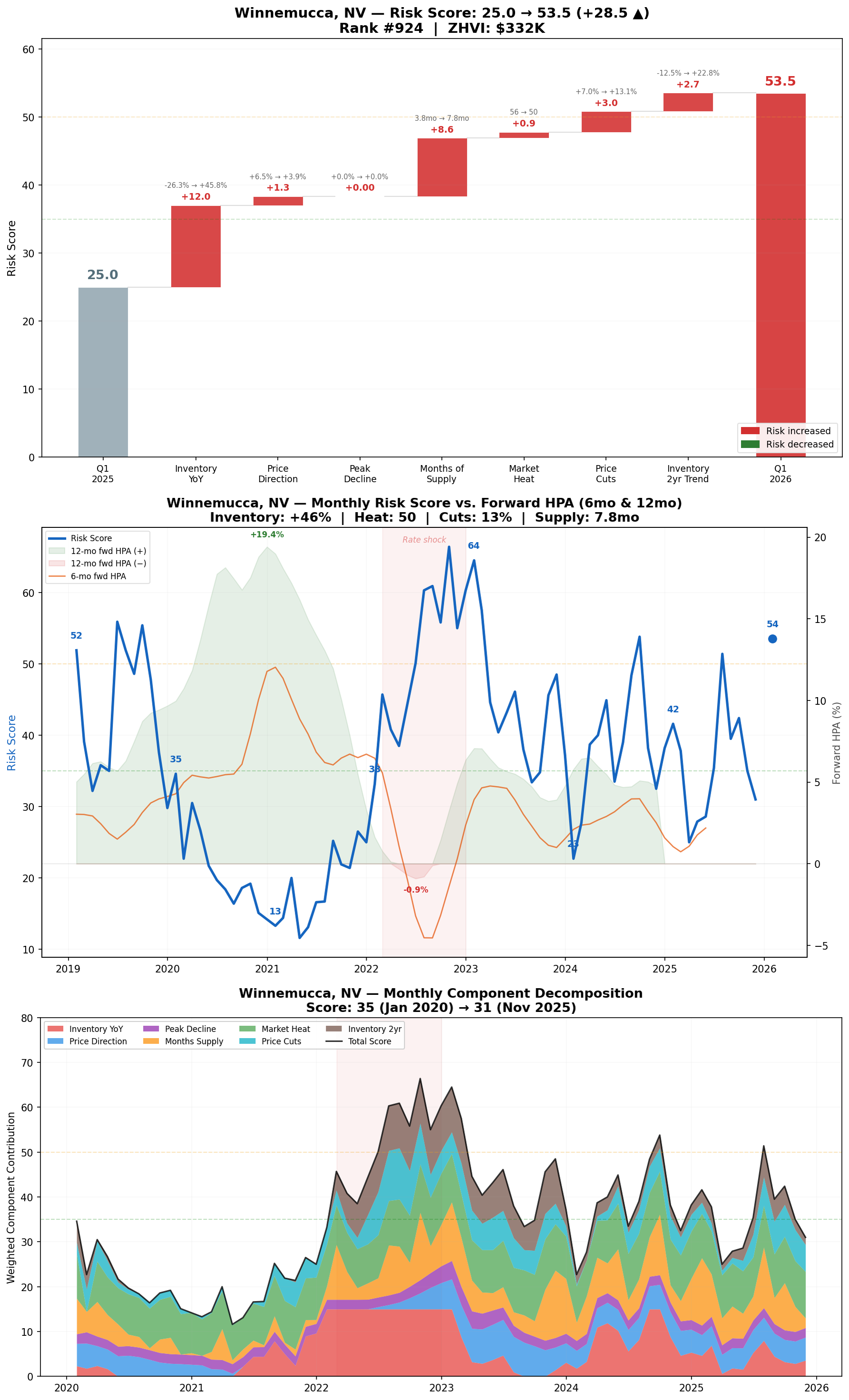
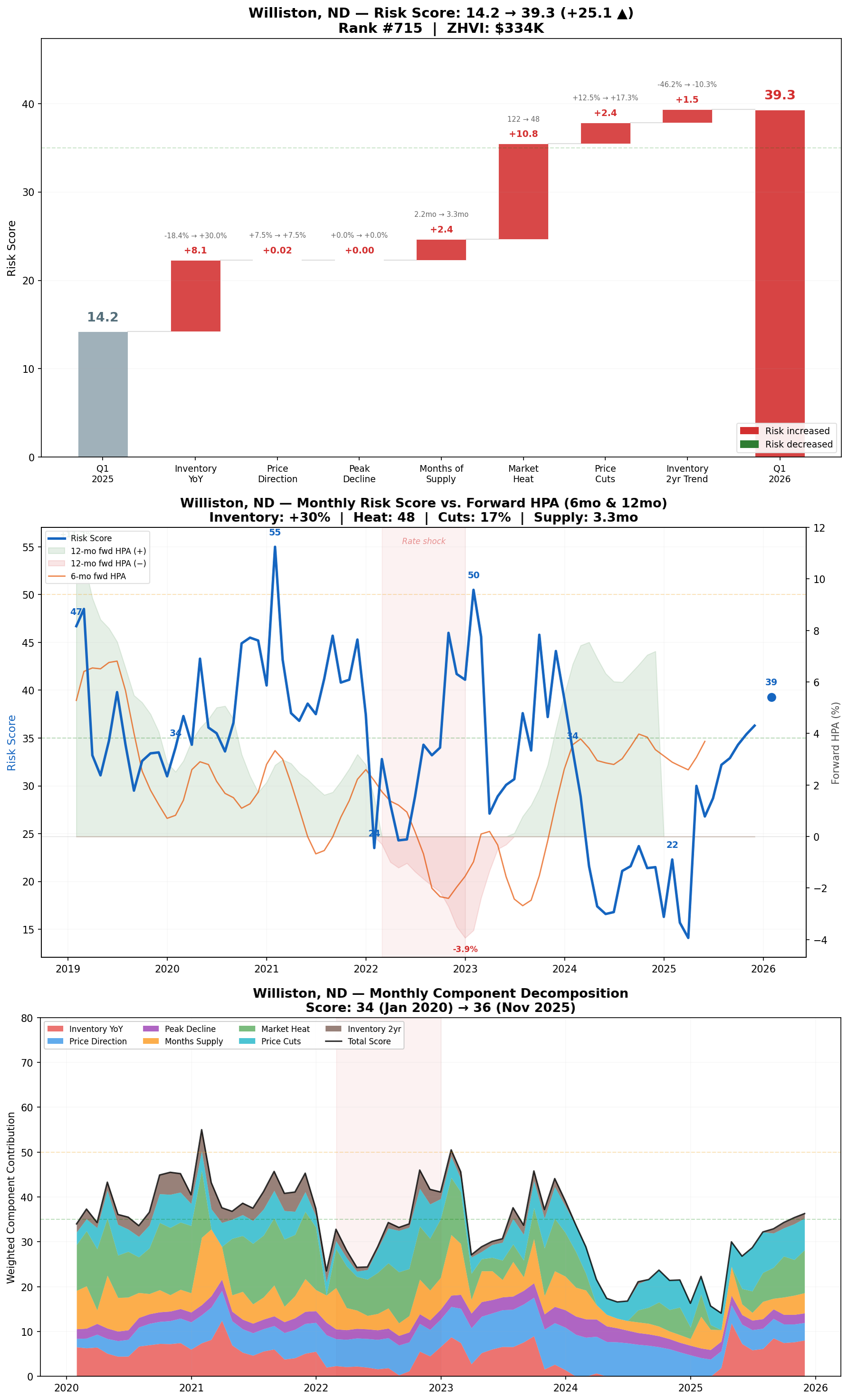
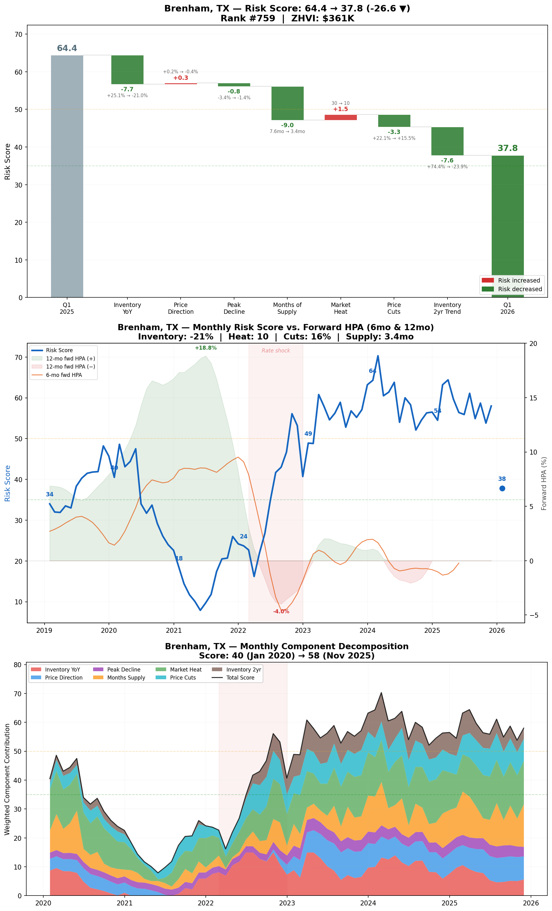
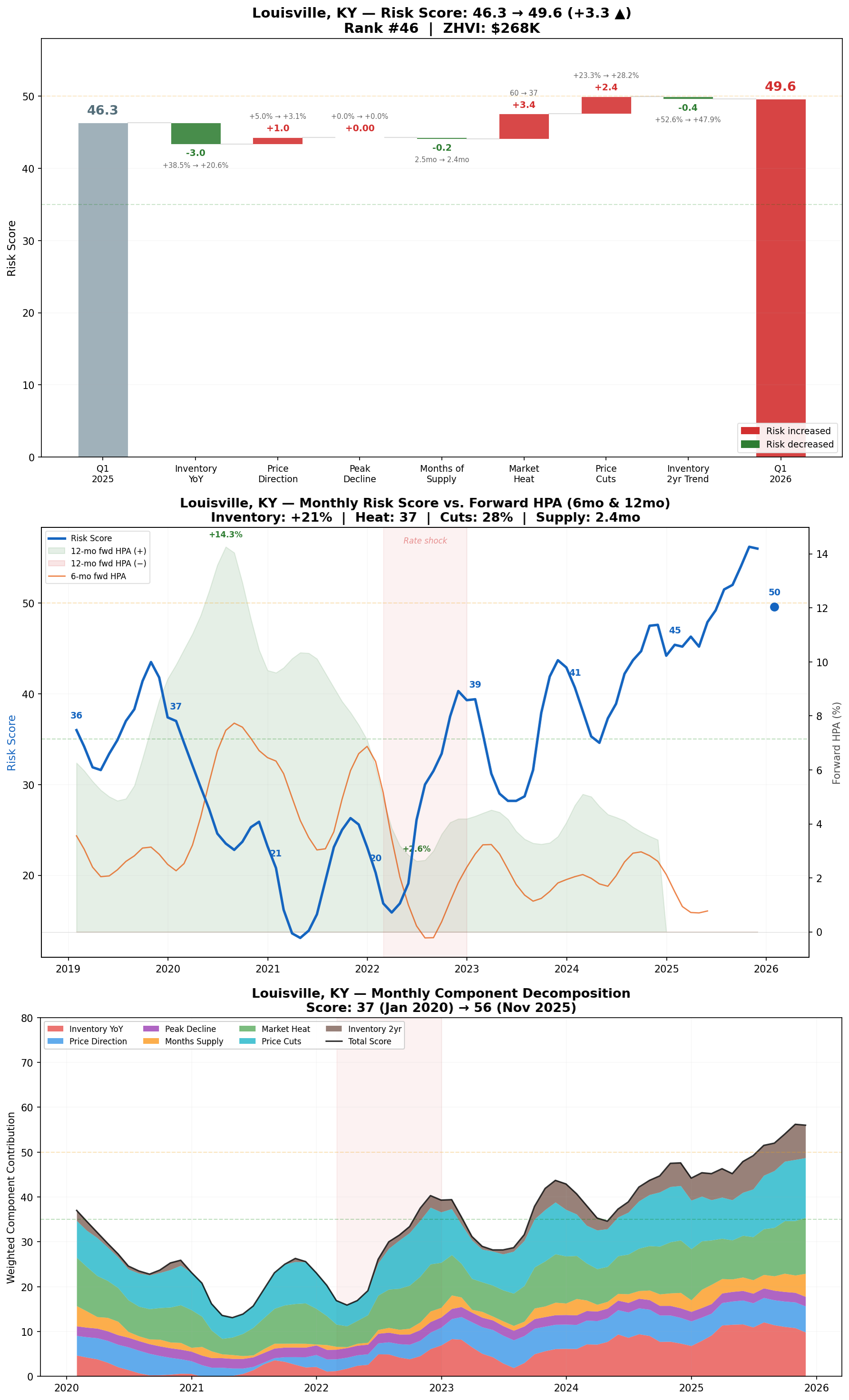
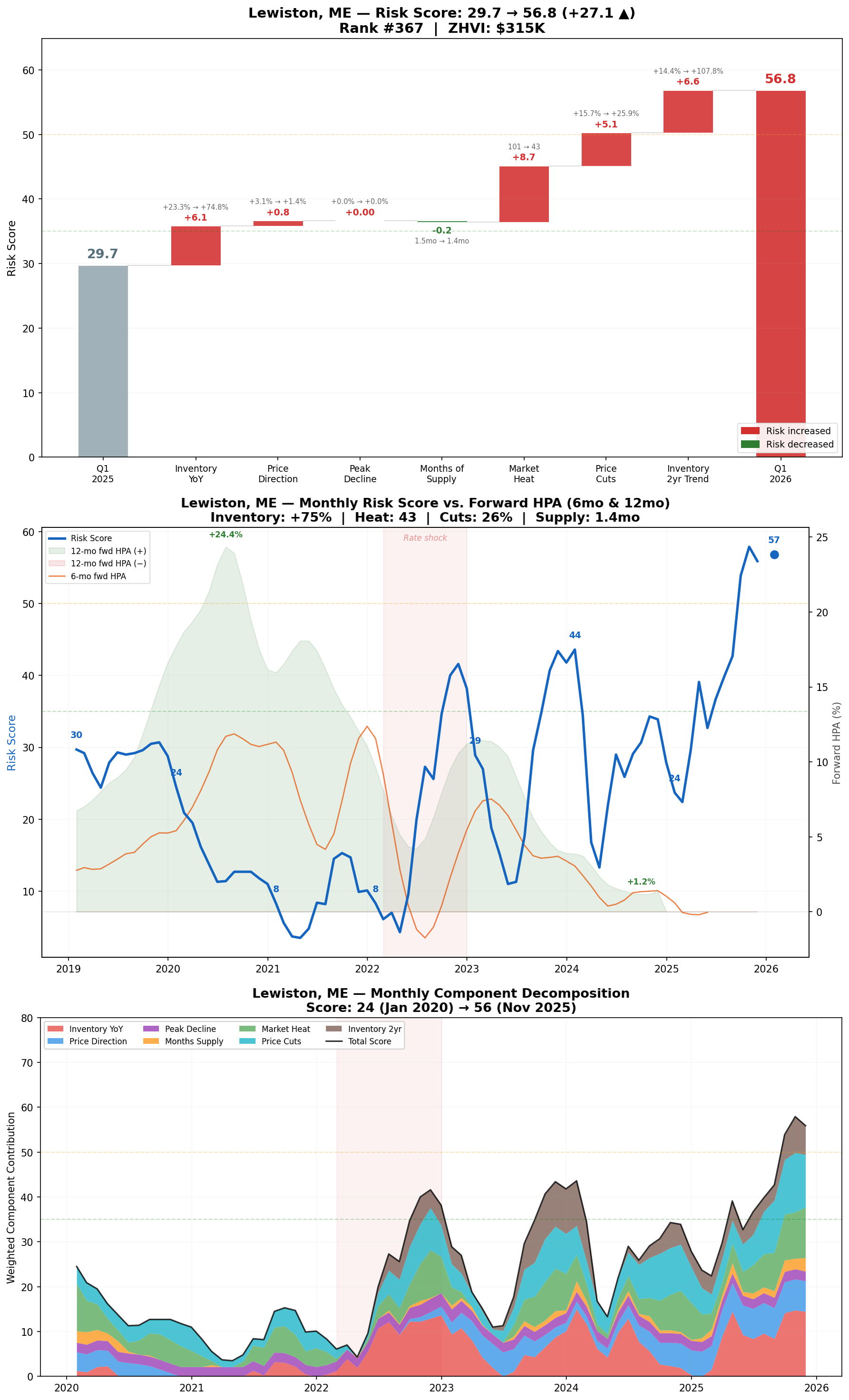
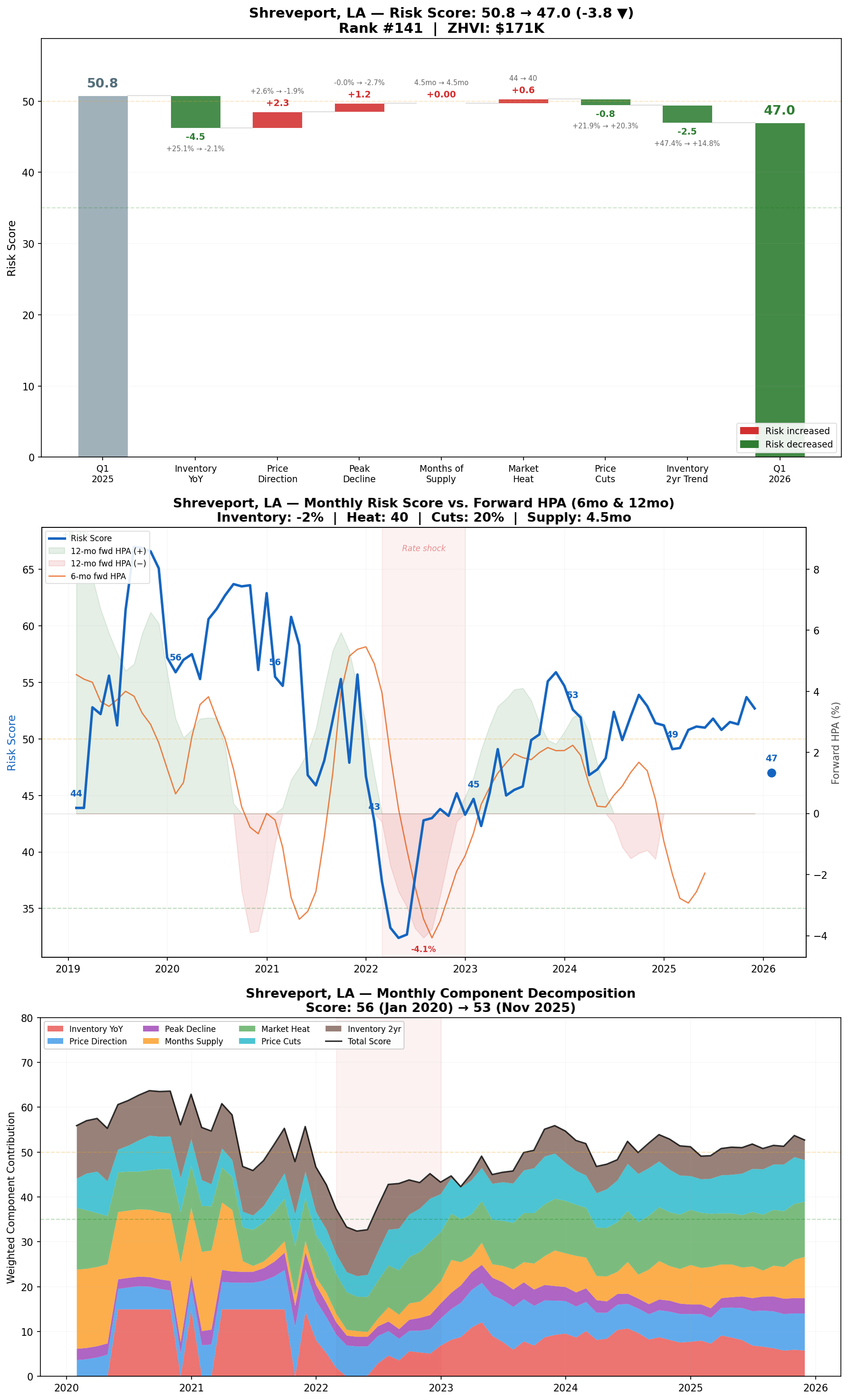
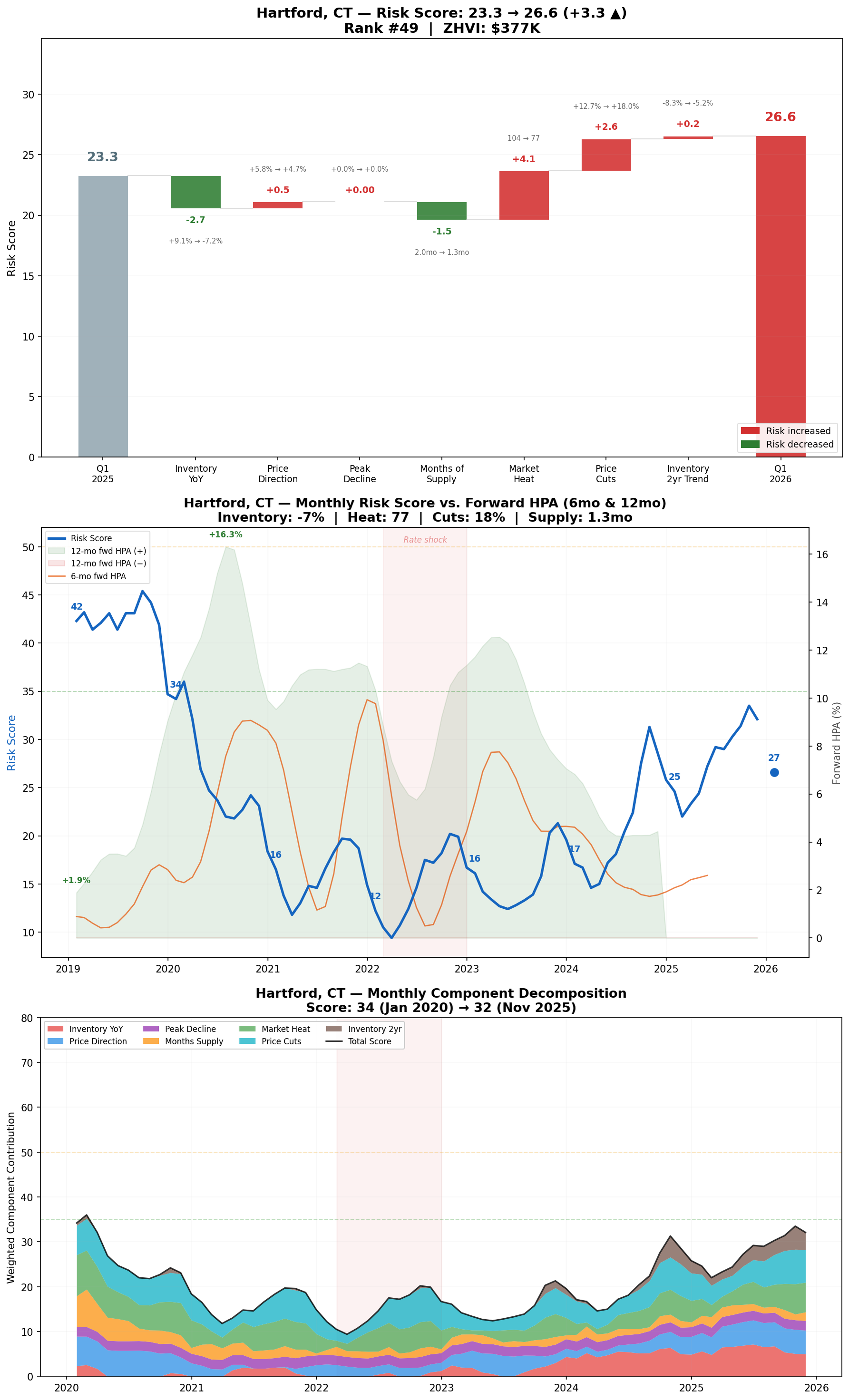
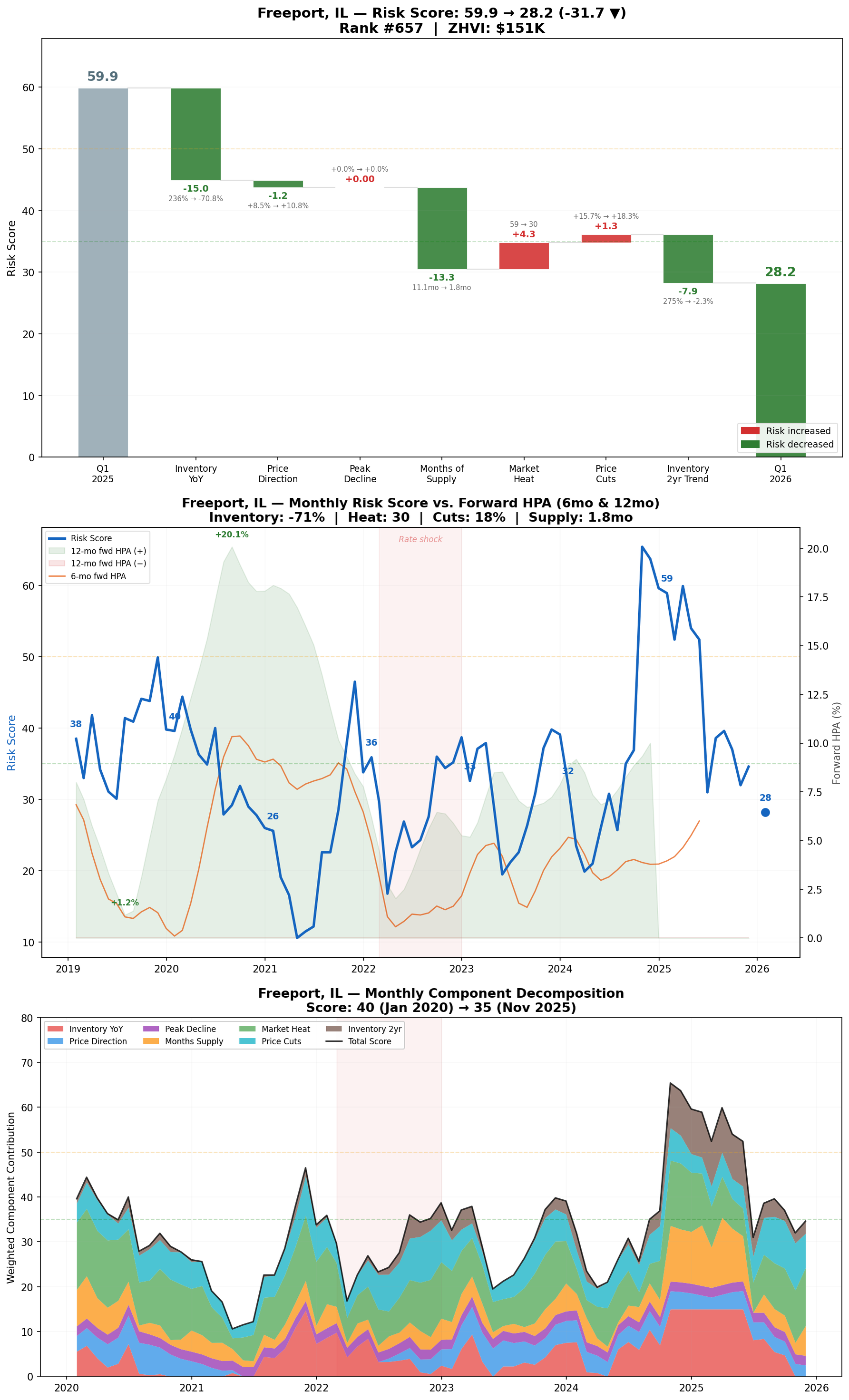
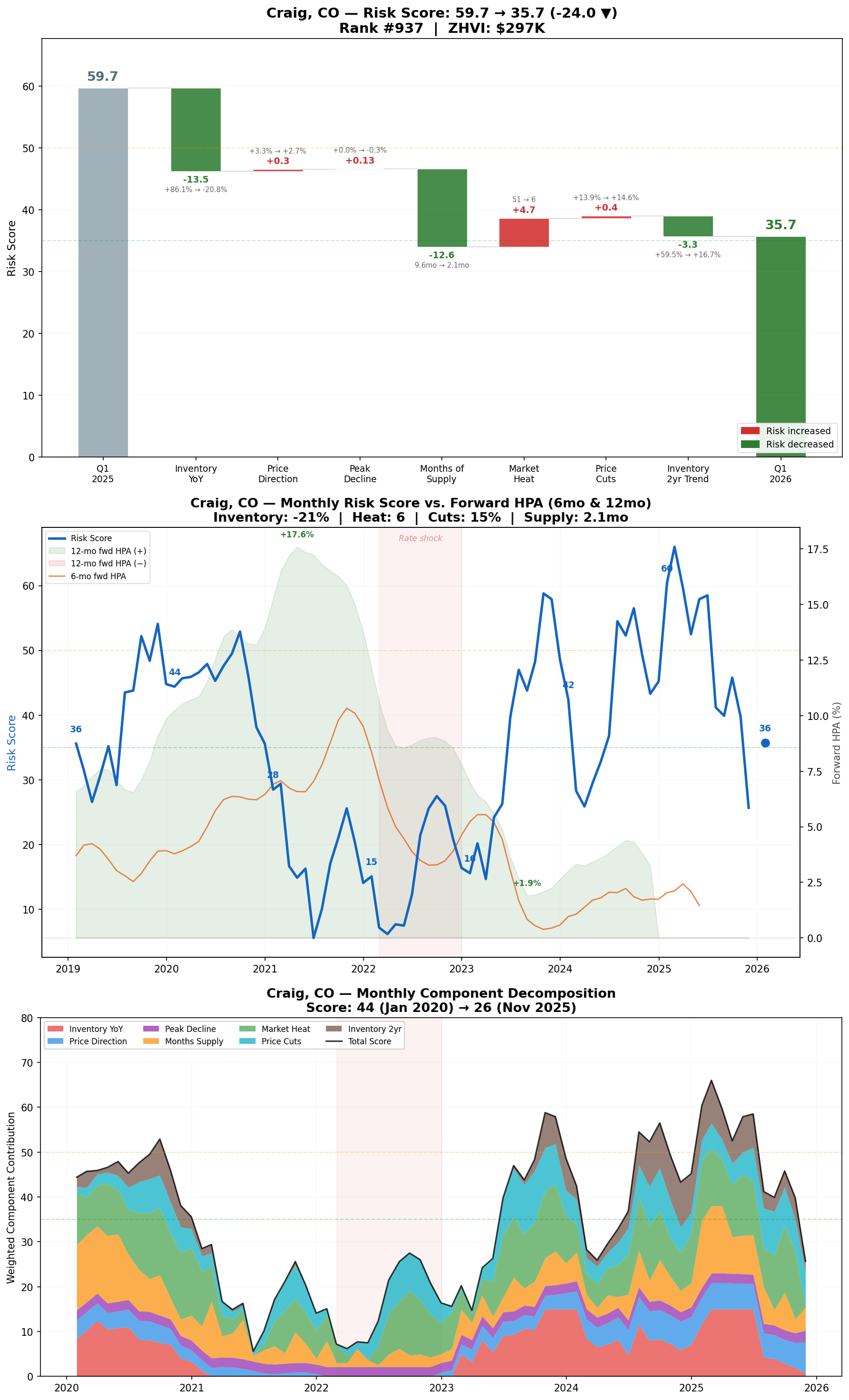
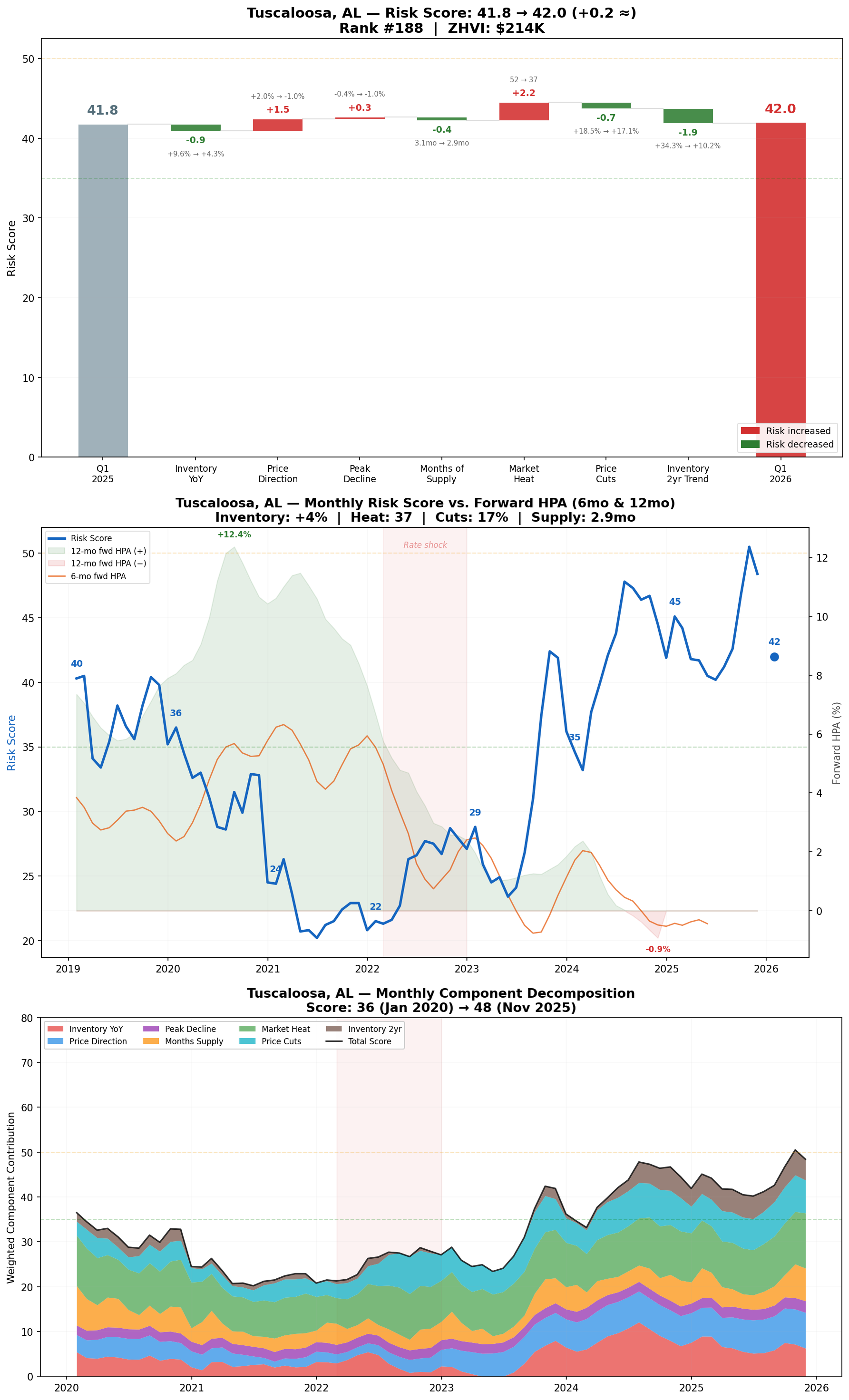
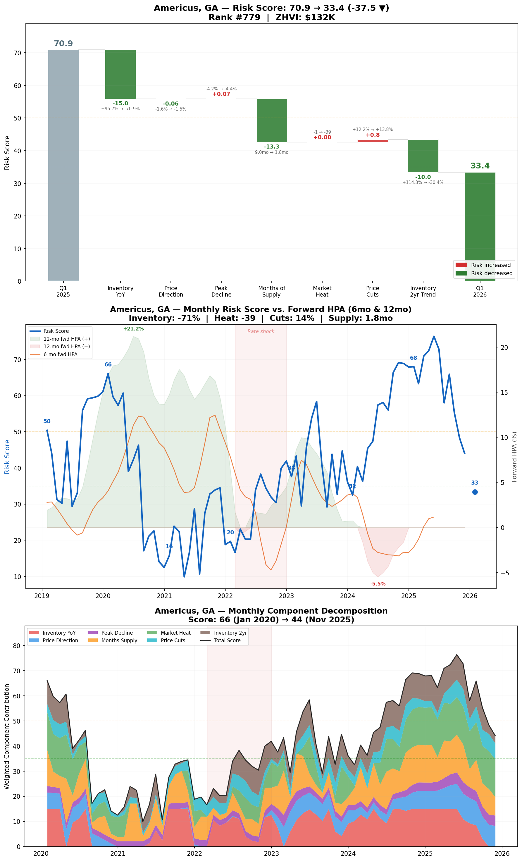
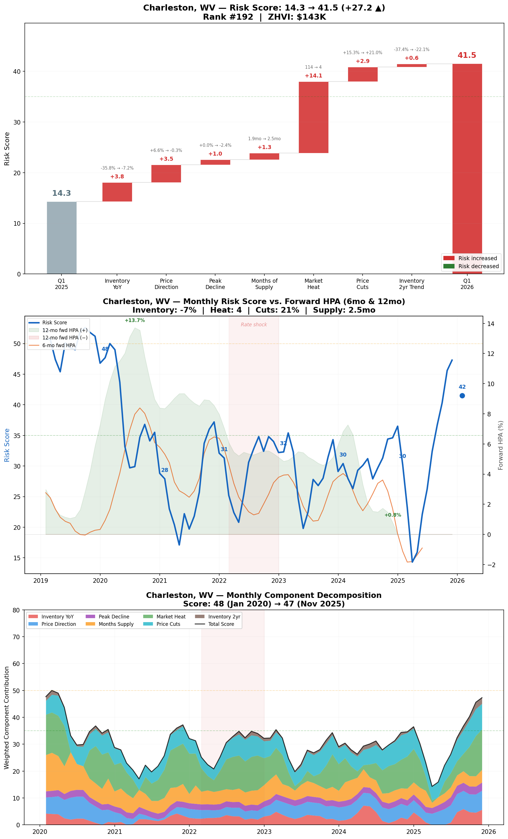
Metro Deep Dives
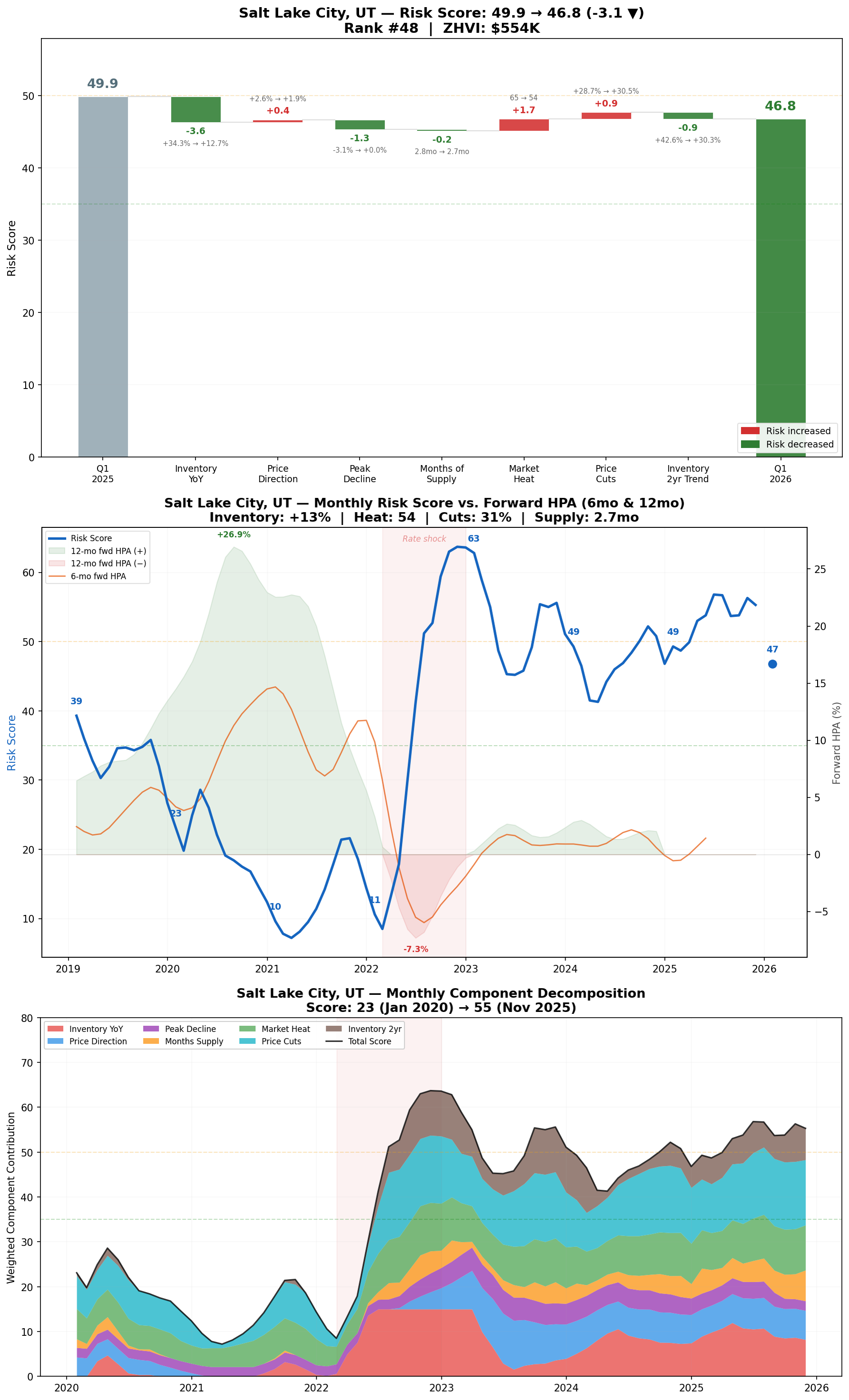
Each major metro's risk score is broken down below. The waterfall chart shows which factors drove YoY changes.
The second chart plots each metro's risk score against 6-month and 12-month HPA, offset by the respective lag periods, making it easy to compare a given risk score with actual HPA outcomes months later.
Finally, the score is decomposed over time, showing which factors are contributing most to changes in risk.
At the end of the article, paid subscribers can access a full spreadsheet of risk scores by MSA.
See below for the spreadsheet of risk scores: